Since some years ago, a group of enthusiastic designers (of which I am part of) go forward and work to take in reality the Asociación Mexicana de Tipografía (Mexican Association of Typography (AMT, by its initials in spanish)), with the purpose to empower and highlight the deep history of Mexico's as the first printing place in America, the handcrafting throughout the times, the mastery of the old and contemporary type designers, lettering artists, calligraphers and any other expression related about the art of typography through the time.
The association rises at the beggining of the lockdown and take action in the midde of the pandemic situation, so there's key decisions to take in mind for starting our activities, so the social networks become our main platform for each different topics we developed for share, so there were graphic contents needed to promote them and I become the man in charge to develop them throughout the next coming year.
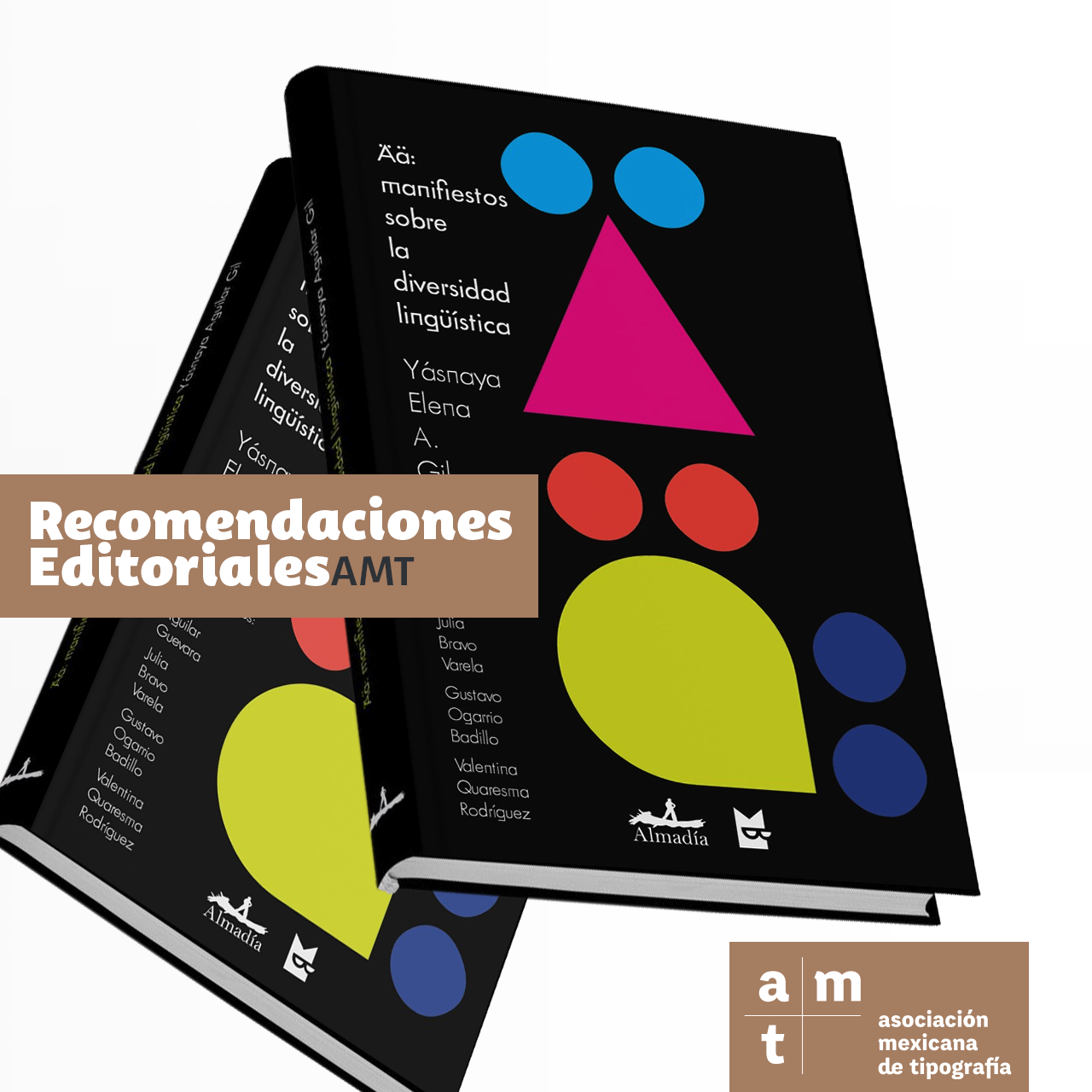
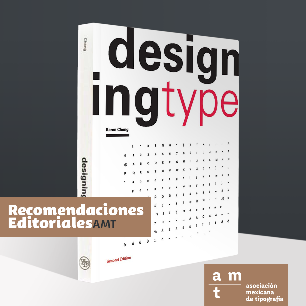
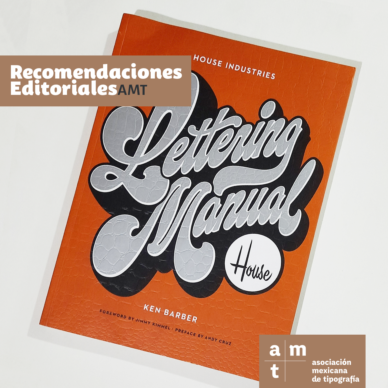
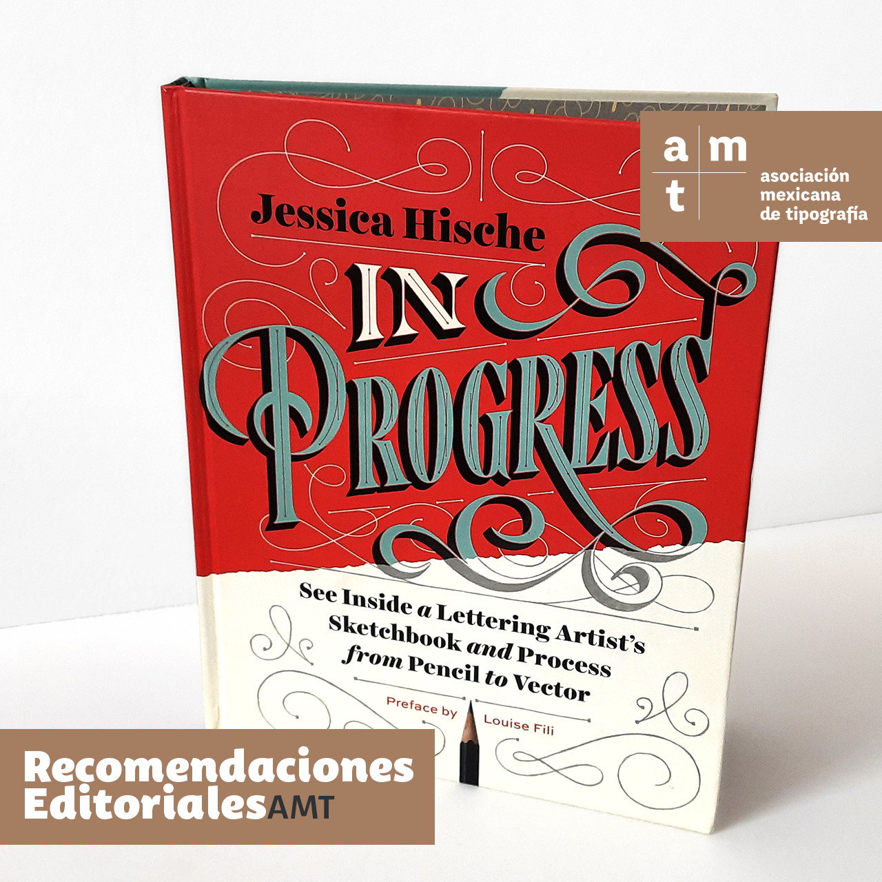
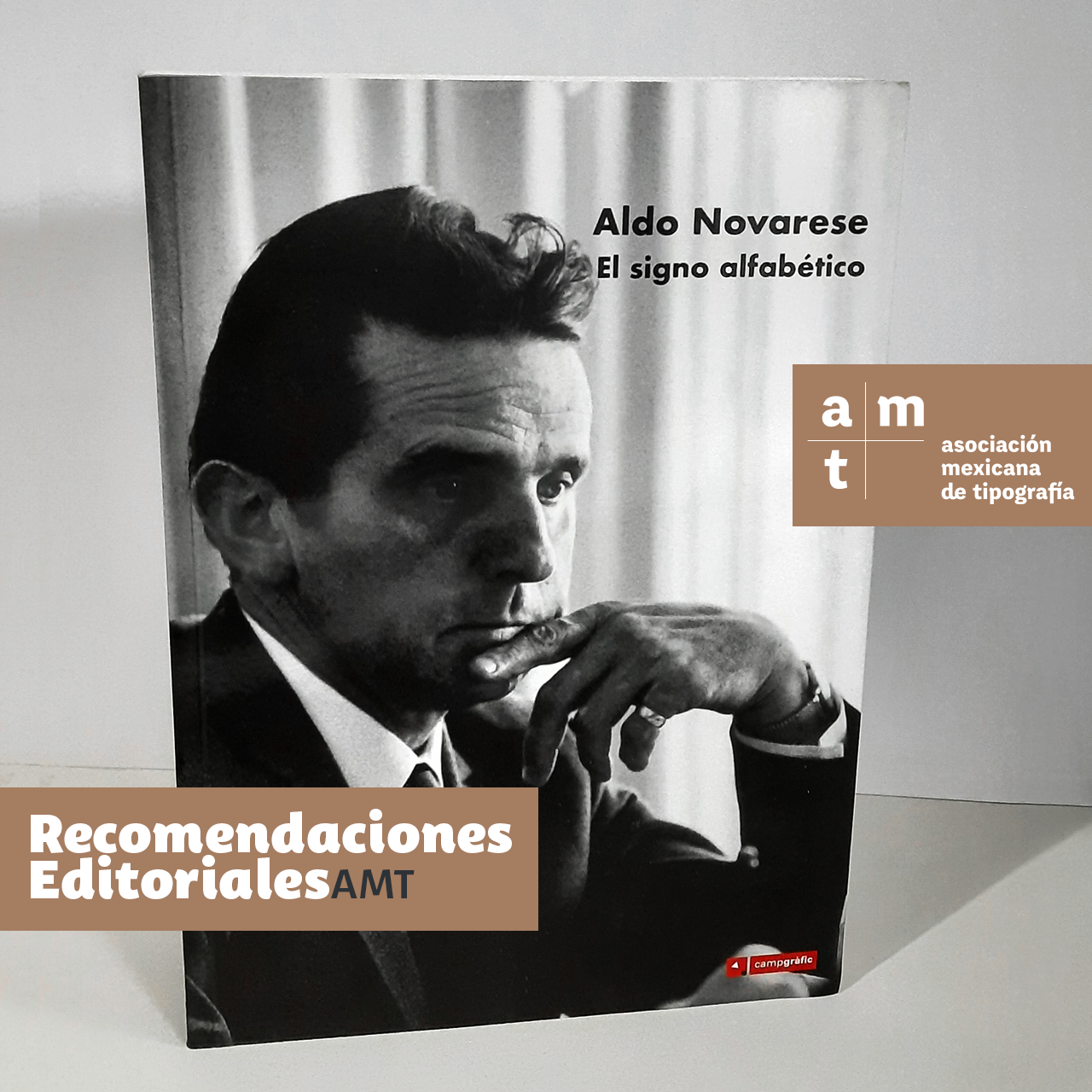
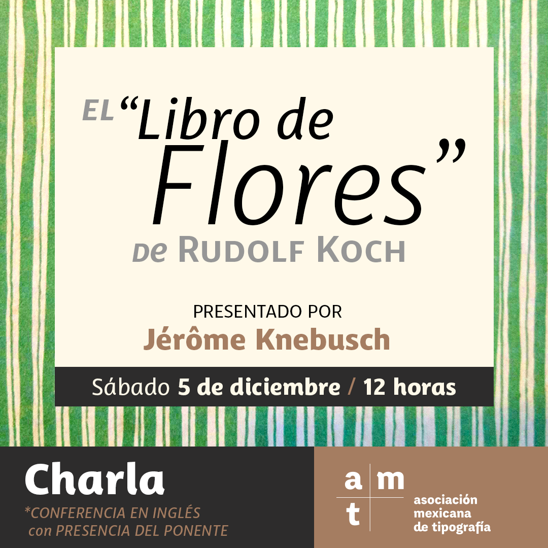
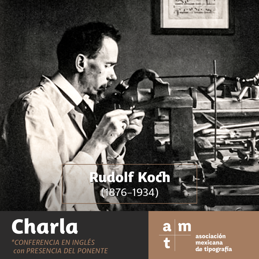
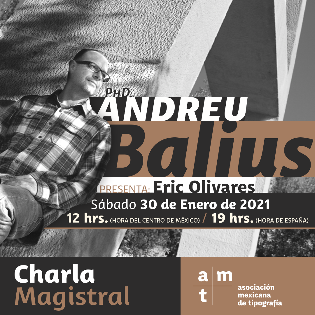
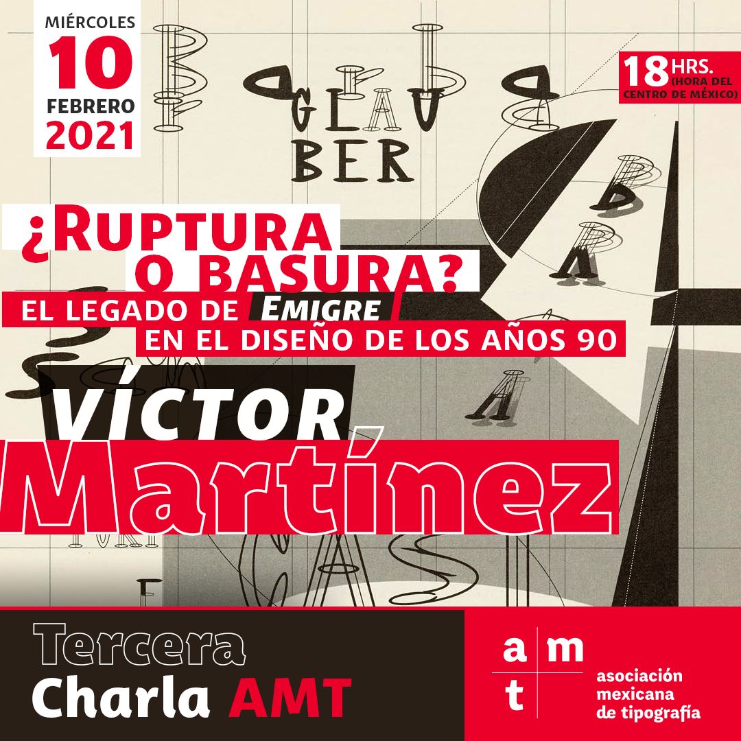
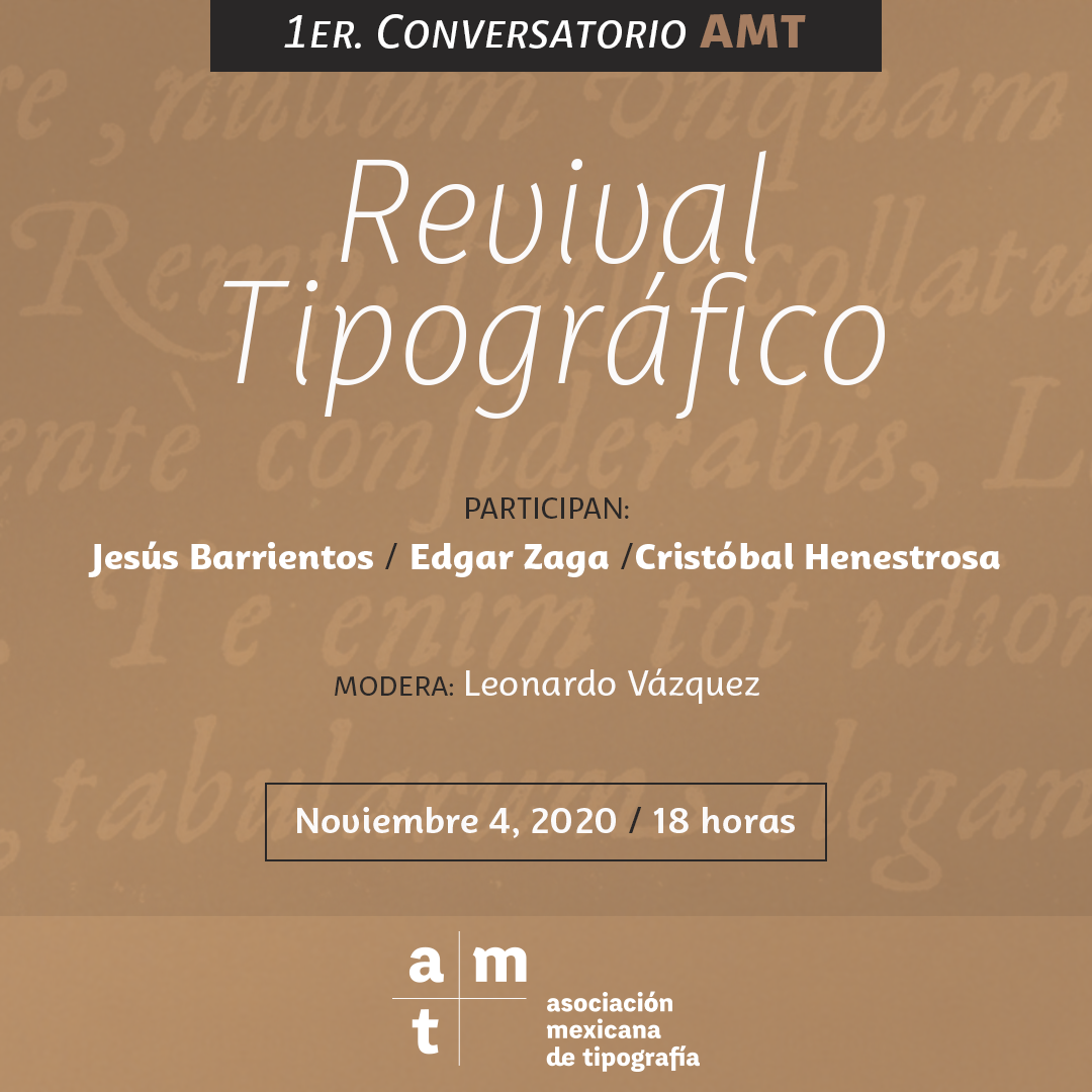
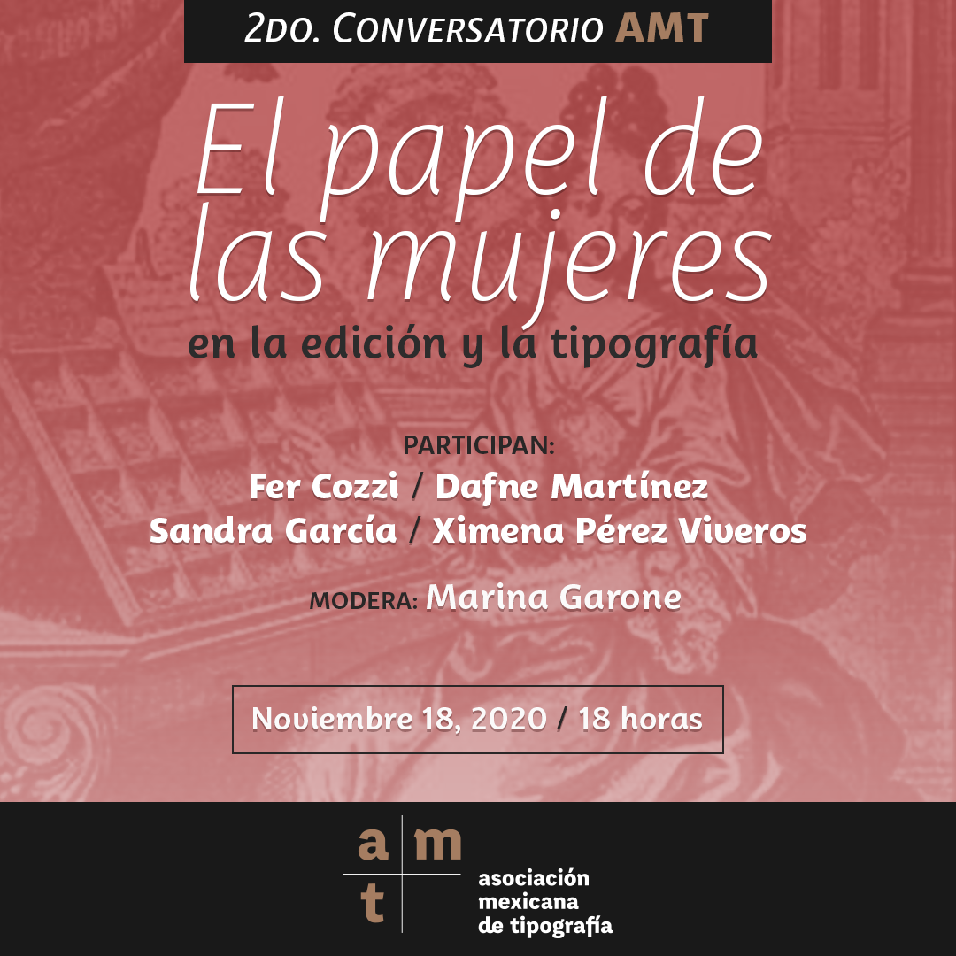
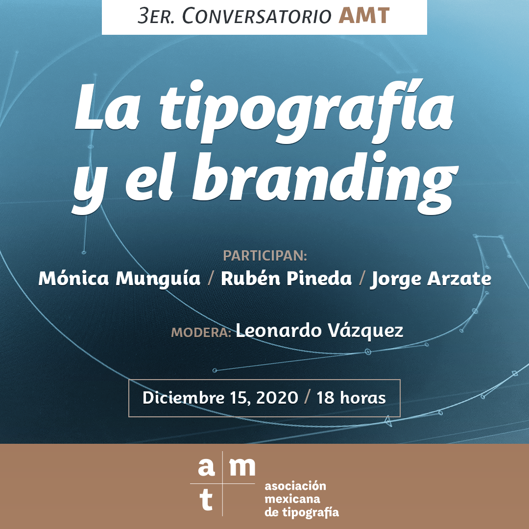
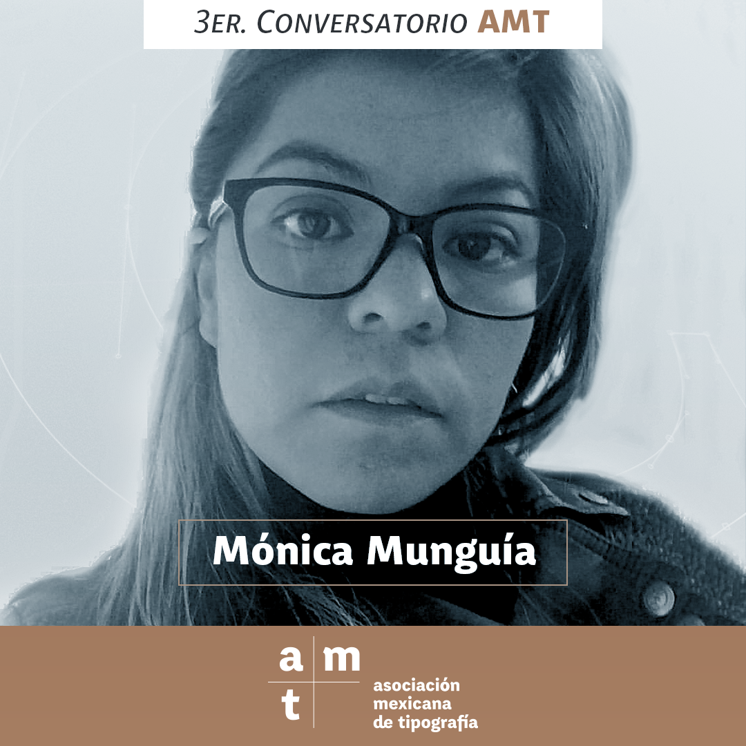
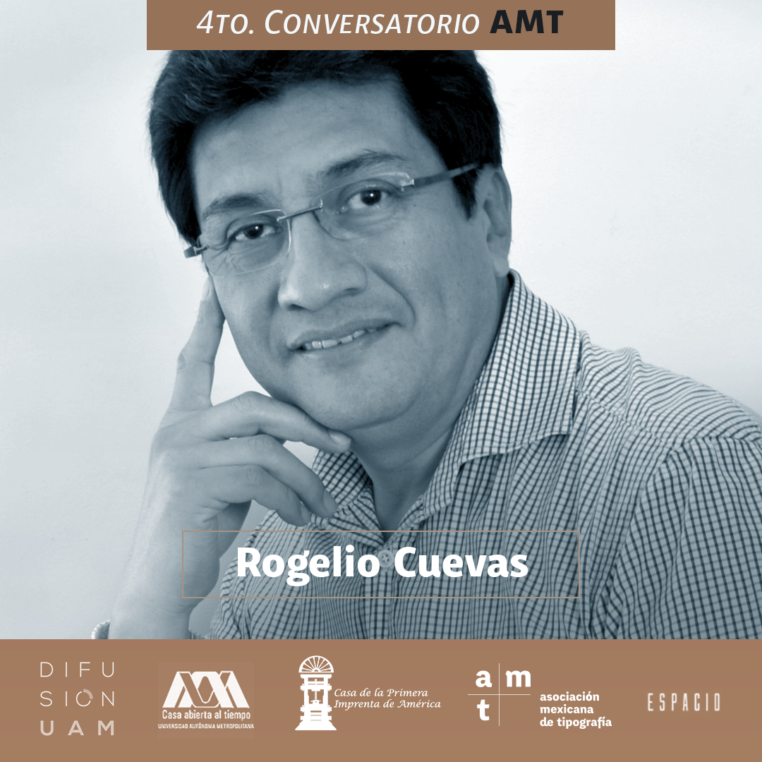
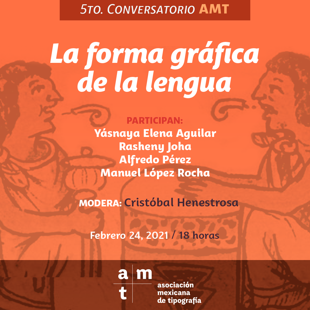
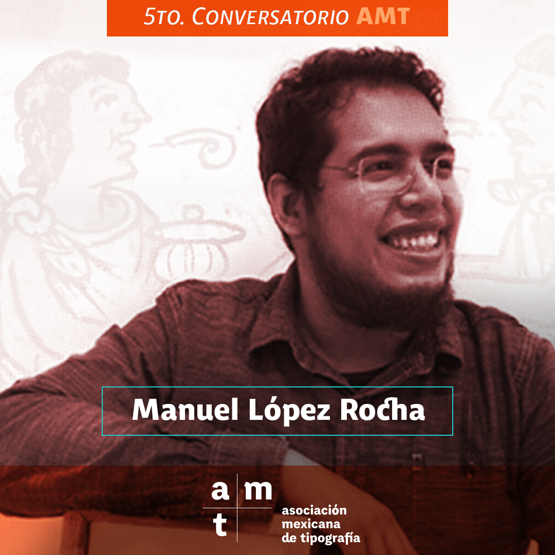
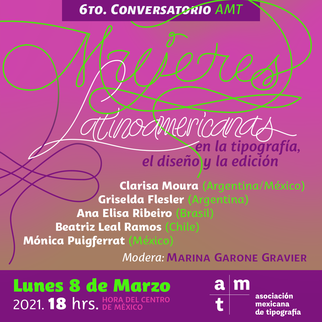
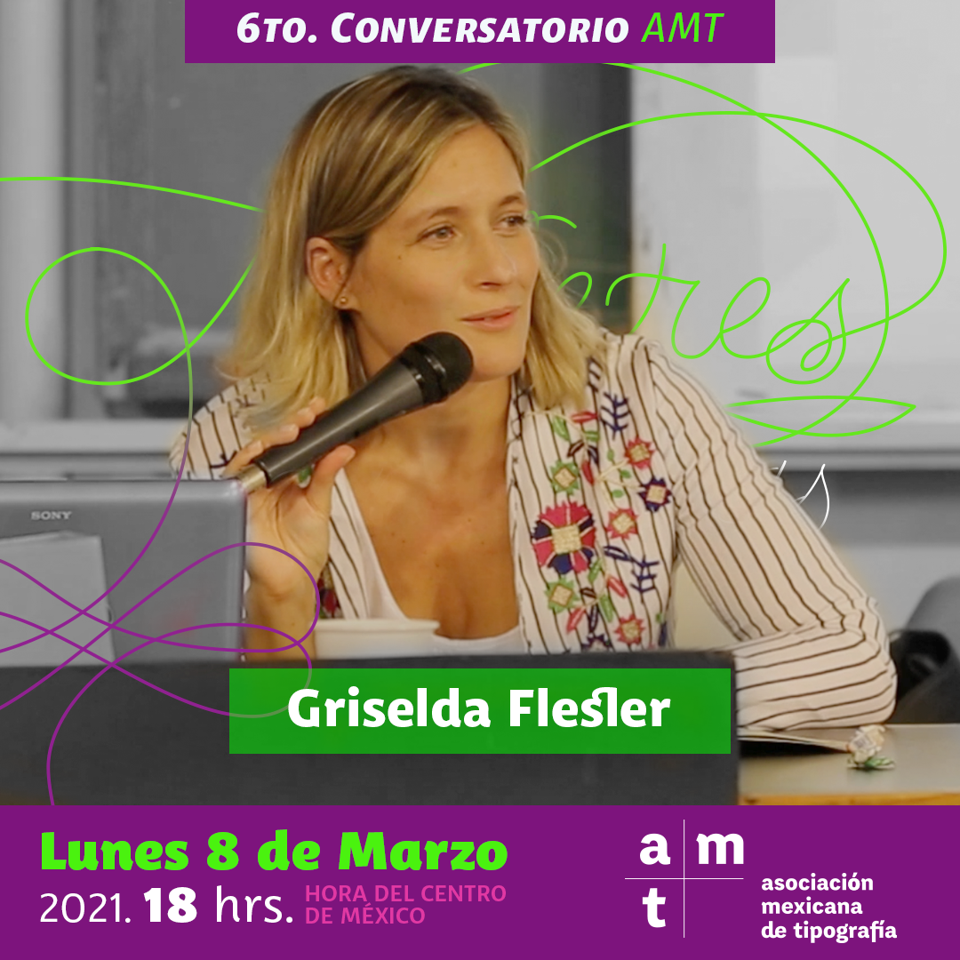
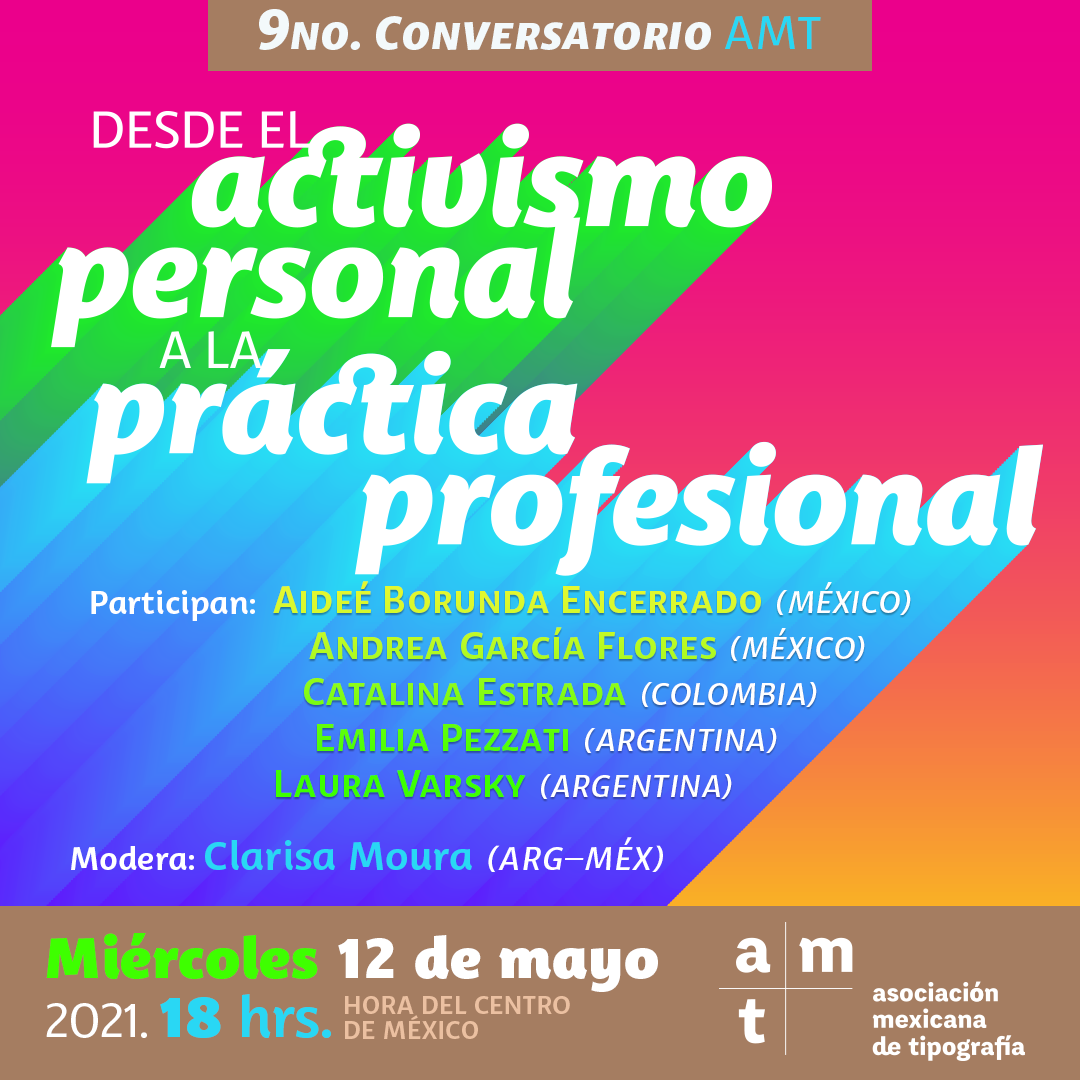
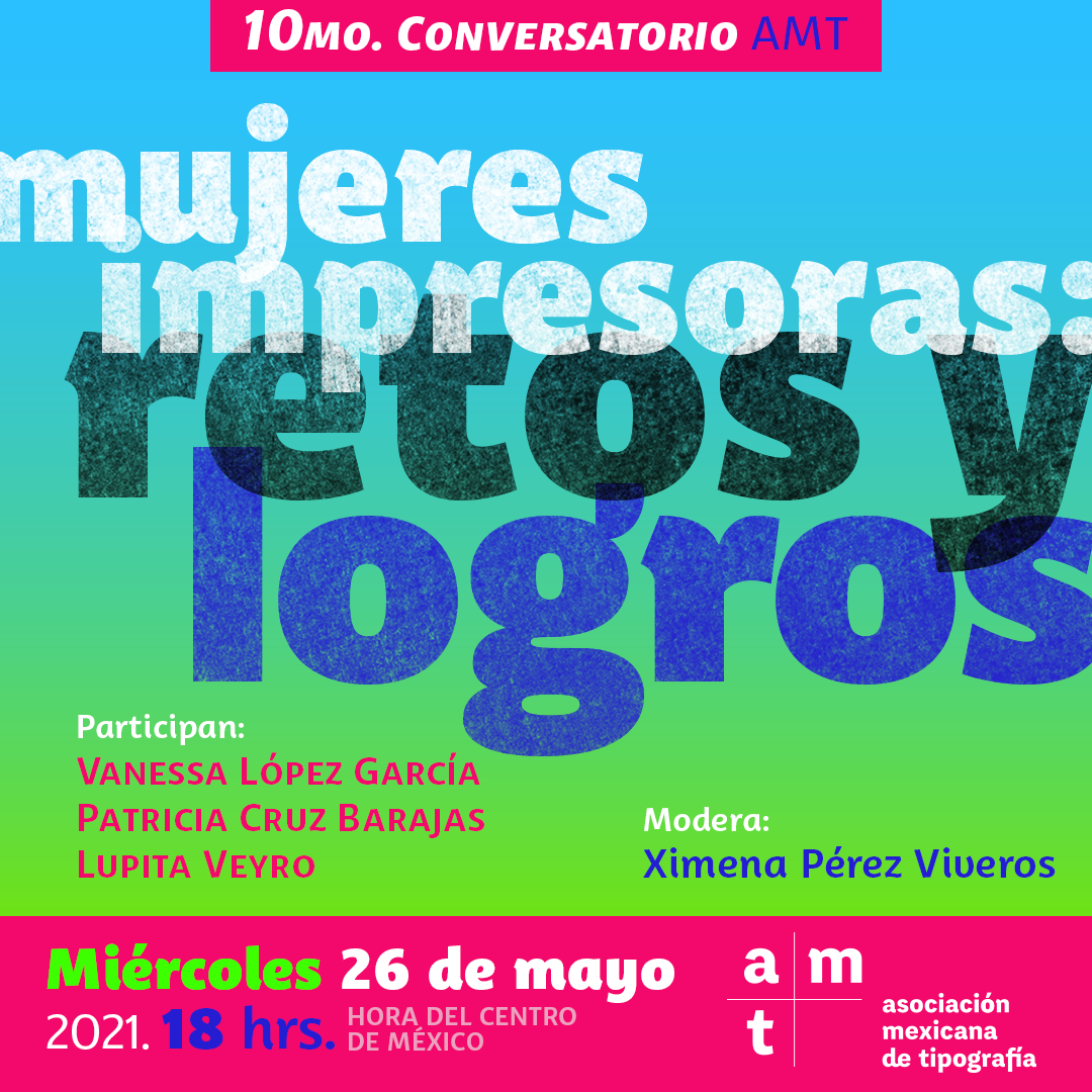
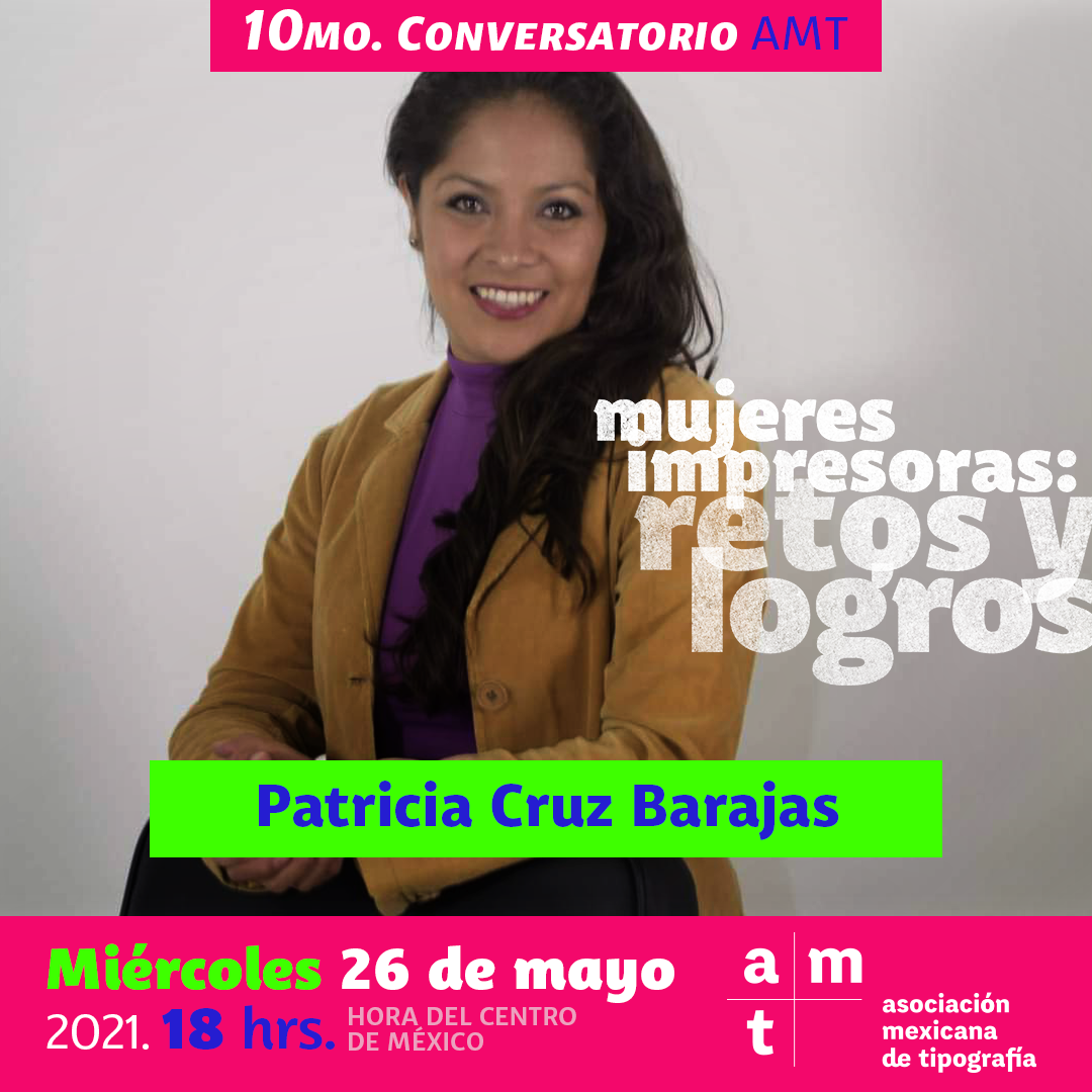
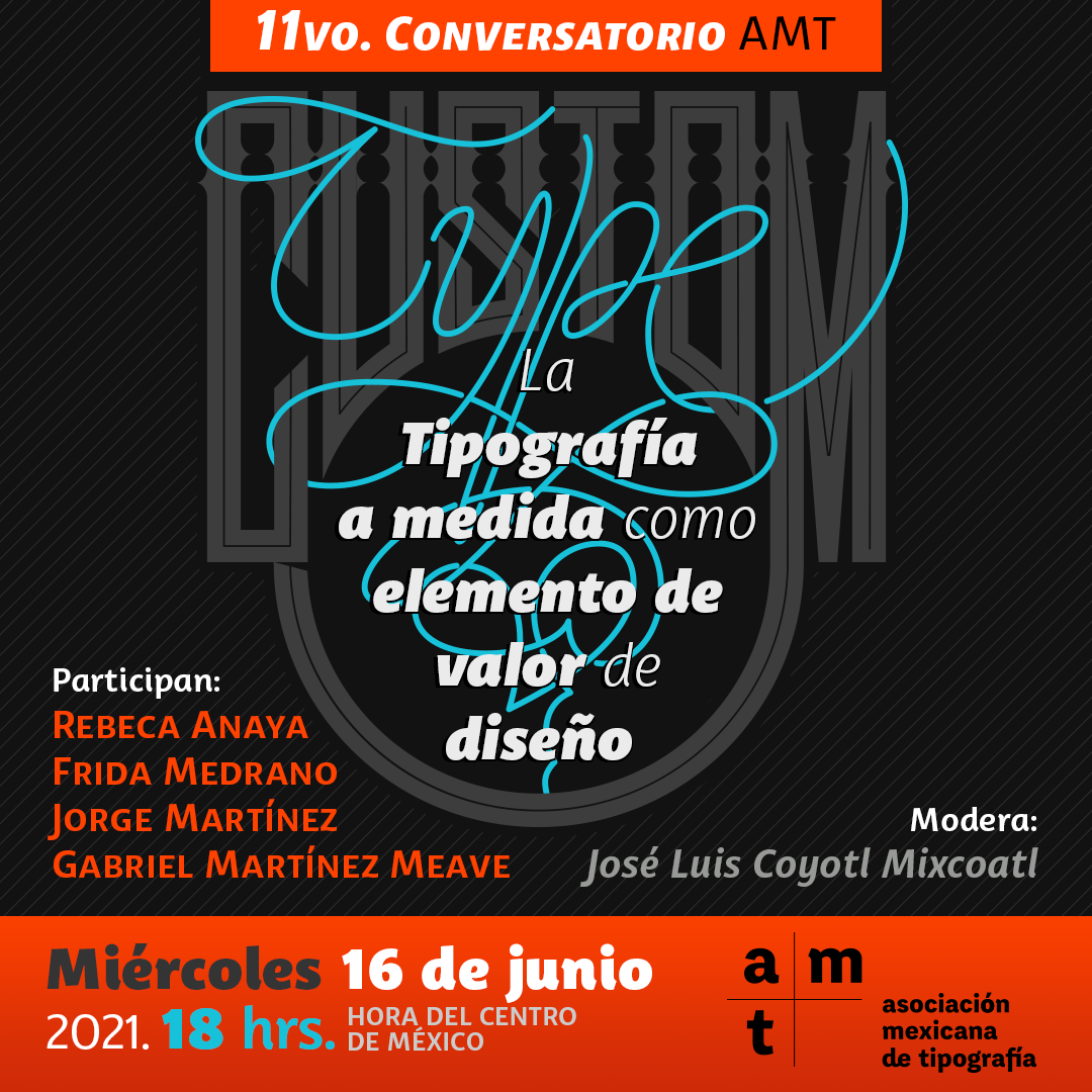
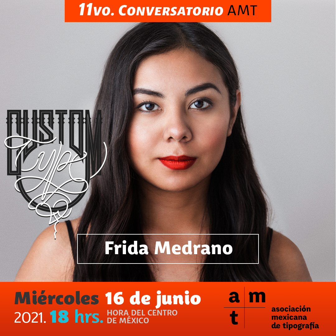
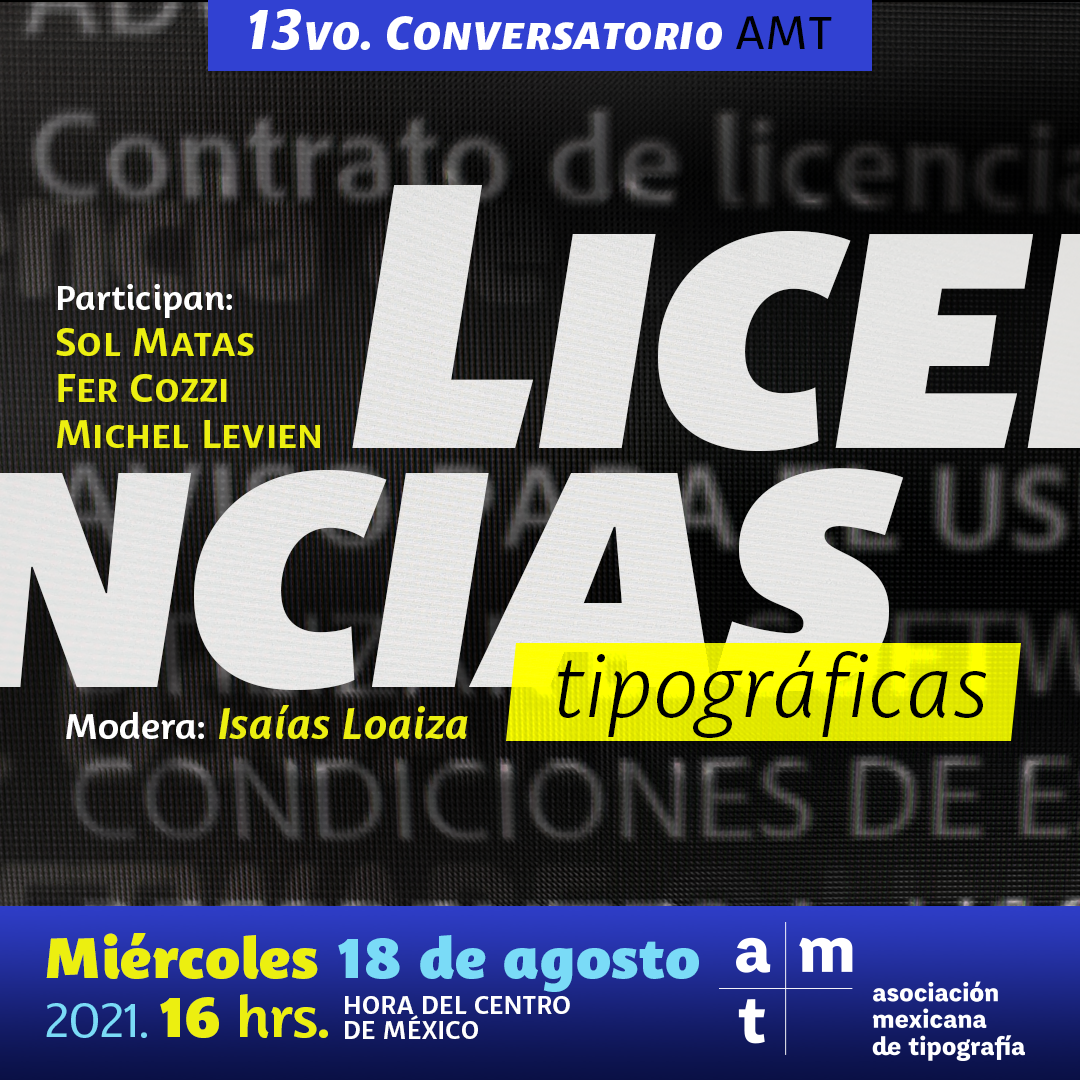
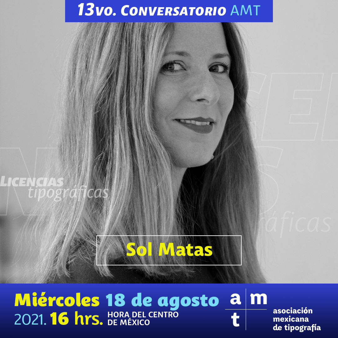
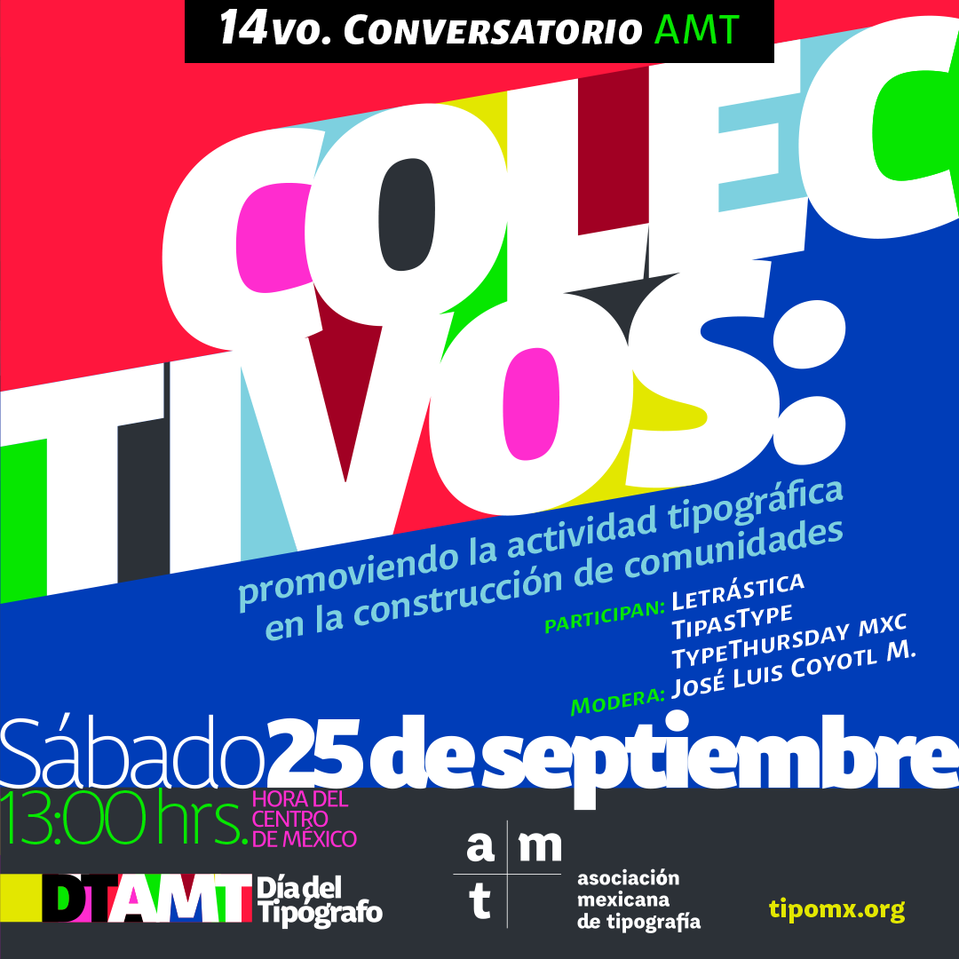
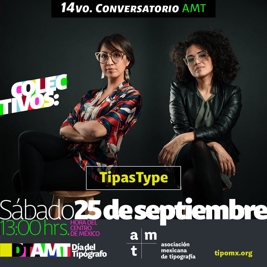
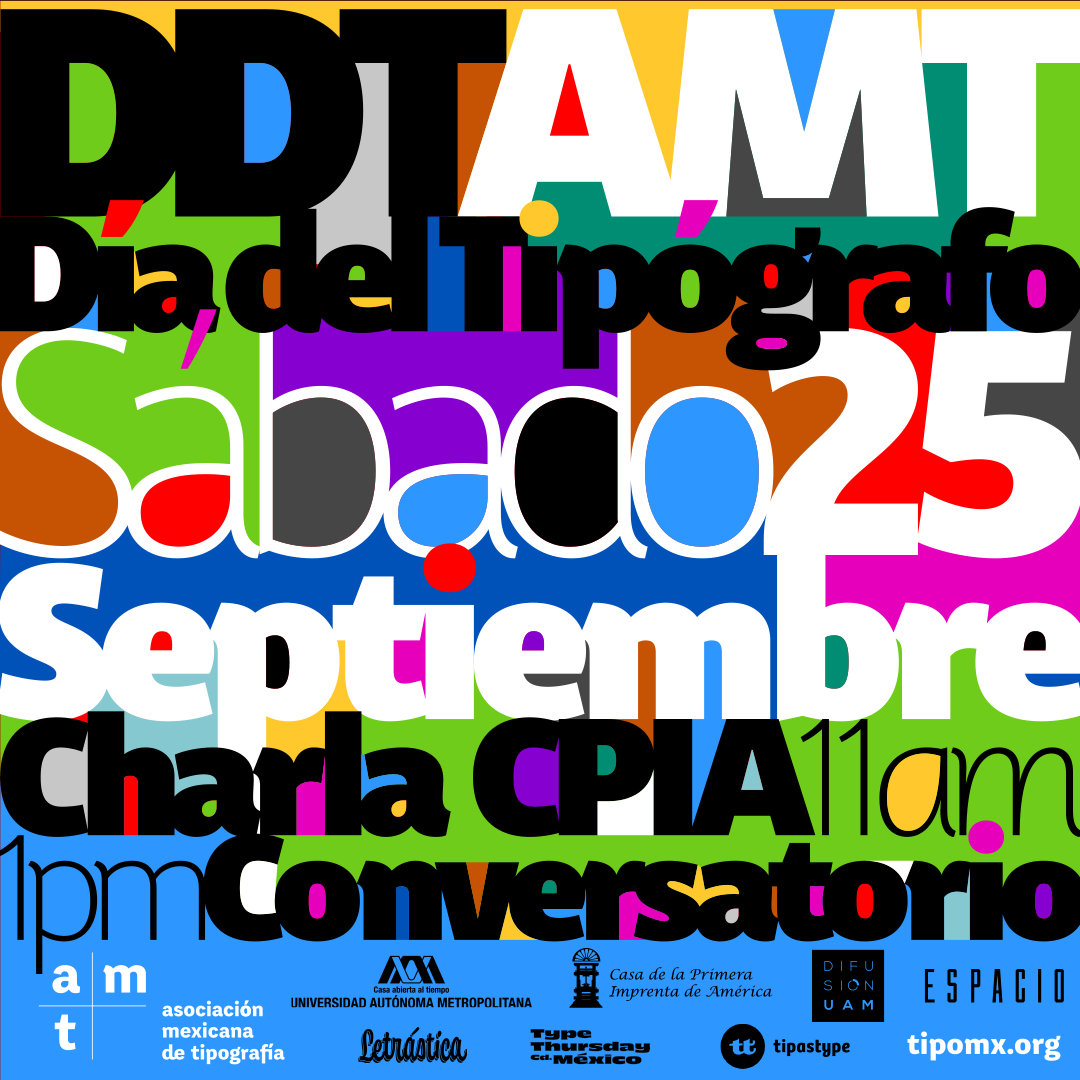
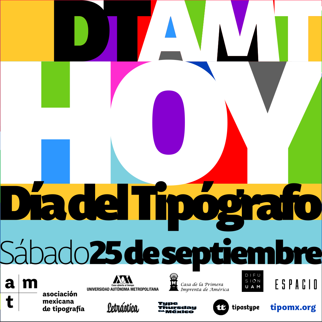
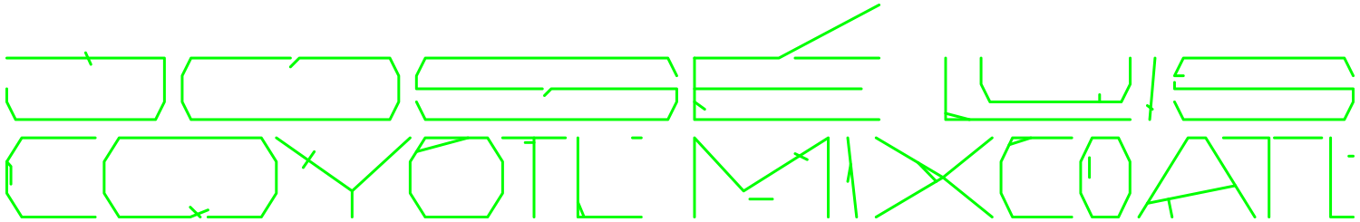
The activities had mainly some sort of on live talks known as 'Conversatorios AMT' and 'Charlas AMT', also books recommendations, blog articles and other activities, even a logo reveal for intro presentation that happened throughout the year that need some certain visual material to be promoted.
So, I developed in a 1:1 format (1080x1080 px.) for having consistency in the management of sizes, also with some main elements like logo, color palette and fonts that allow some playful work and customize them to having a wide range to differentiate in between them. The typographic compositions were the main graphic style, so there's a contemporary feeling that keep the identity and go with the essence when we create the AMT, and at the same time, feels friendly with the community that joins to our activities.
By the way, the AMT logo was designed by the great and only David Kimura.