By 2018, CECSAMEX has just arise a new age with a rebranding that I also designed and directed, and thorughout the process we realize we need to work on social media because it gonna be part of its promotion from that point and ahead.
So, I left designed a criteria in the styleguide of the rebrand that gonna be part of the mindset for the managing of the new brand I made, that include brand photography, color and typographic palettes and even the way they could manage its communications in general.
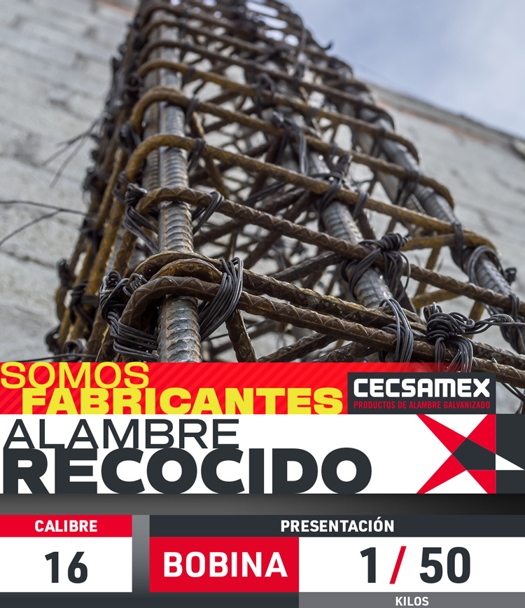
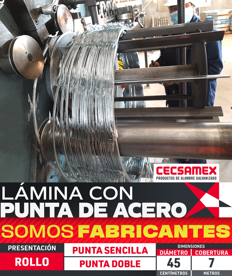
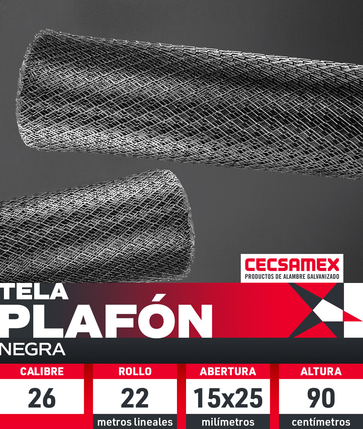
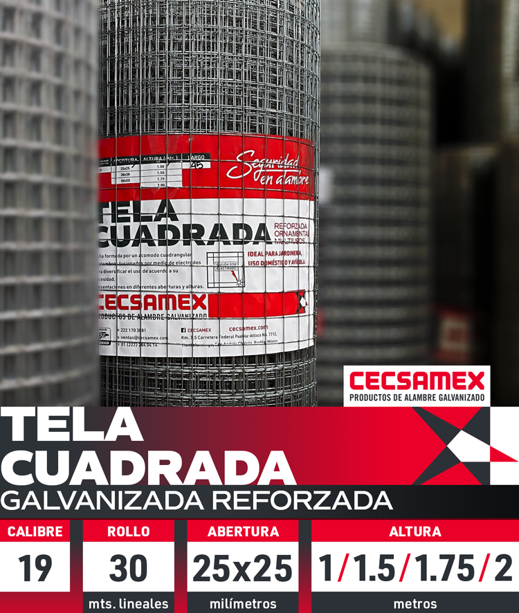
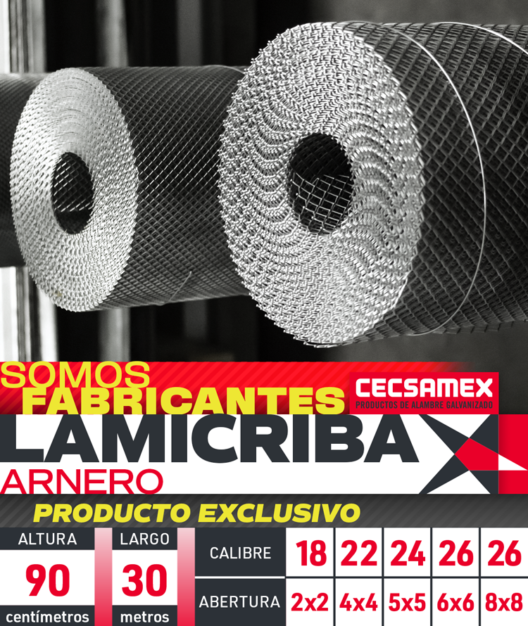
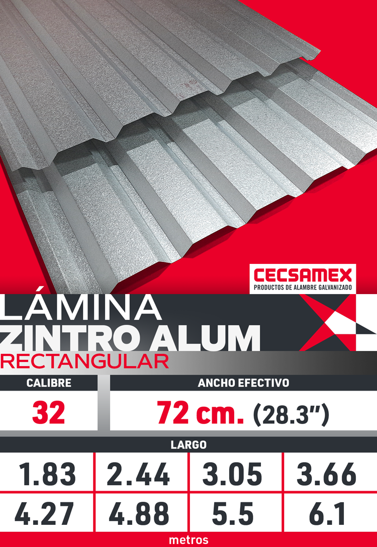
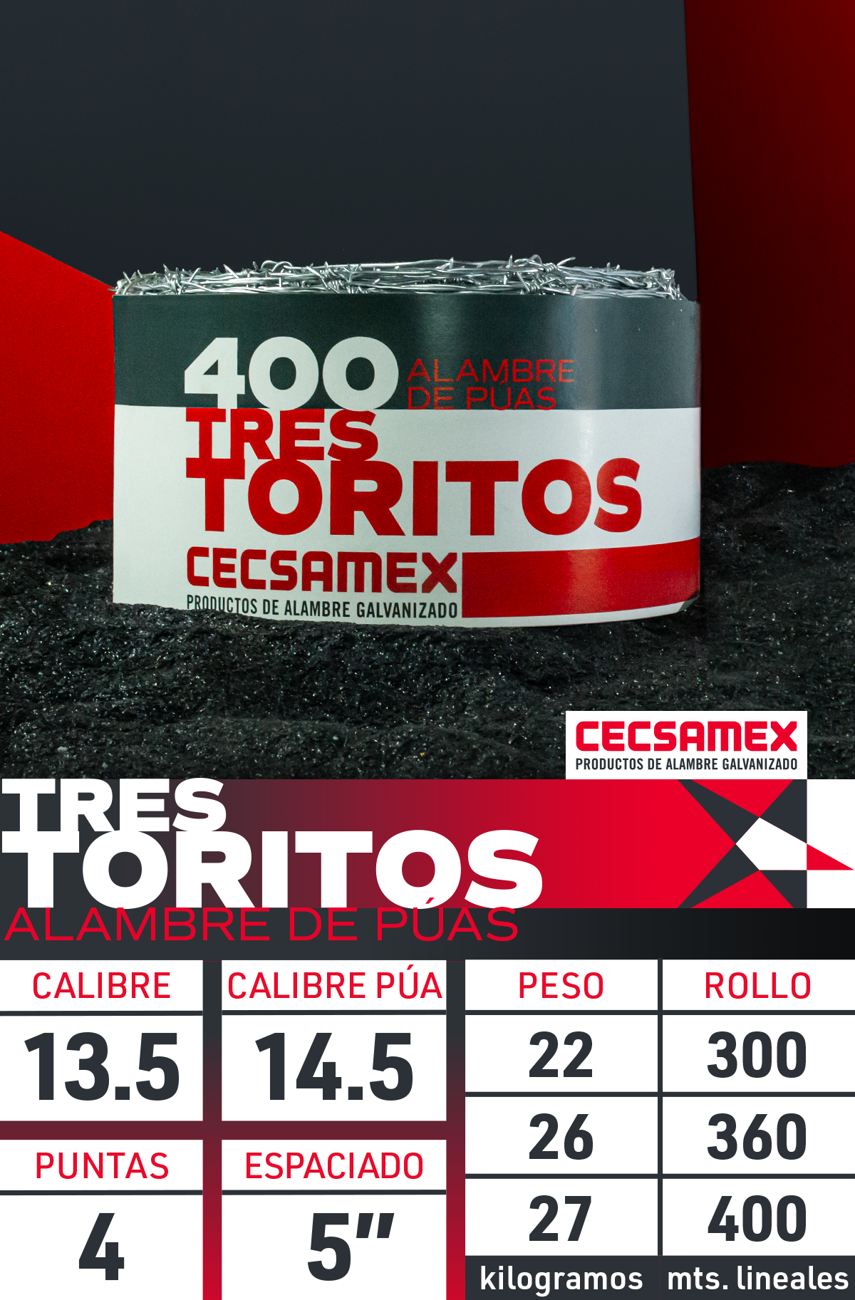
Regarding its social media, the principles for managing the products they produce and sell was to keep a simple but also a sophisticated language, with a contemporary feeling with open and close ups shootings that keep certain consistency, also showing the nature of the materials, textures, mesh and the strenght of the galvanized manufacturing, combined with the brand colors and typography and other elements of the brand, that were applied not only in static contents, but also for multimedia like videos, animations, animated gif's and other stuff mainly applied for posts, cover images and icons for Facebook.
Throughout 2021, I develop its campaign with new brand photography not only by its products, also industrial and administrative activities for its institutional communications for social media, newsletters and other promotional issues. Hundreds and hundreds of materials for posting and promotional purposes on Facebook mainly, with some different content variations, incuding descriptive, technical cards, product showrooms and samples, uses in real life and even samples of the product manufacturing, also other different activities into the factory and outside, with clients and other related commercial, work and festive announcements, with a renewed classy brand style.
There are also videos and animated contents I made for the social media for CECSAMEX, that you can find also into my site here.
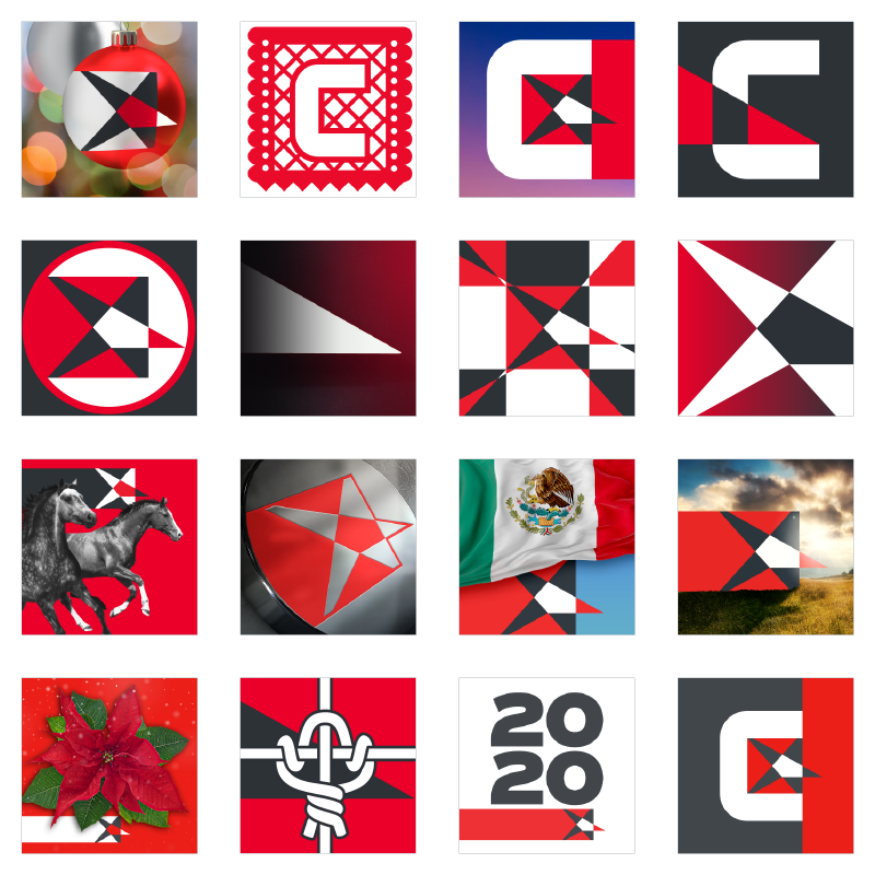
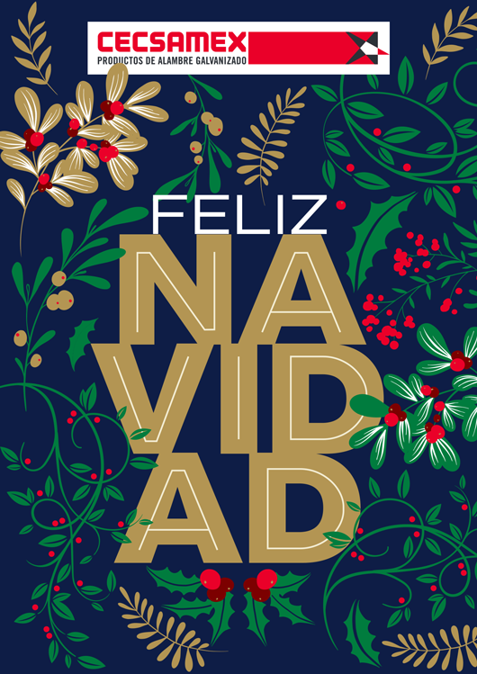
Small selection of icon images for Facebok profiles I made, each month there's a new one that keep the brand fresh and updated.
But also by 2020, I take the management of its social media communications, with a break of some months because the pandemia, but it was a great opportunity to anchor its institutional and commercial communications in social media. In the same mindset, the first thing was to show the products with a nice taste taking in mind the rebrand criteria that I made in 2018, but with a refreshing vibe.
A clean and monochromatic criteria for the products samples, but also a colorful design for any other stuff, that works in the way of keeping them separated consistently but also attached by the brand language.
From the original rebrand, I developed a visual style for social media, that were used certainly throughout 2019, but it gonna get a refresh by the 2020 and 2021 campaigns, so it makes me feel proud of the way the new brand mindset flows since then.
Besides the social media contents, I expand that language to newsletters, that expands its communications.
Since I handled the social media contents design, also I managed the copywritting, animation, photography and edition in the most of cases. The resources were mostly generated by ourselves, but also have some complementary stock images.

Samples of newsletters