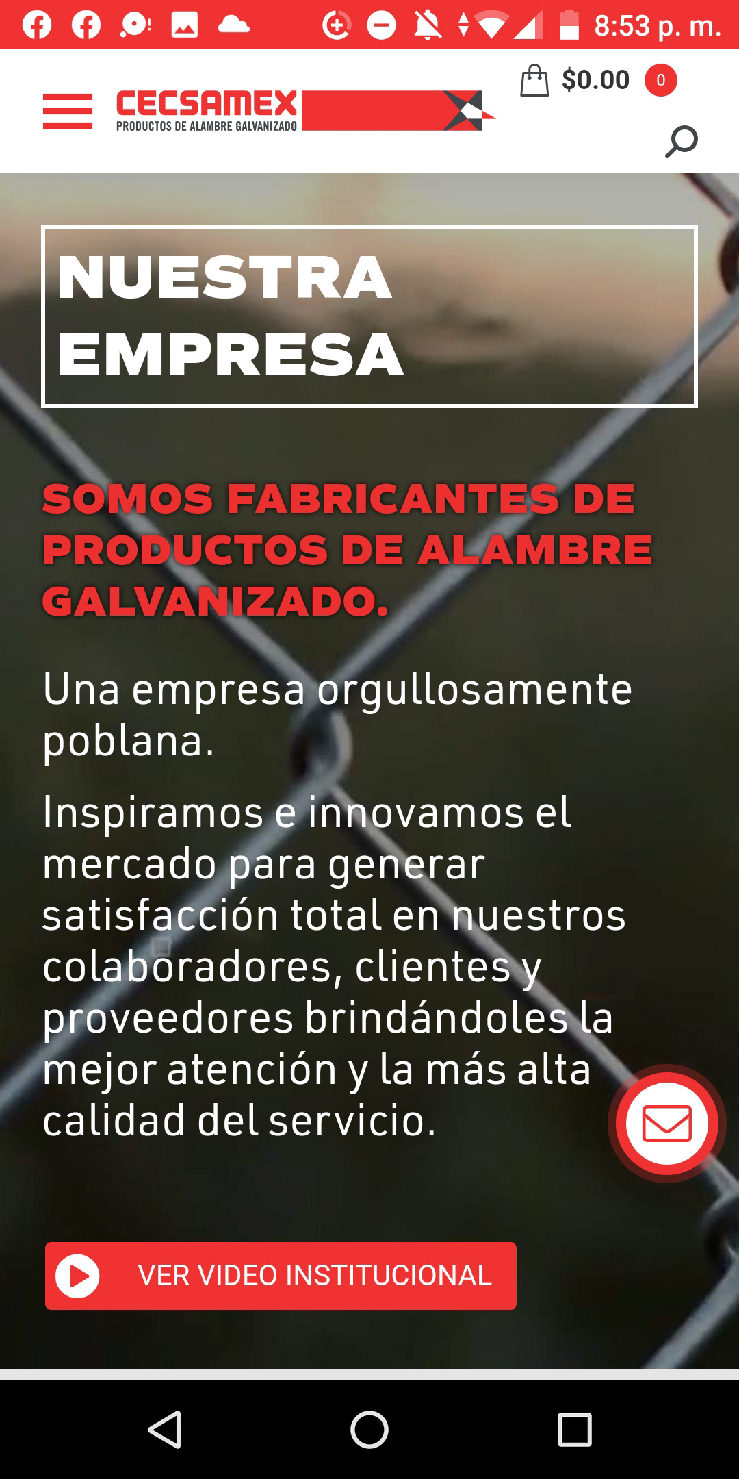
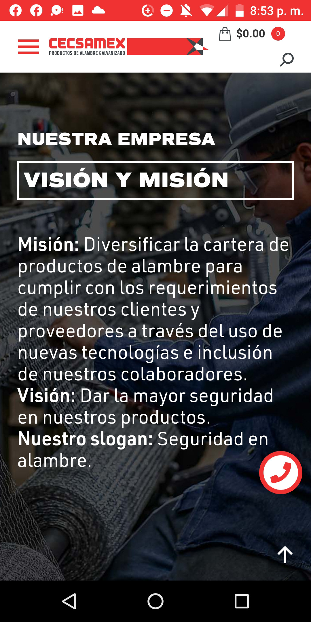
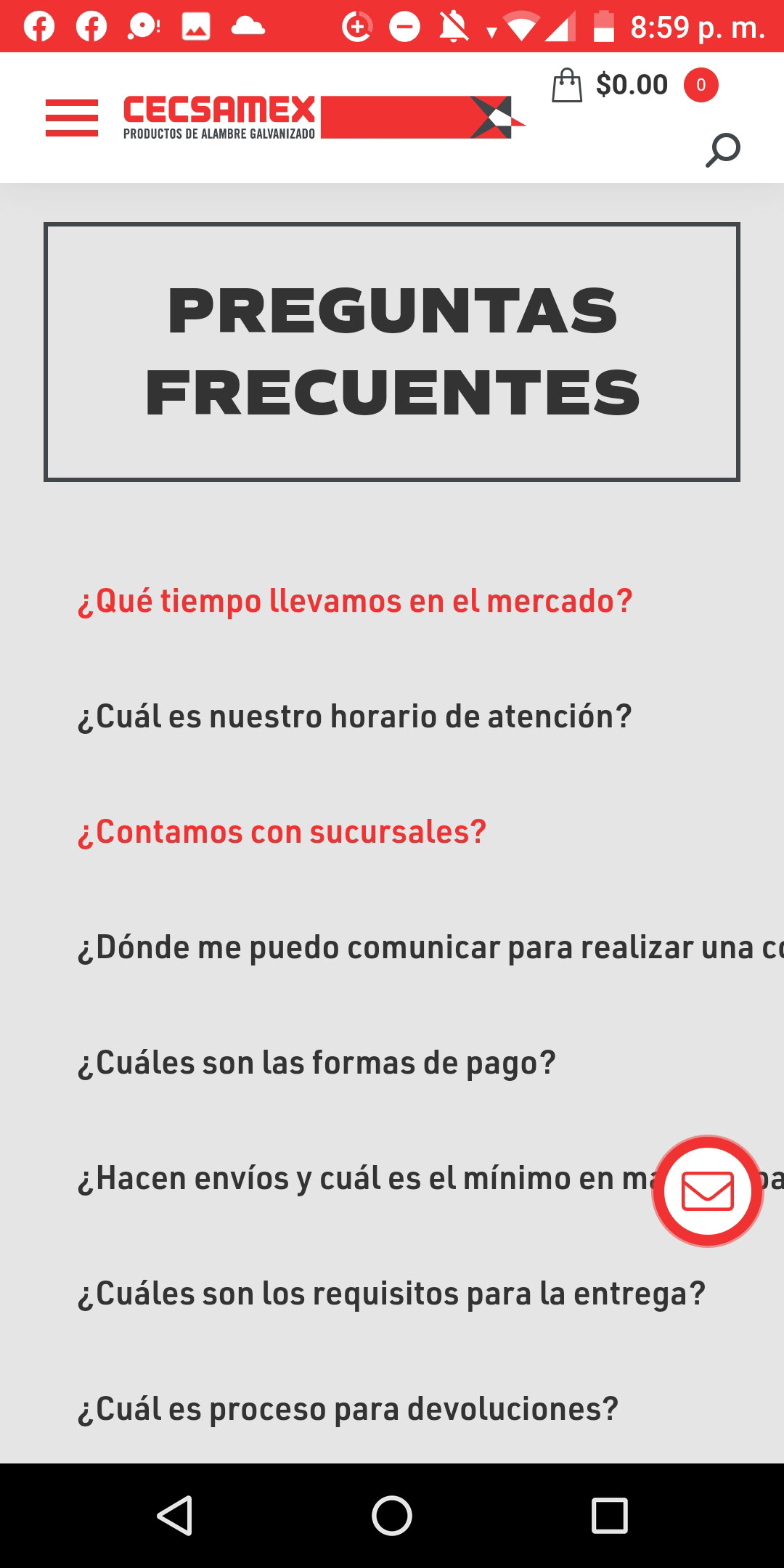
CECSAMEX, as a galvanized products producer that empowers its growing seriously, they want to cover also its presence online.
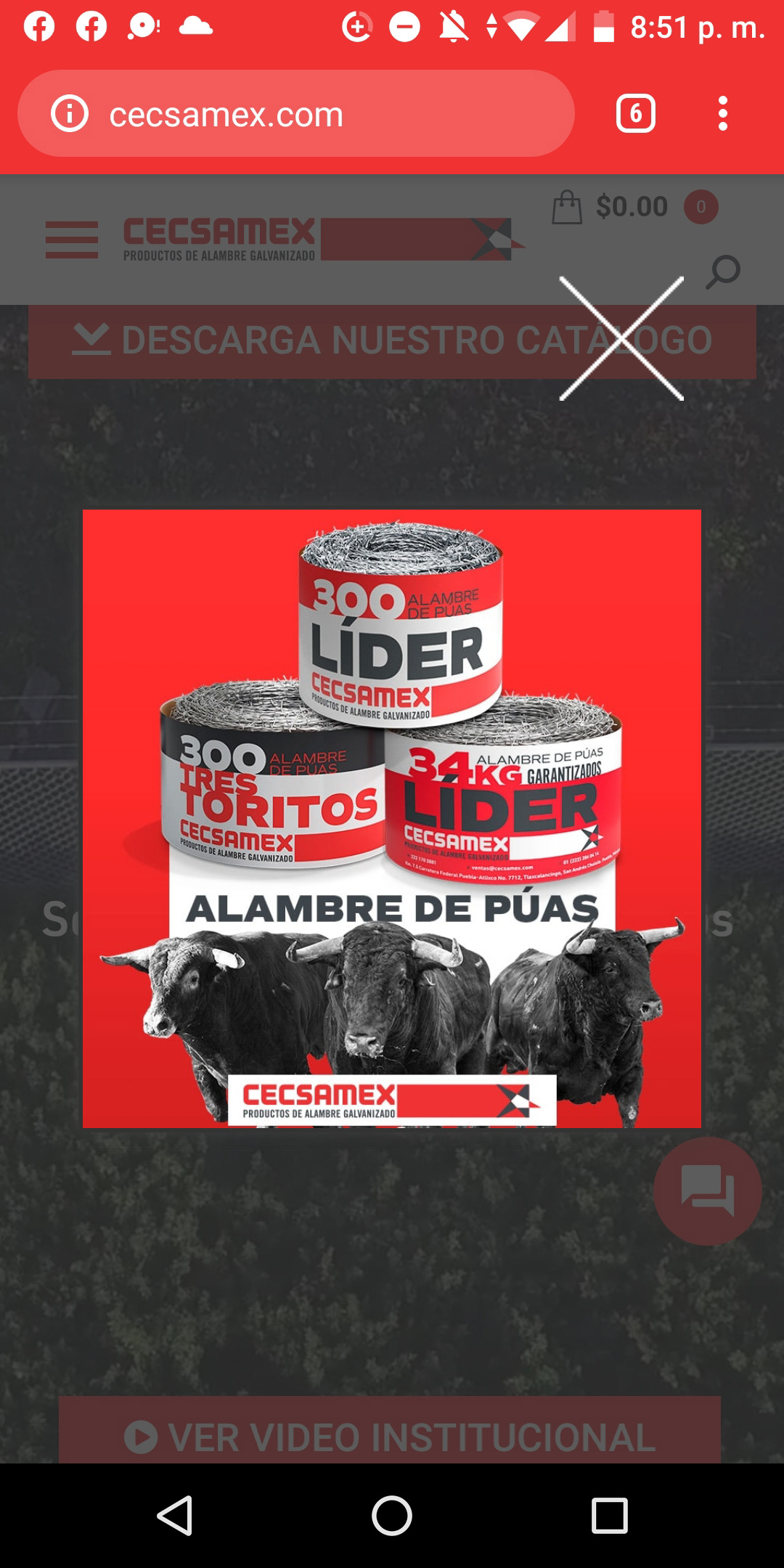
With a basic and long outdated website, so they want to have a renewed, fresh and functional site that allows spread the new brand soul. So I analize every weak point and the new needs for the new interface. We will highlight a product showroom, also with a dynamic way to cover each detail of the company. Some key points were placing the right element in the right place, giving the functionality and a beautiful aestethic with the brand soul.
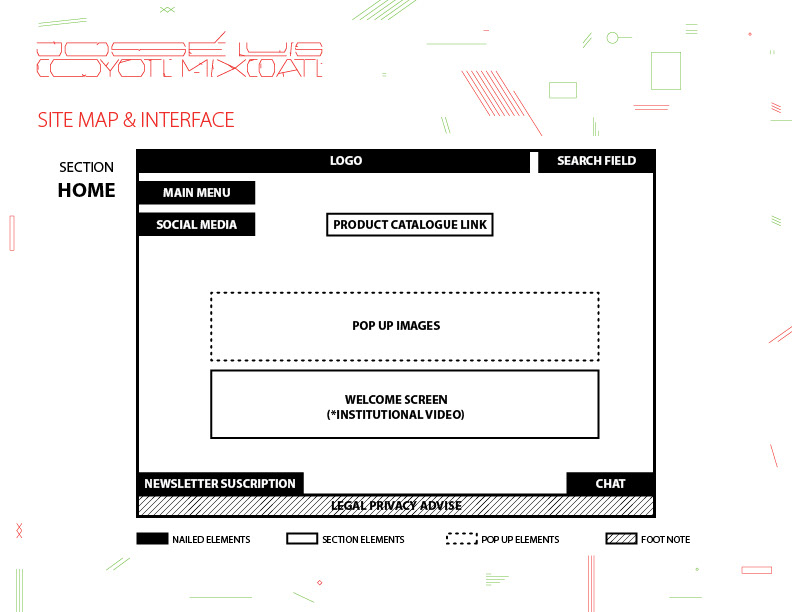
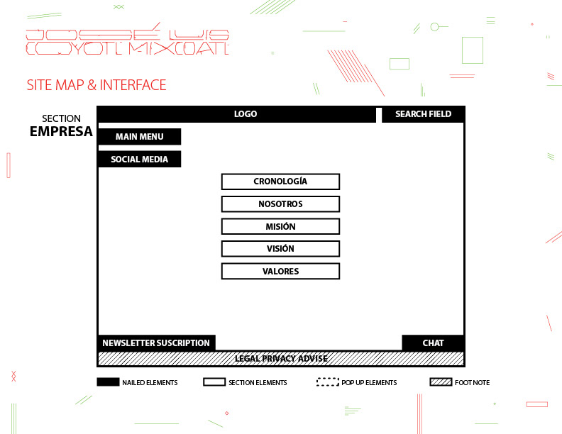
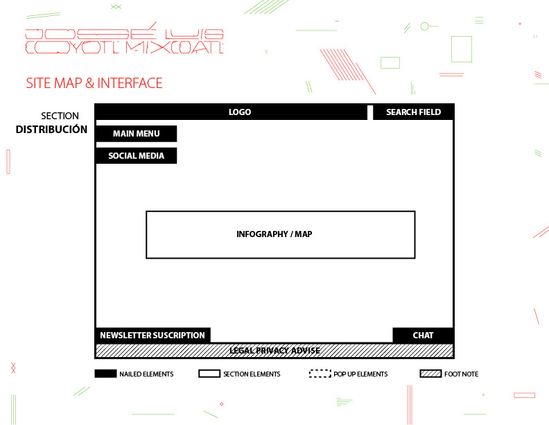
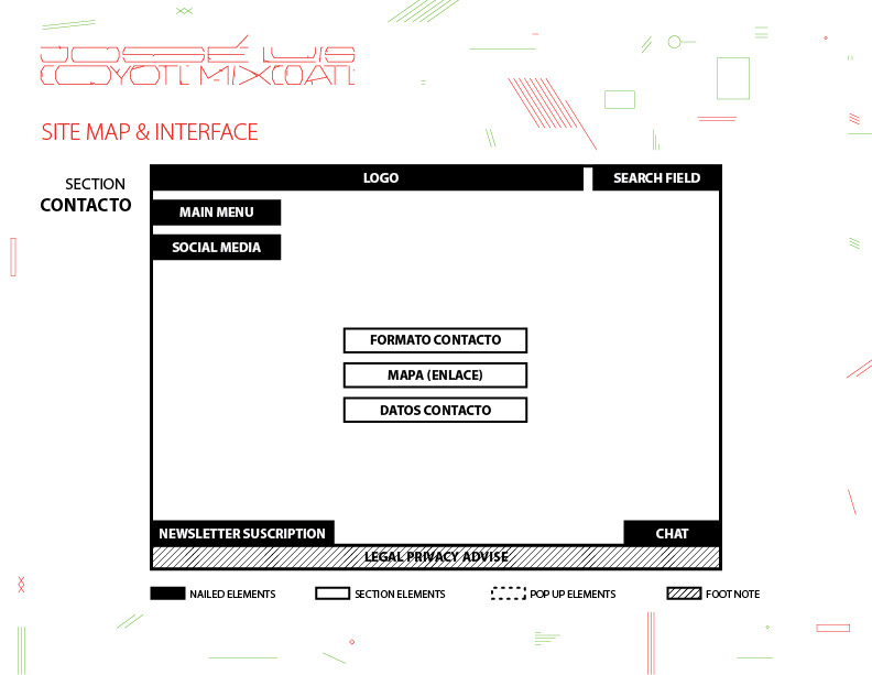
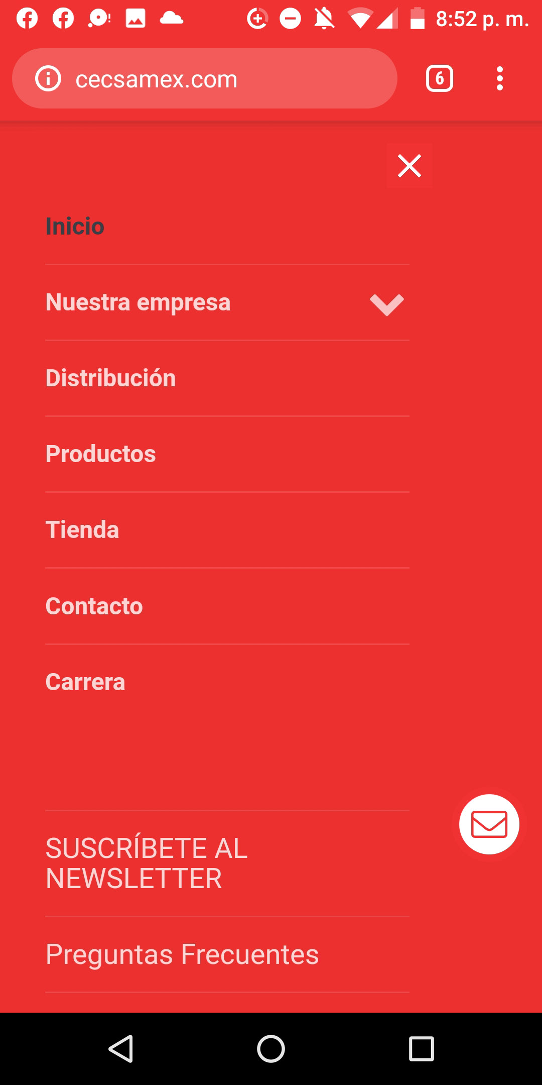
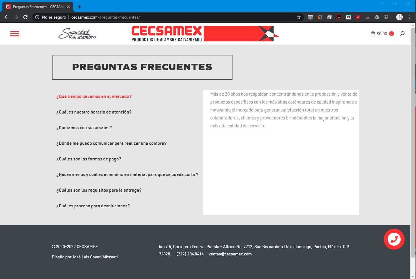
There were developed a simple interface with an easy way to being navigate, specially because they had a lot of information to show, with a scrolling and independent sections.
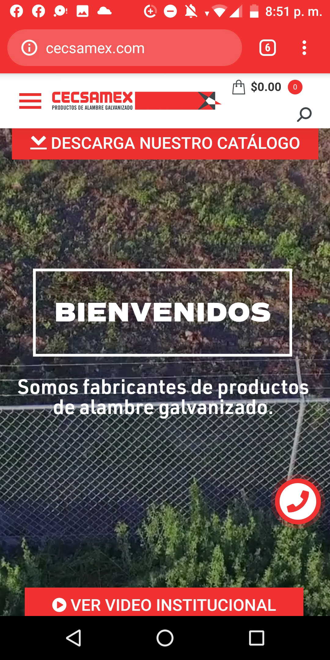
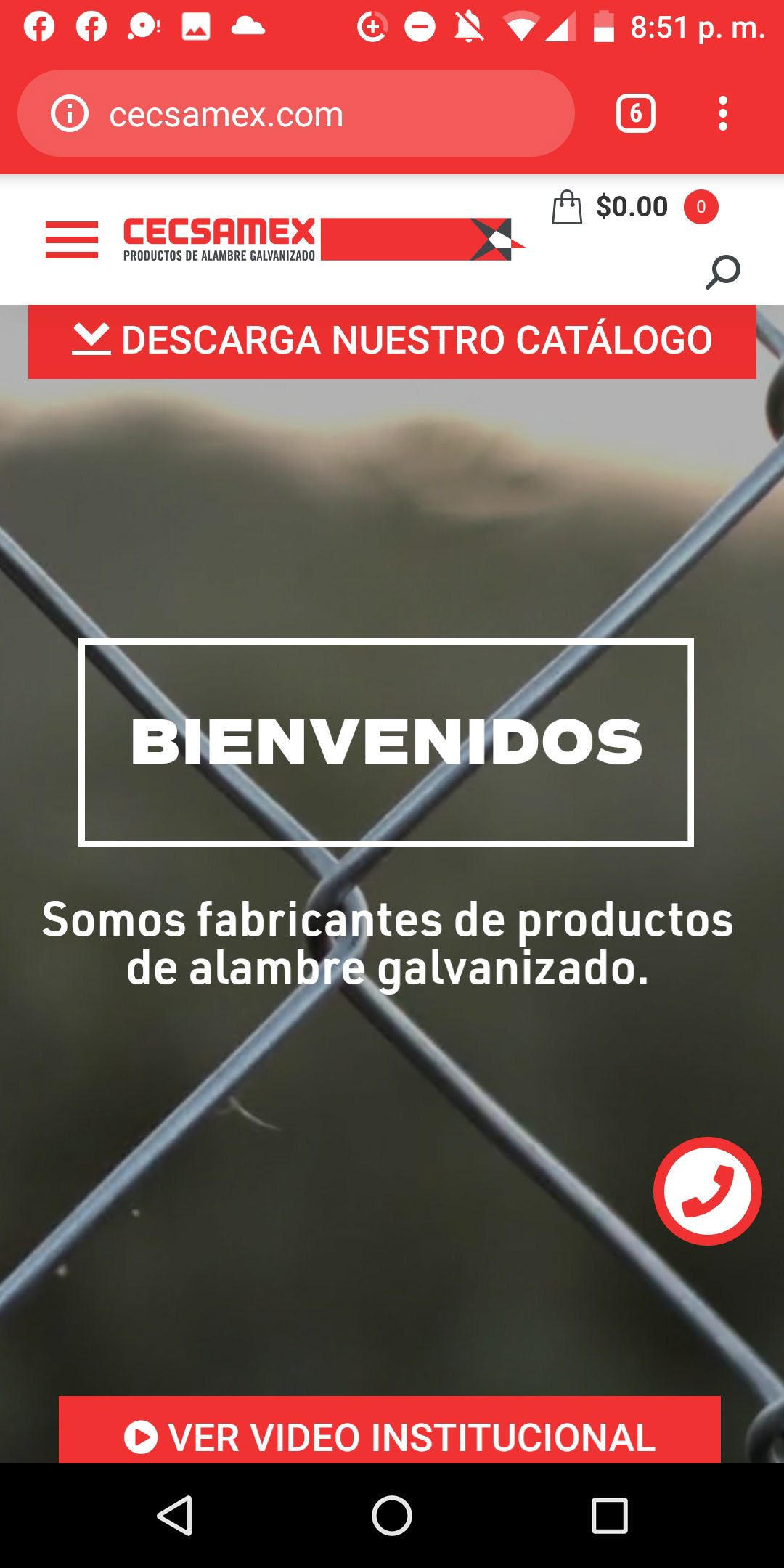
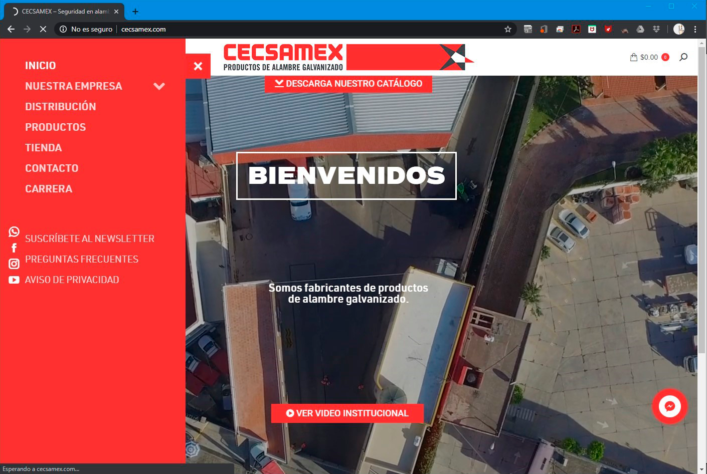
First, the HOME section defines the general interface of the site, with the menu aside with each section and social media links and the brand spread across the elements like color and typography, also a SEARCH field and a CHAT button, also the LEGAL PRIVACY ADVISE that give consistency in the whole site.
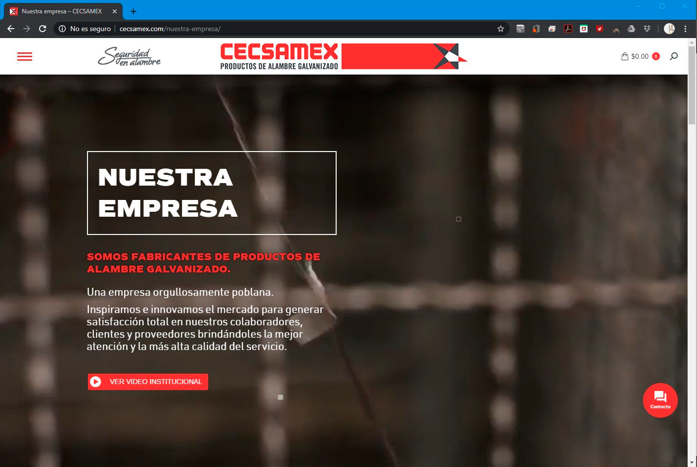
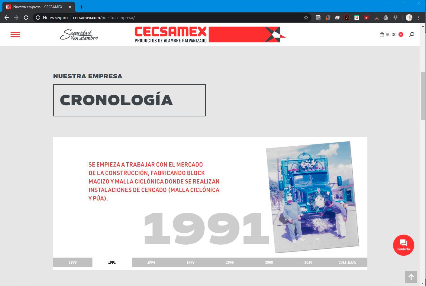
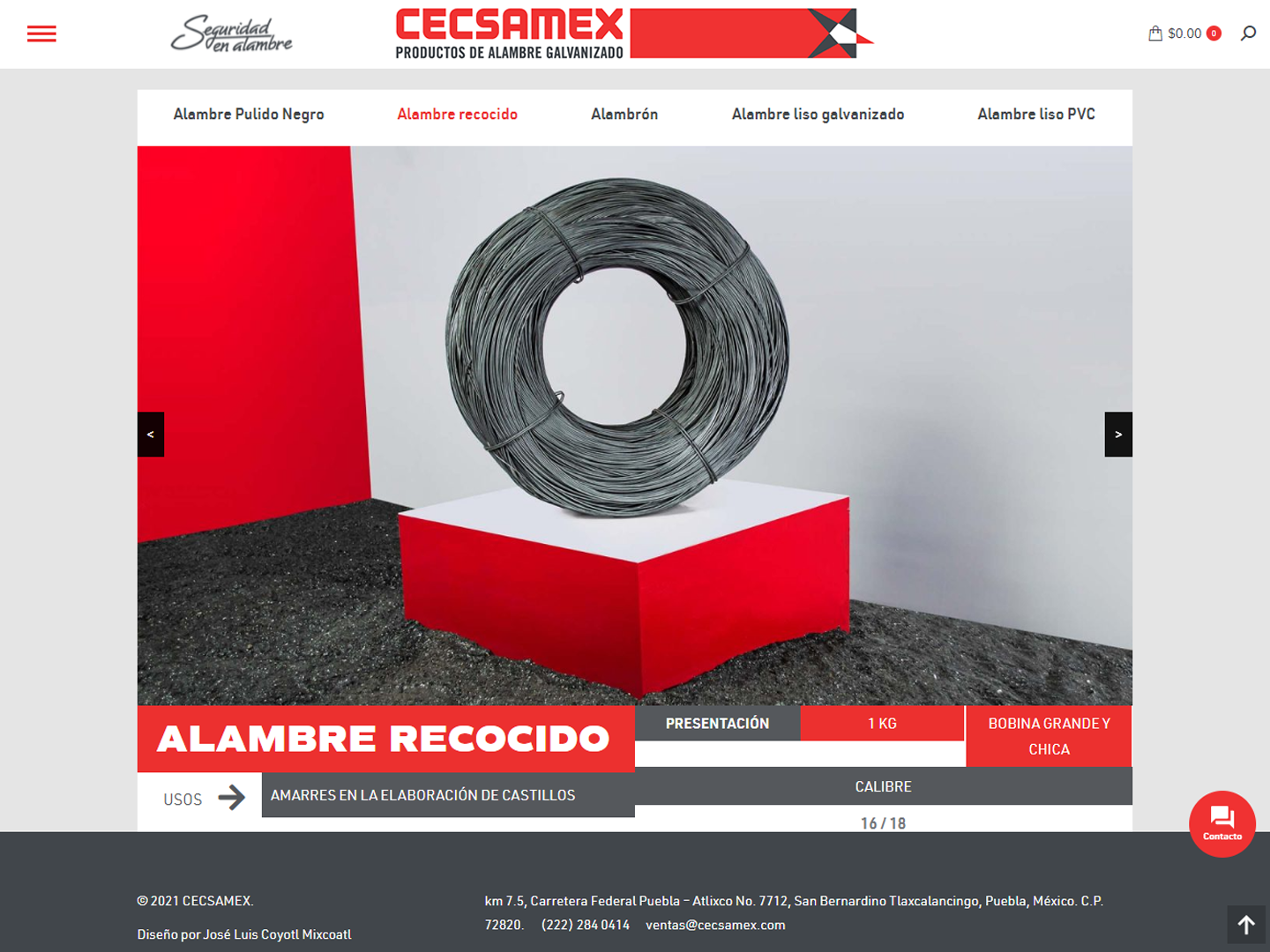
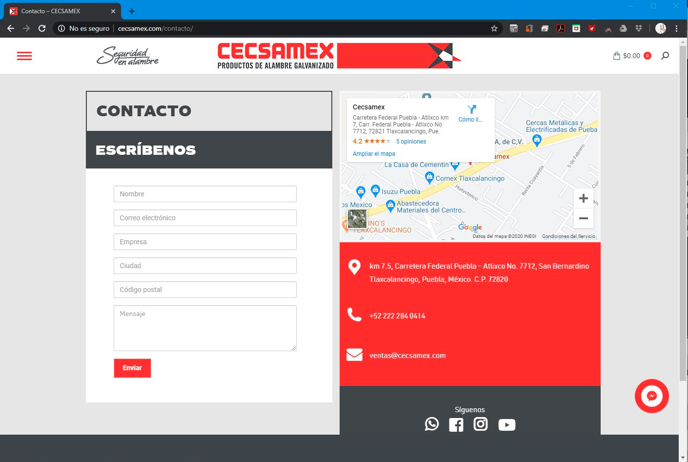
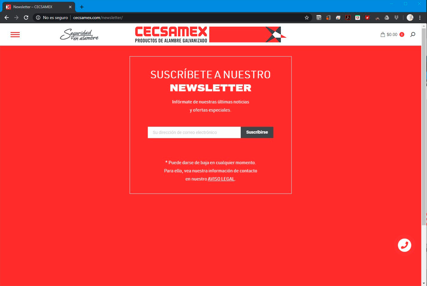
Each section need different animated, video, interactive, text contents and static elements that spread the company's history, who they are, mission, vision and values, also the way they work in its commercial management, also a product showroom with its basic technical card for each one with a proper and carefully selection photographies and descriptions, included the new brand photography I also made. Also its contact, newsletter and hiring information.
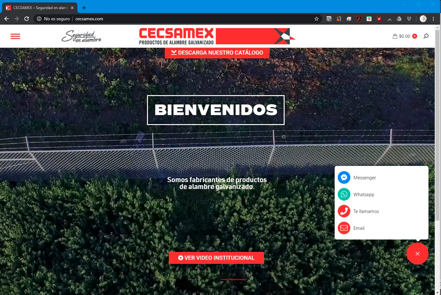
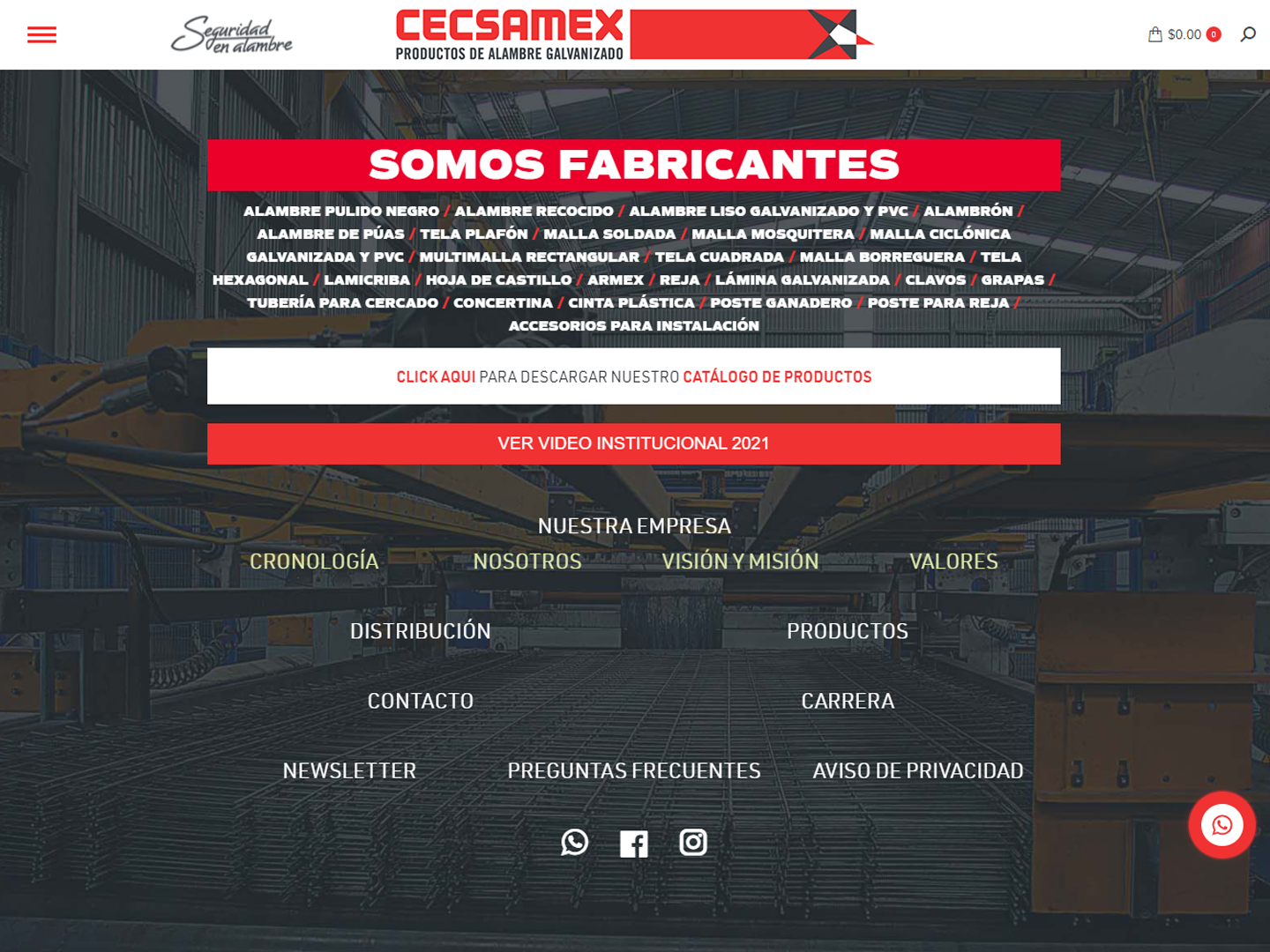
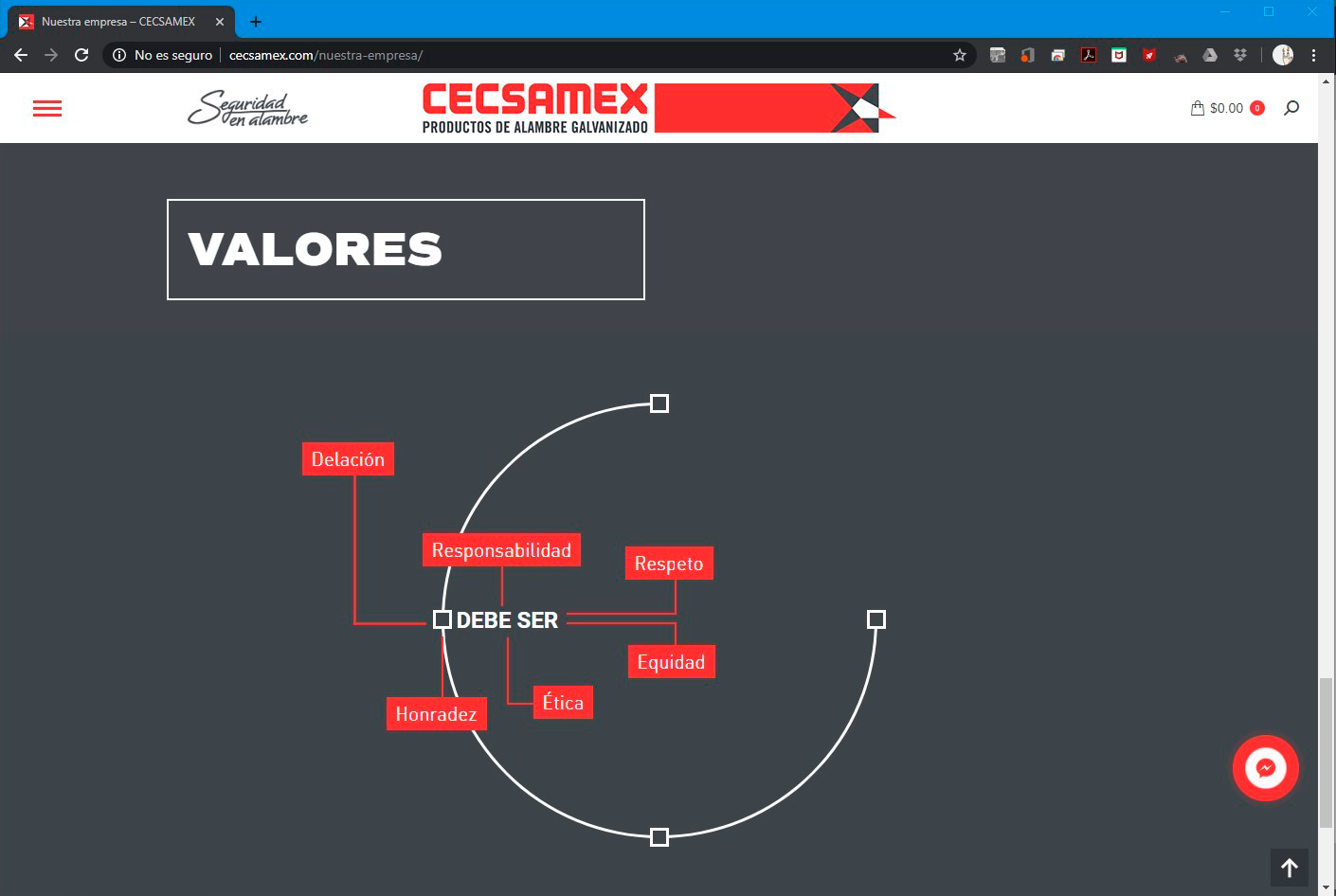
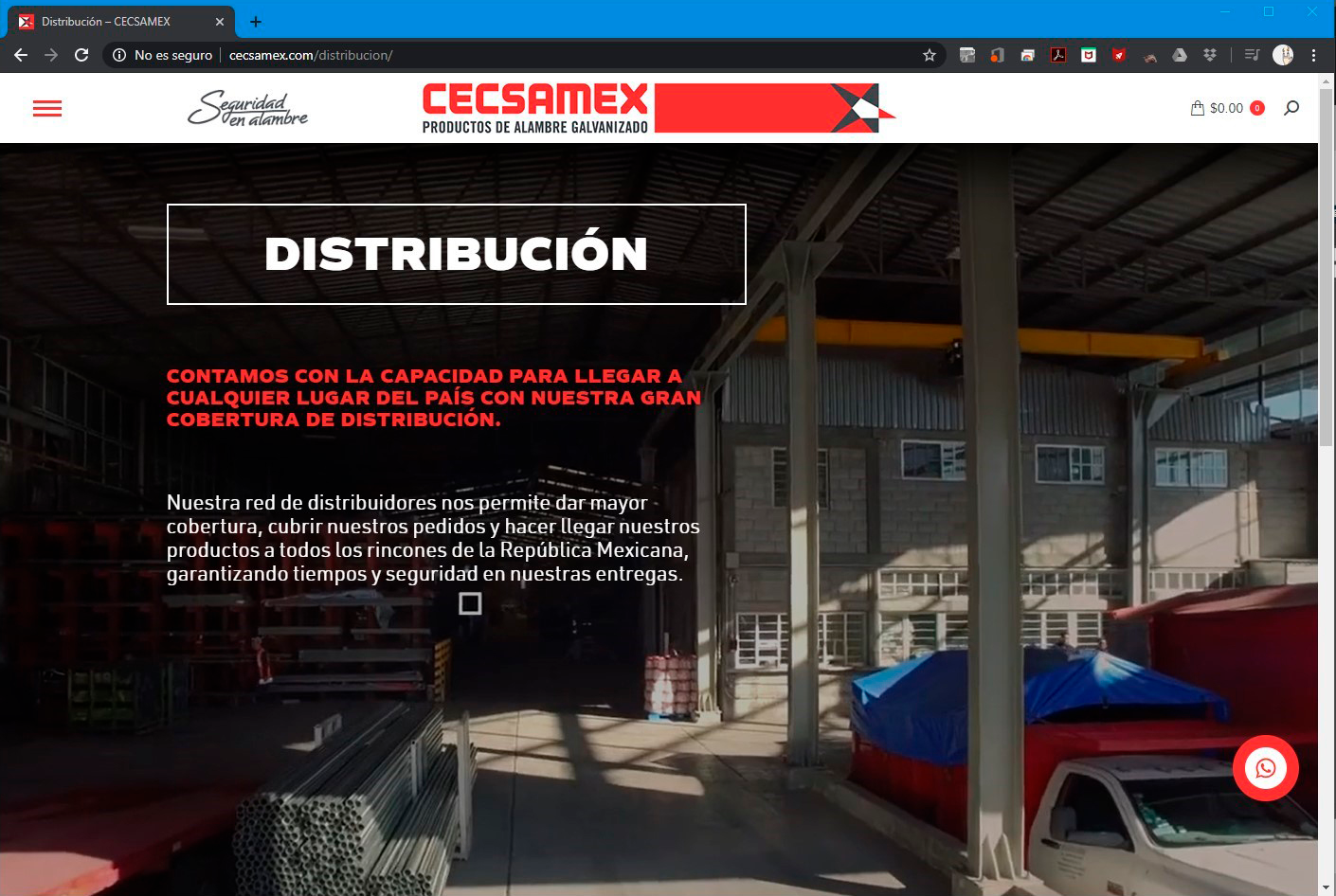
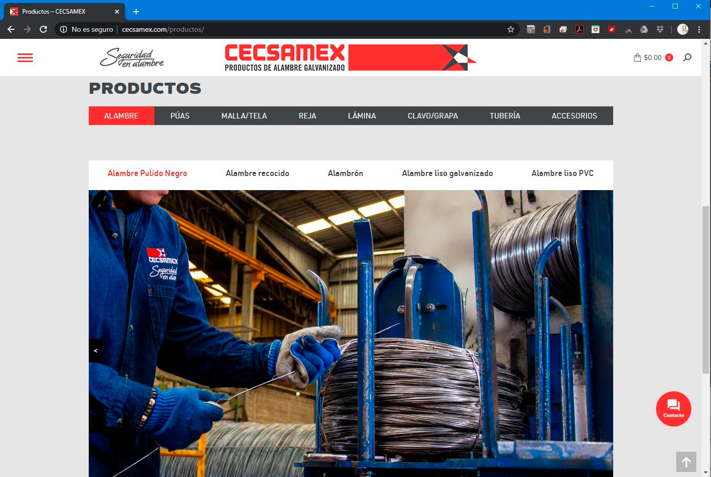
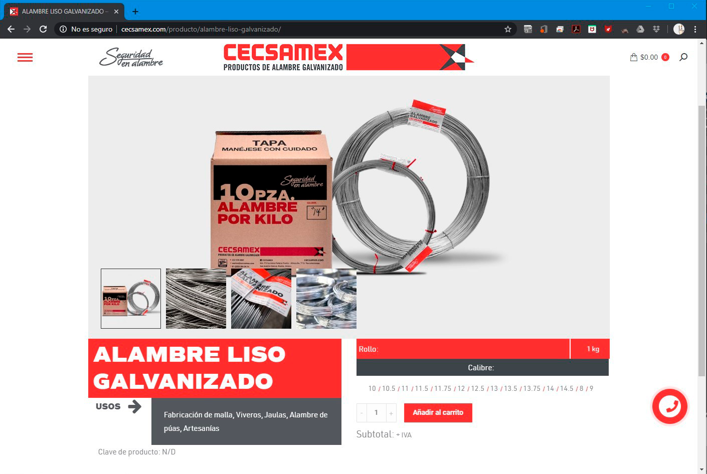
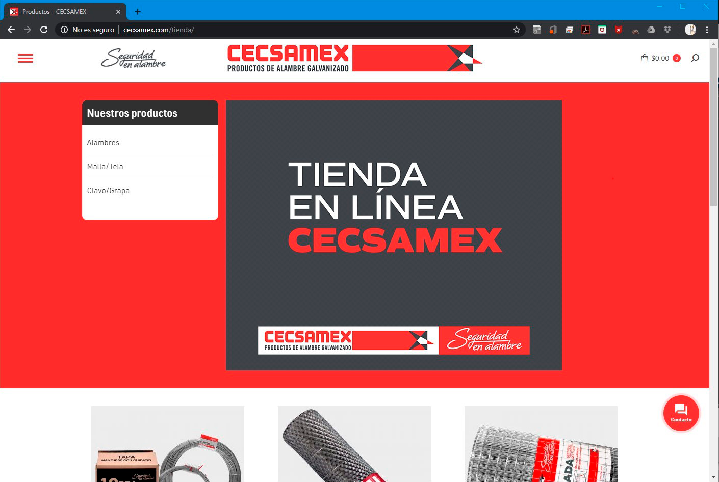
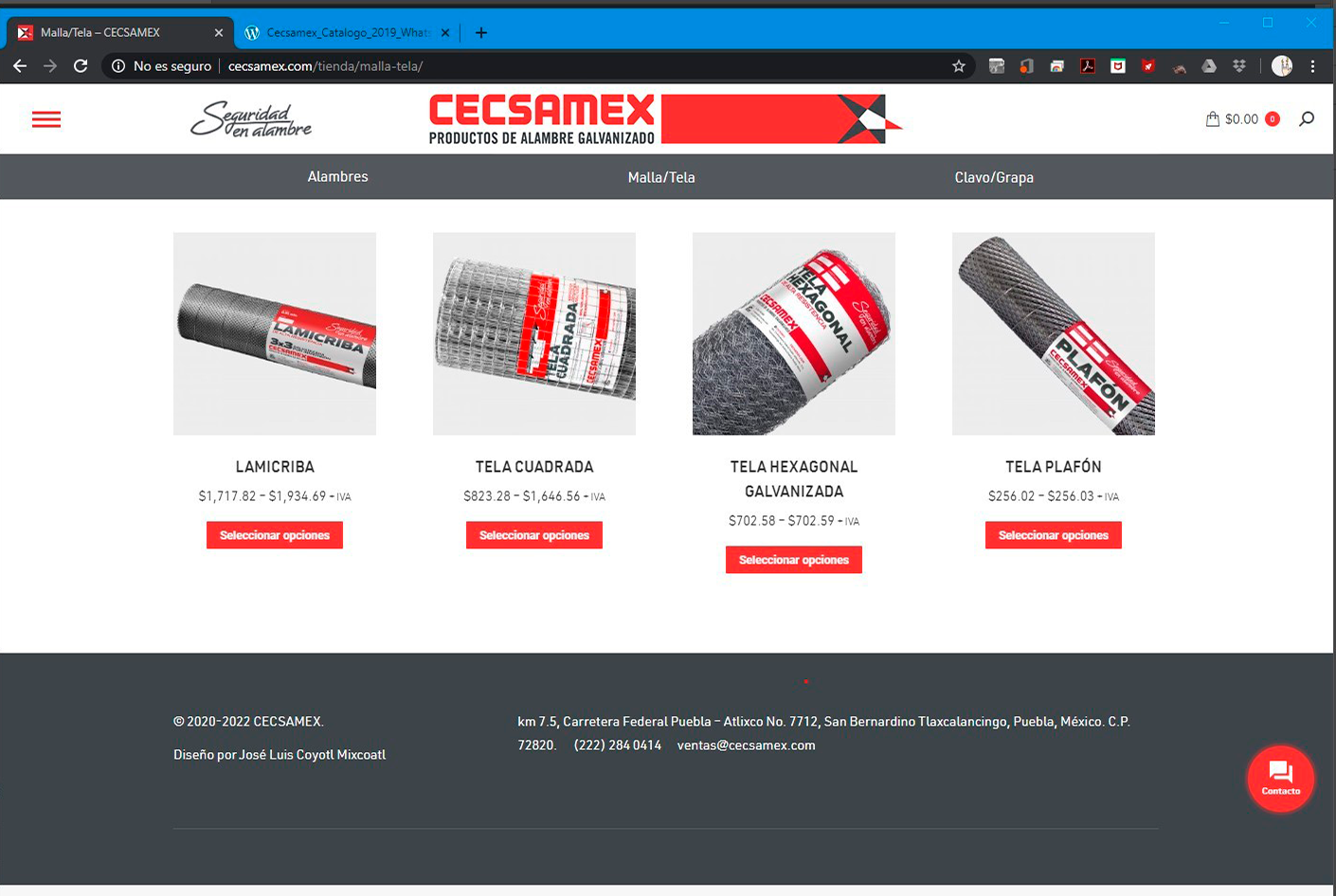
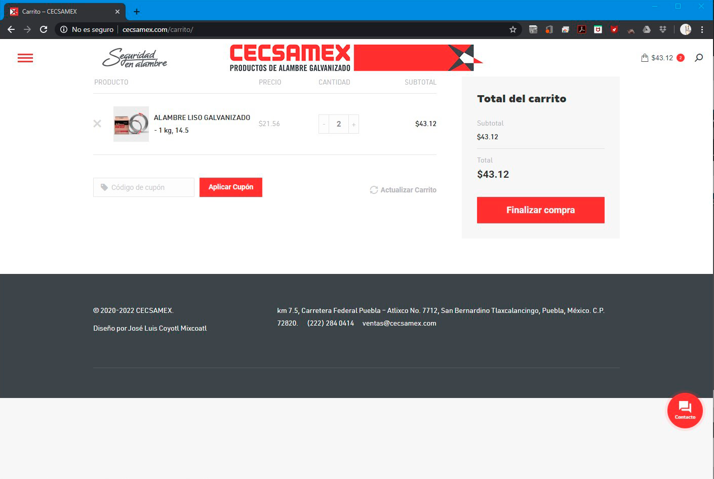
Also the site need to be responsive to different devices for it can optimize its functionality for the users in different ways, specially the mobile cause the notorious percentage of users, so it also need nailed well.
