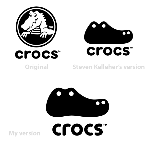
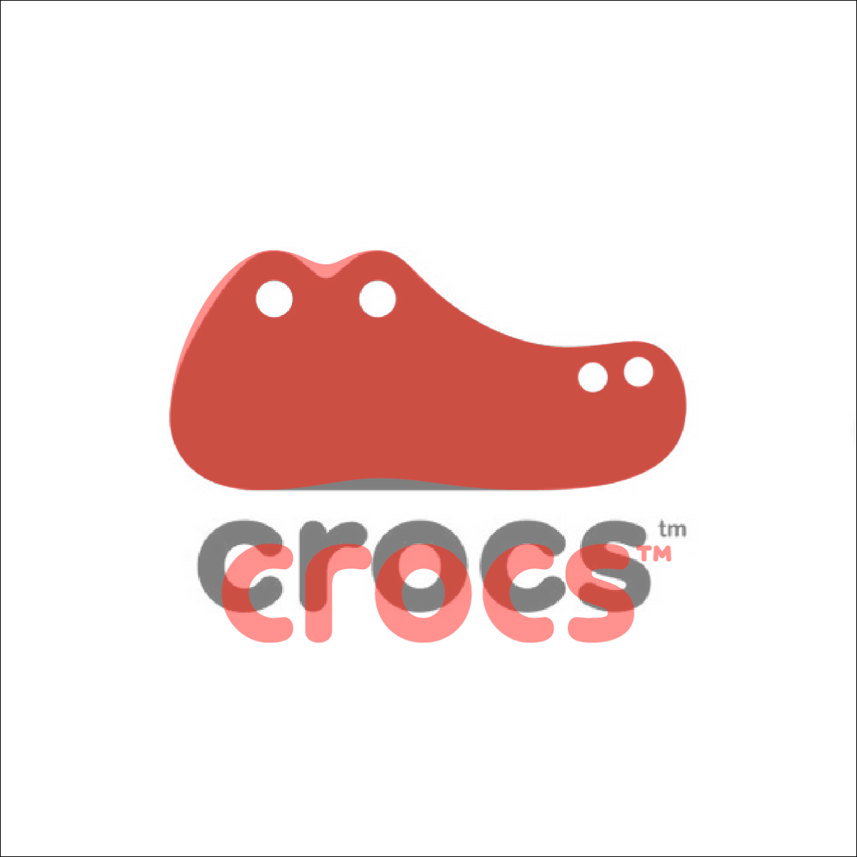


I saw at Brand New site a faux redesign by the fantastic Stephen Kelleher Studio for the world famous Crocs brand and makes me a smile for the cool solution he made and make me feel inspired. But it makes me think about that and I just felt that there's a step forward to do in there just as a brain challenge. So I wanted to try something there that expands the way I design and it looks like a good challenge to do. I just can't stop thinking about it, so I put my hands on work on that as a free mind exercise. So, I just take the time to do something else from Stephen's design.
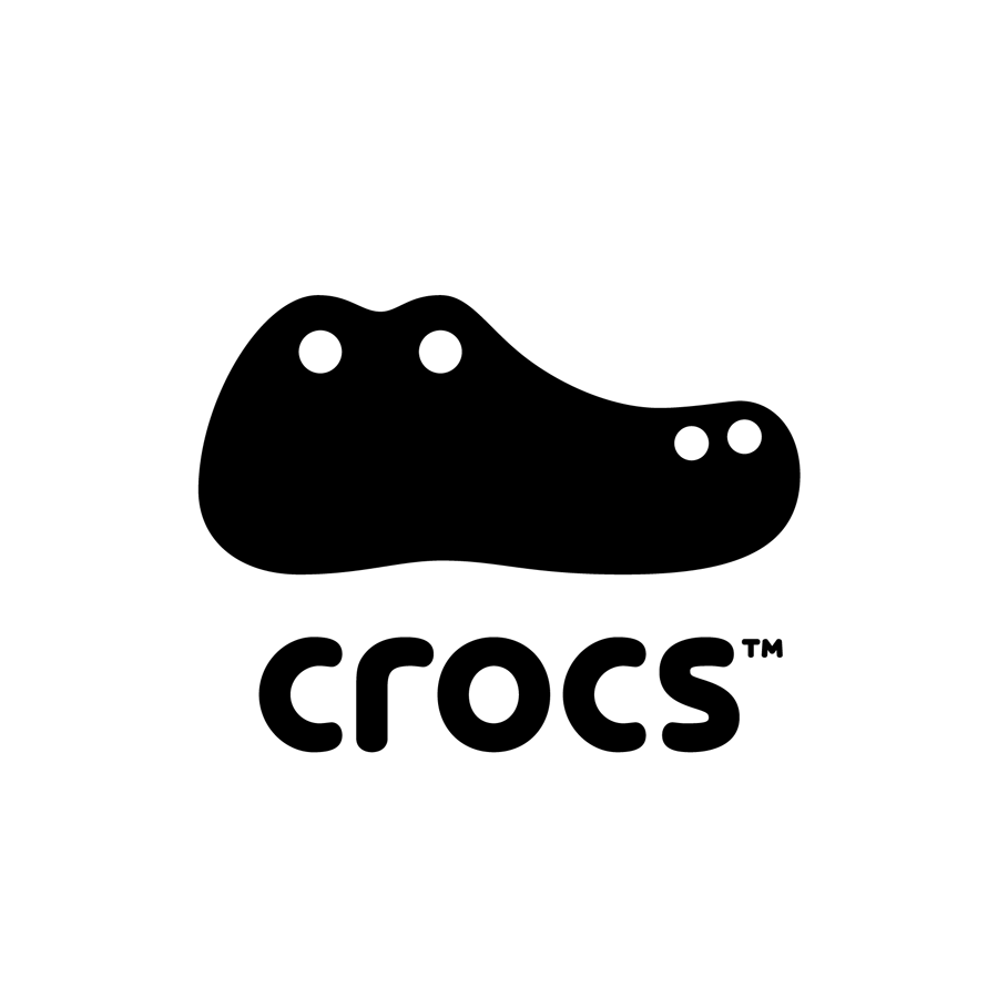
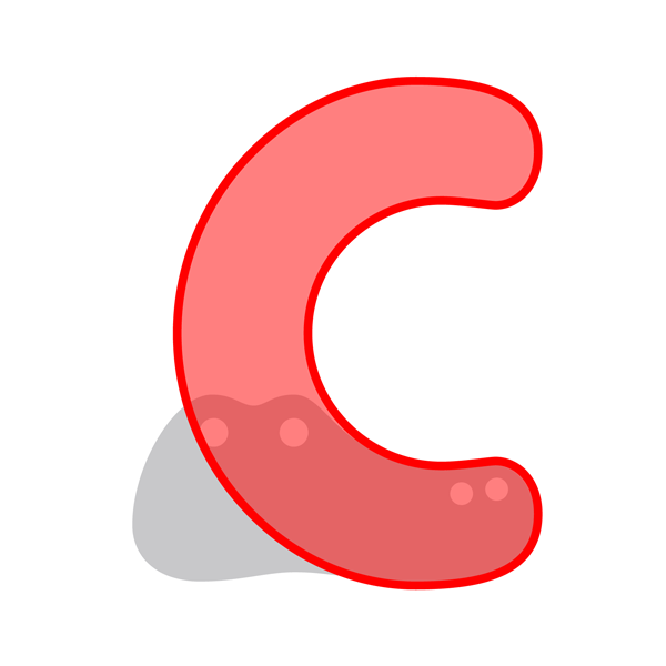
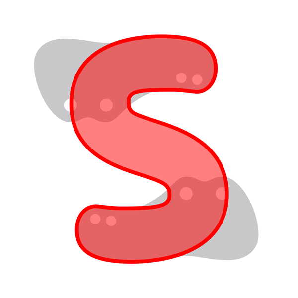
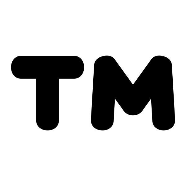
Because I'm a type designer and a brand believer, I just sharpen a little bit the icon, with some small and soft tweaks, that makes the crocodile head shape more organic, even more comfortable as the Crocs products suggest, but mainly, I want to build something nice and smart in the type of the word mark. So, I just make a custom type research and make a fresh alternate solution with a friendly feeling keeping the rounded and friendly structure and readability of the original type. Every letter was carefully designed from the icon as reference and integrated as a logotype and melting with the icon that I push forward a bit, making some balance, proportion and spacing, even the Trademark (™) symbol has custom type made it. I love the result of this self-taugth challenge, I felt is more modern, fresh and works better.