Simply, Modern, Friendly
Kattatak is a creative studio based in Australia, founded by Gustavo Morales Ainslie, which have a long story as a designer with a social cause profile.
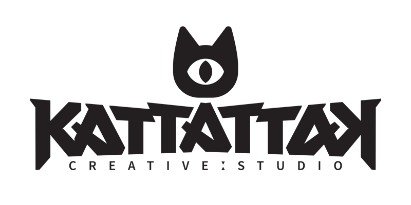
The spirit of KATTATTAK, part of the play on words that comes from “Cat attack” that Gustavo likes to use that wants to capture the essence of a being as active and temperamental as a cat, which in many ways is related to what we are as people.
The spirit of KATTATTAK, part of the play on words that comes from “Cat attack” that Gustavo likes to use that wants to capture the essence of a being as active and temperamental as a cat, which in many ways is related to what we are as people.
Being a brand for a creative studio with the singularities of KATTATTAK, I developed two main elements from the beggining: an icon, which is the representation of a cat's head and its different moods, giving a character capable of showing the possibilities in which they can be used, with the idea that, precisely the versatility of the studio in different environments and circumstances, being represented according the mood of the cat, involving a symbiotic feeling between icon and typography.

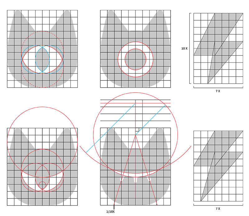
I designed some different of icons on the cat head shape, that works as a brand element that can work separated of the wordmark. Its simplicity and its singularity of a cyclop treatment, giving a mystic/legendary reference that, according to the greek mythology, cyclops was the thunderbolt makers, also related to the eyesight as a powerful way of creativity, but with a cat eye with certain mood and expression in them like warning, calm and even anger.
Being the stylization of the cat's silhouette one of the main elements of the KATTATTAK brand, it is important to have the proportions of its strokes well defined and thus easily understand how it works based on the expressions of the eye that is inside.
It is based on the fact that its line has a geometric and symmetrical base, although with singular proportions in the integration of its parts with the intention of having a solid but at the same time kind head.
Starting from basic expressions such as tranquility, alertness, anger or sleep, there are modulations in each one of them in a very simple way within the tracing network of the same head.
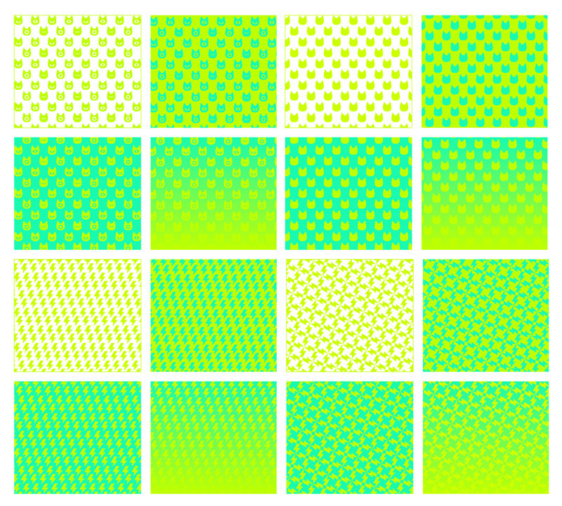
Thus, two options built on the iconographic basis of a lightning bolt have also been generated. One of them modulated to generate textures and the second as a simple icon.
The typographic design of the KATTATTAK brand is personalized, giving singularity in the composition of the letters that form it, also with its capicua reading and in a style that is functional for reading, making the understanding of the typographic brand more efficient in display sizes also as small ones.
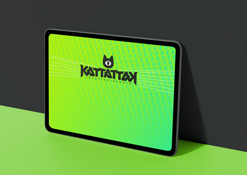
Designed on a subtly fugitive structure generating a polygonal silhouette in the environment of the word that refers to the whiskers of a cat. The icon has been integrated so that it generates a block solid with great visibility.
One of the main thniking for the brand is the ability of the word KATTATTAK to be read both forwards and backwards, in addition to the double T's, the trio of A's and the pair of K's, making the composition more unique.
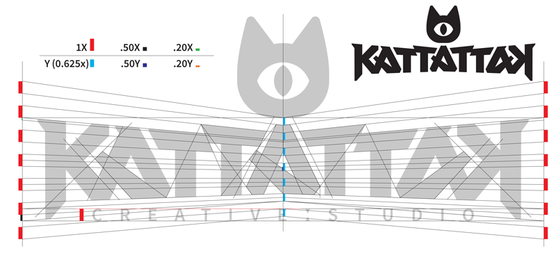
The typographical an icon structure was carefully draw and designed for it can work in any size, into a positive or negative space, as monochromatic an with color, also with other elements cause certainly it have a complexity but also simplicity at the same time, so the matter of making it becomes so important.
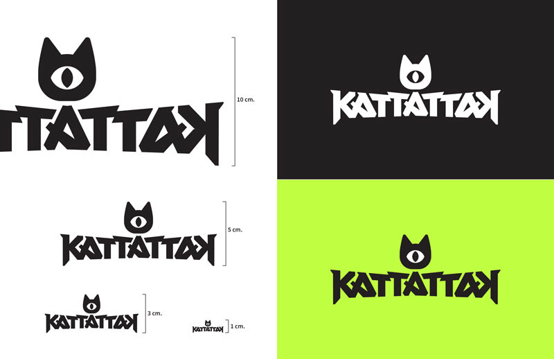
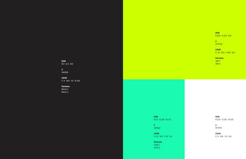
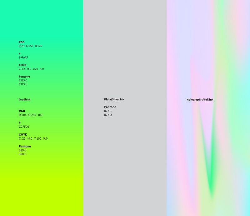
The color palette was so simple. Since a black and white scheme, until complementary colors and even gradient, metallic and foiled inks for certain uses. The application of the brand becomes also a challenge but at the end, the mixing of eclectic but simple design was the best way to still spreading the brand feeling, not just for stationery but for digital uses, even a wide set of icons and textures collection were designed that have a full explosion of color and possibilities for the KATTATTAK's brand universe.