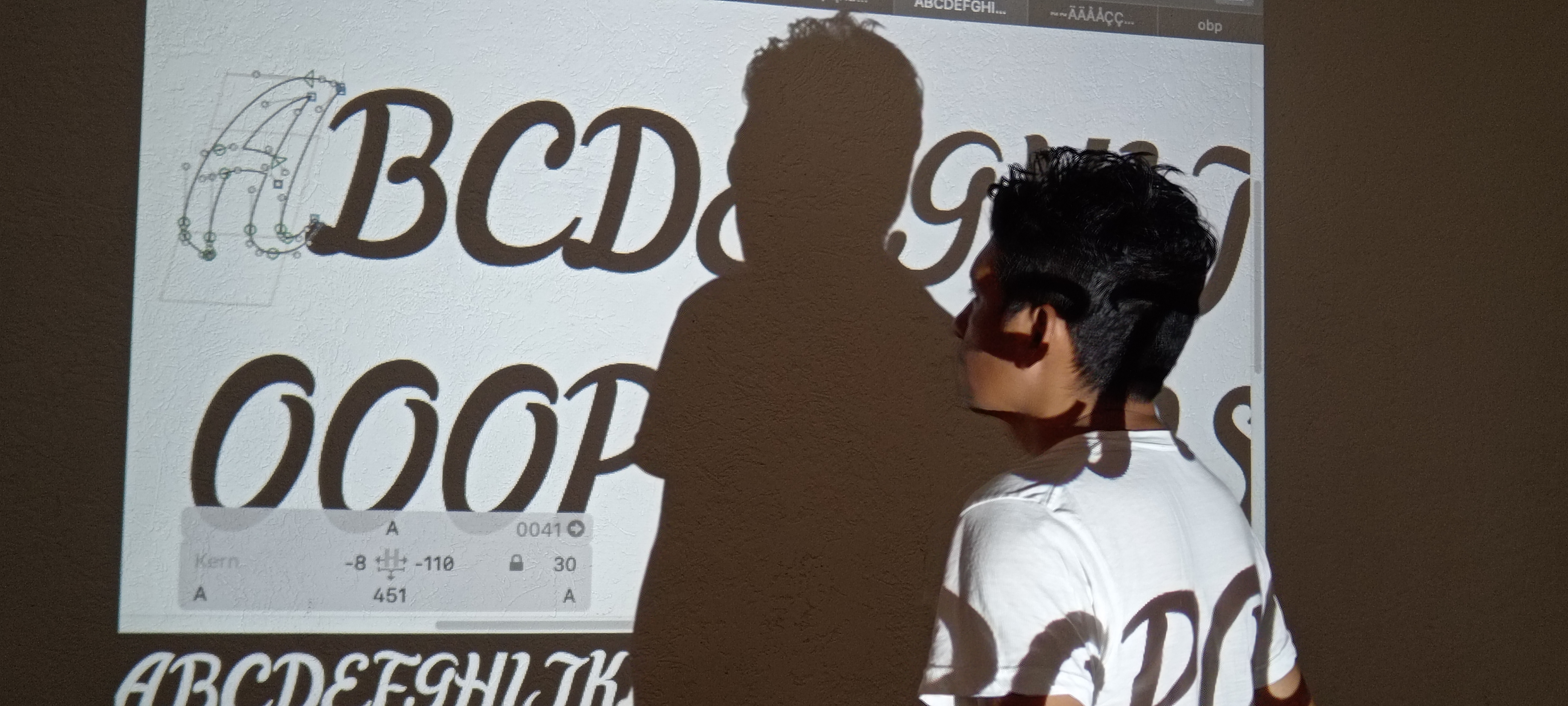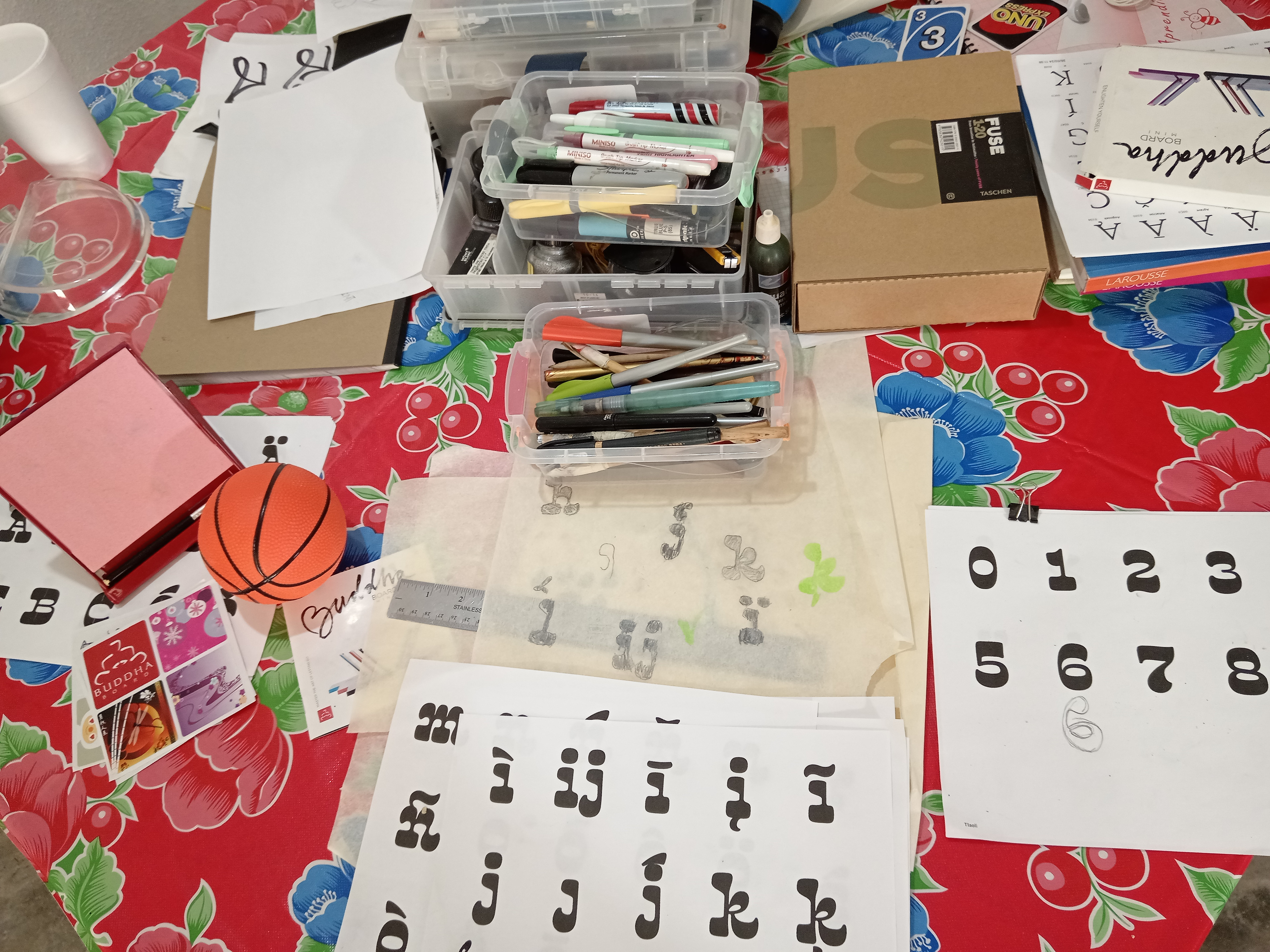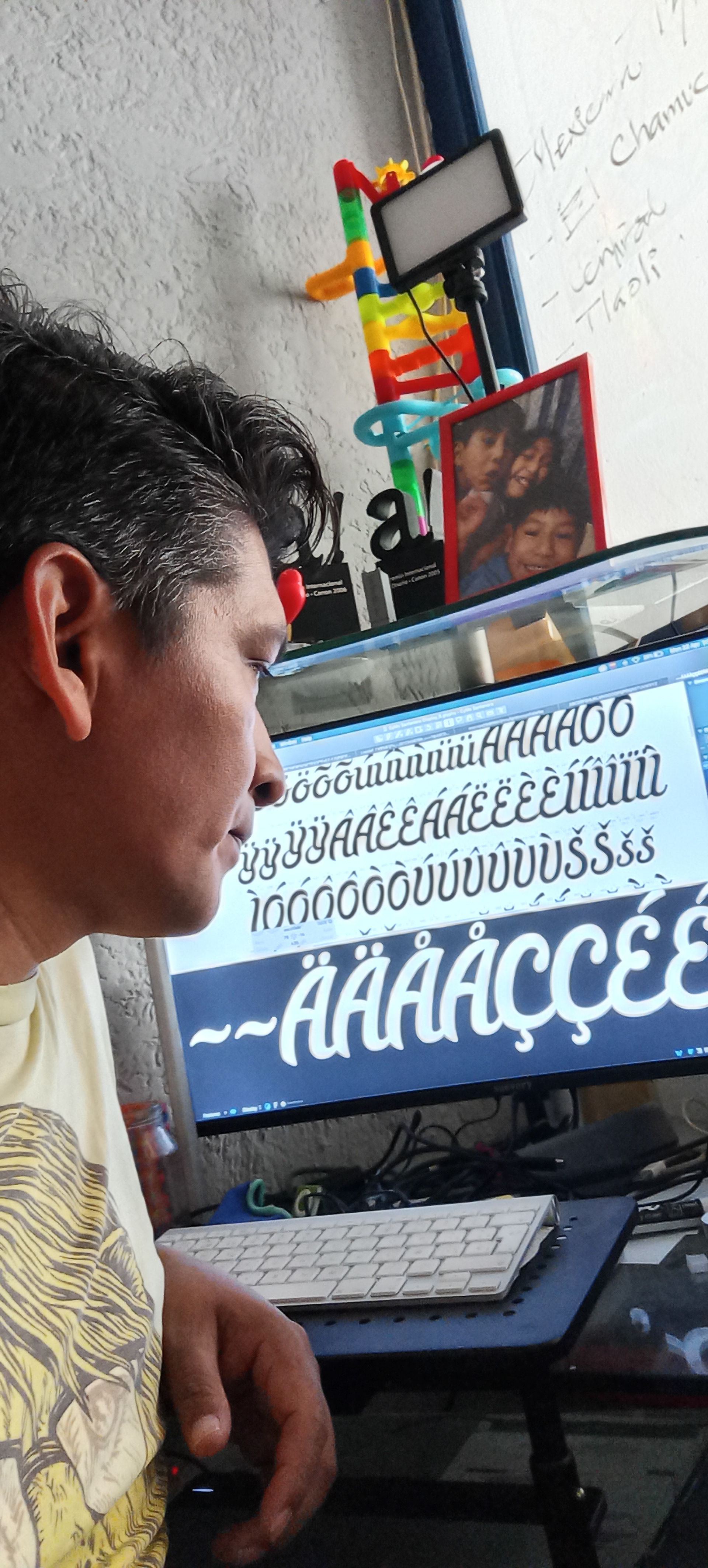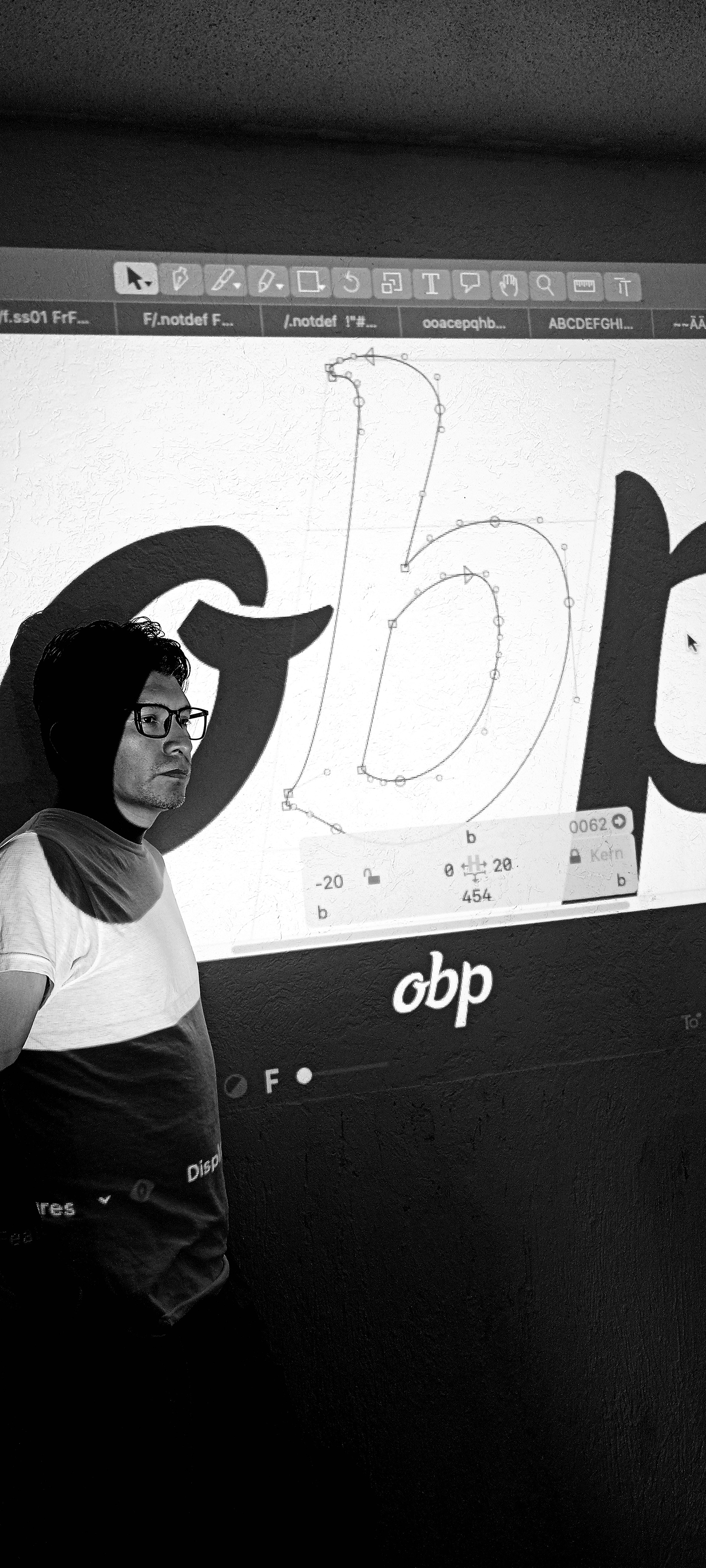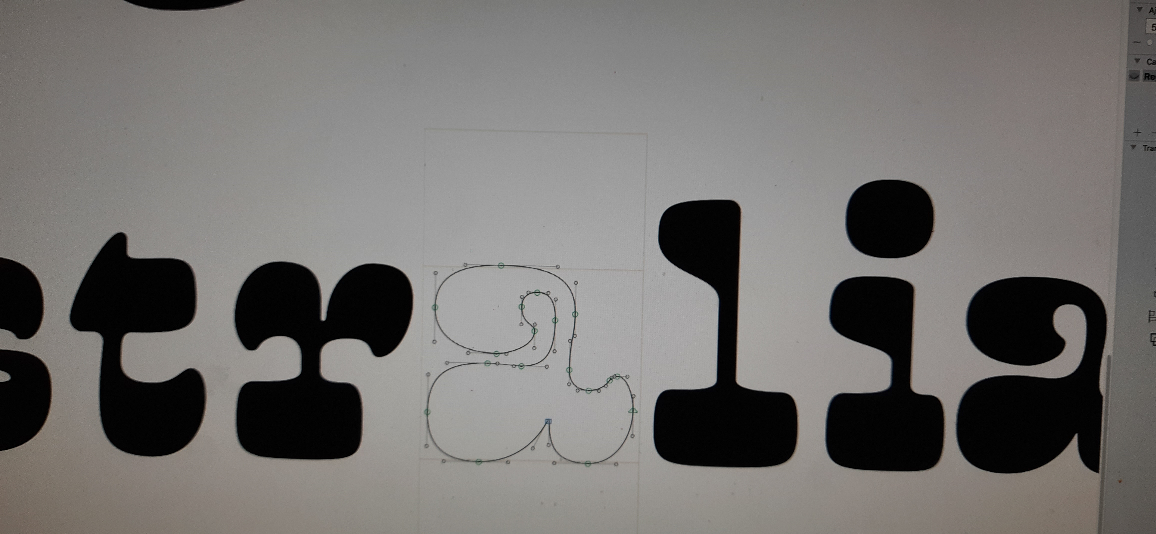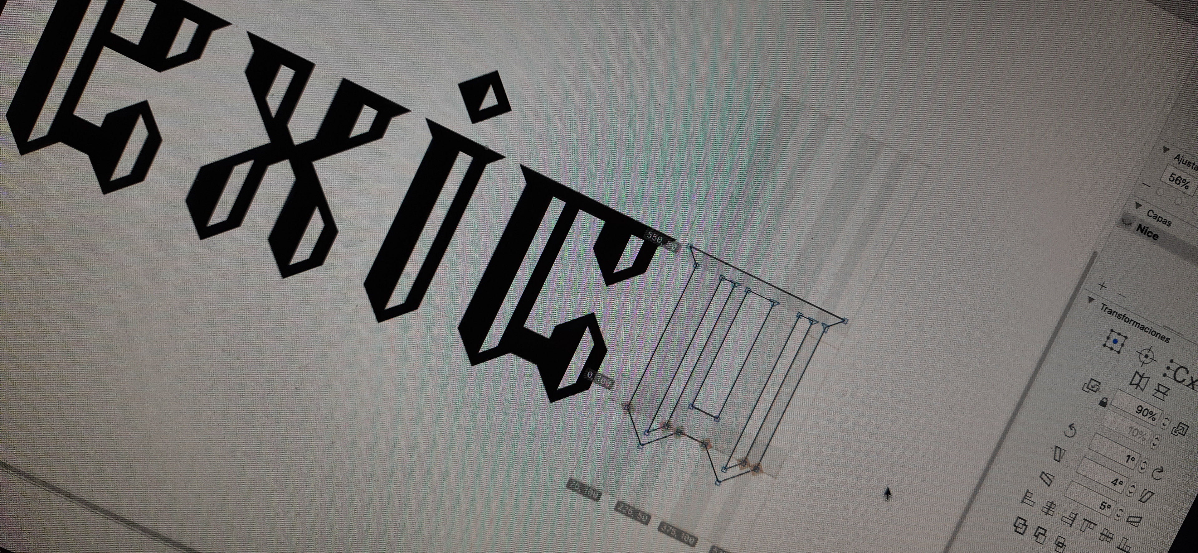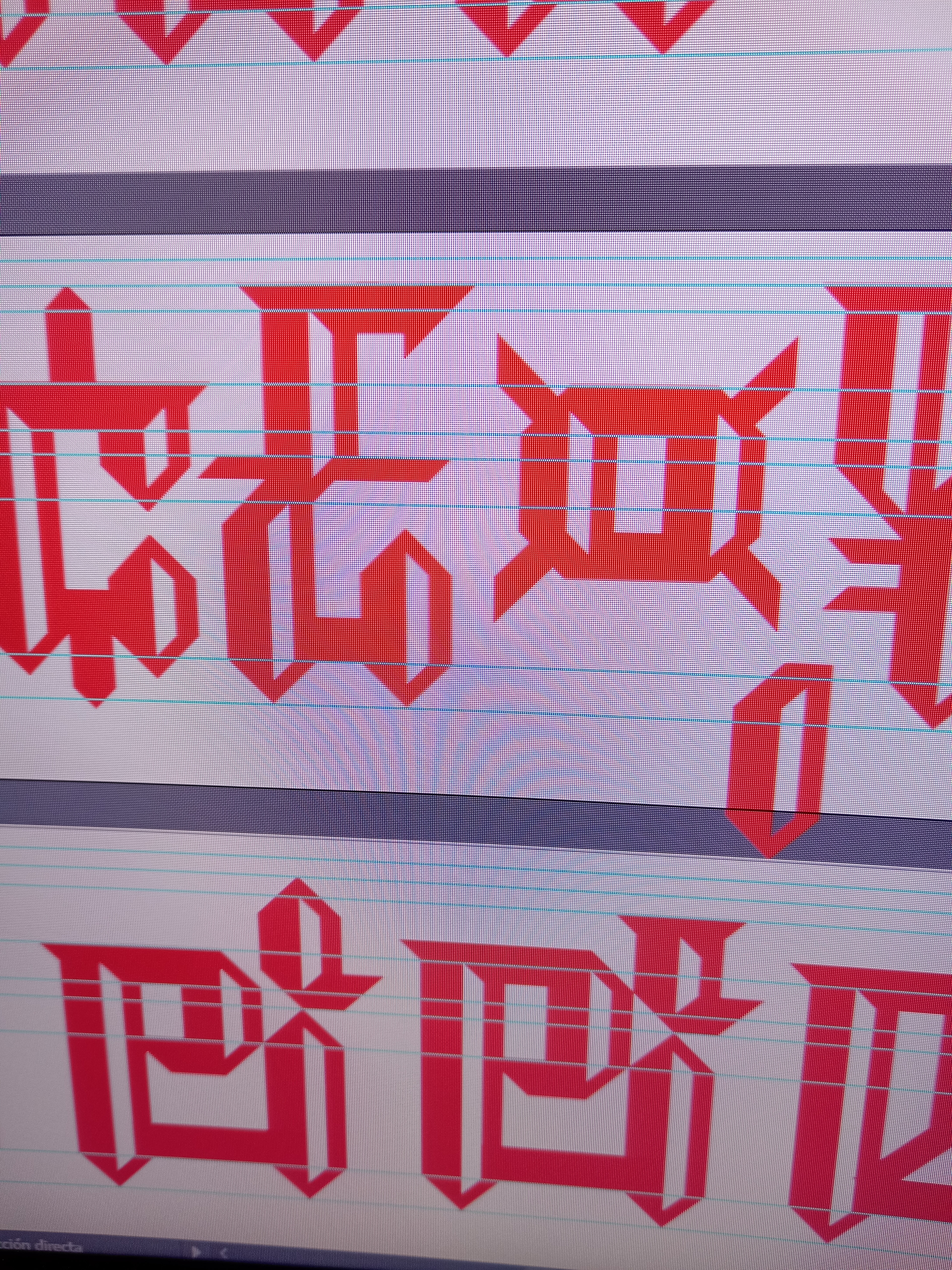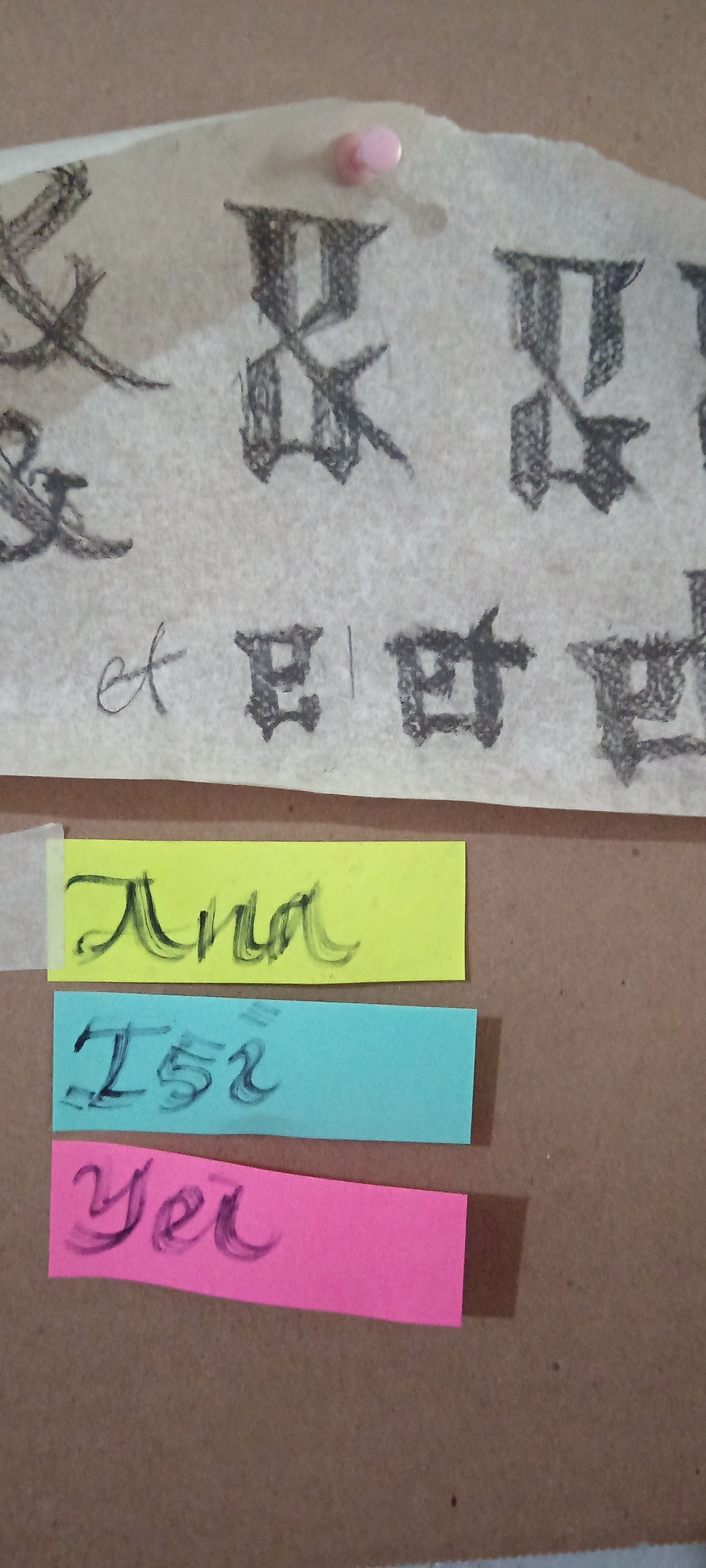
Mexicana Type is an own signature entrepeneurship as a typefoundry, developing the fonts I designed through more than 28 years of career, some of them as custom type, commercial and custom fonts projects with a contemporary profile, working on updating them, but also pushing forward for new proposals in the coming future.
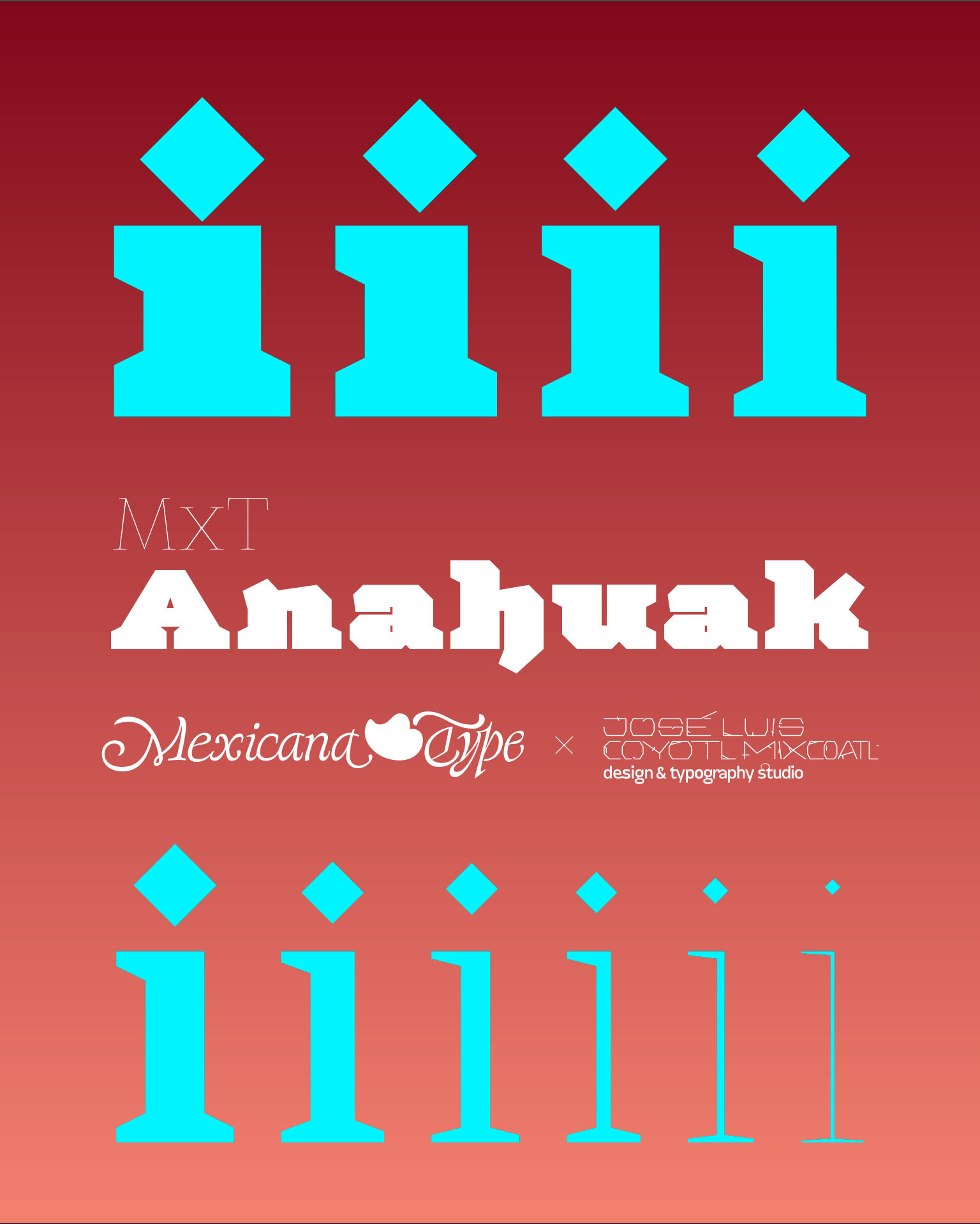
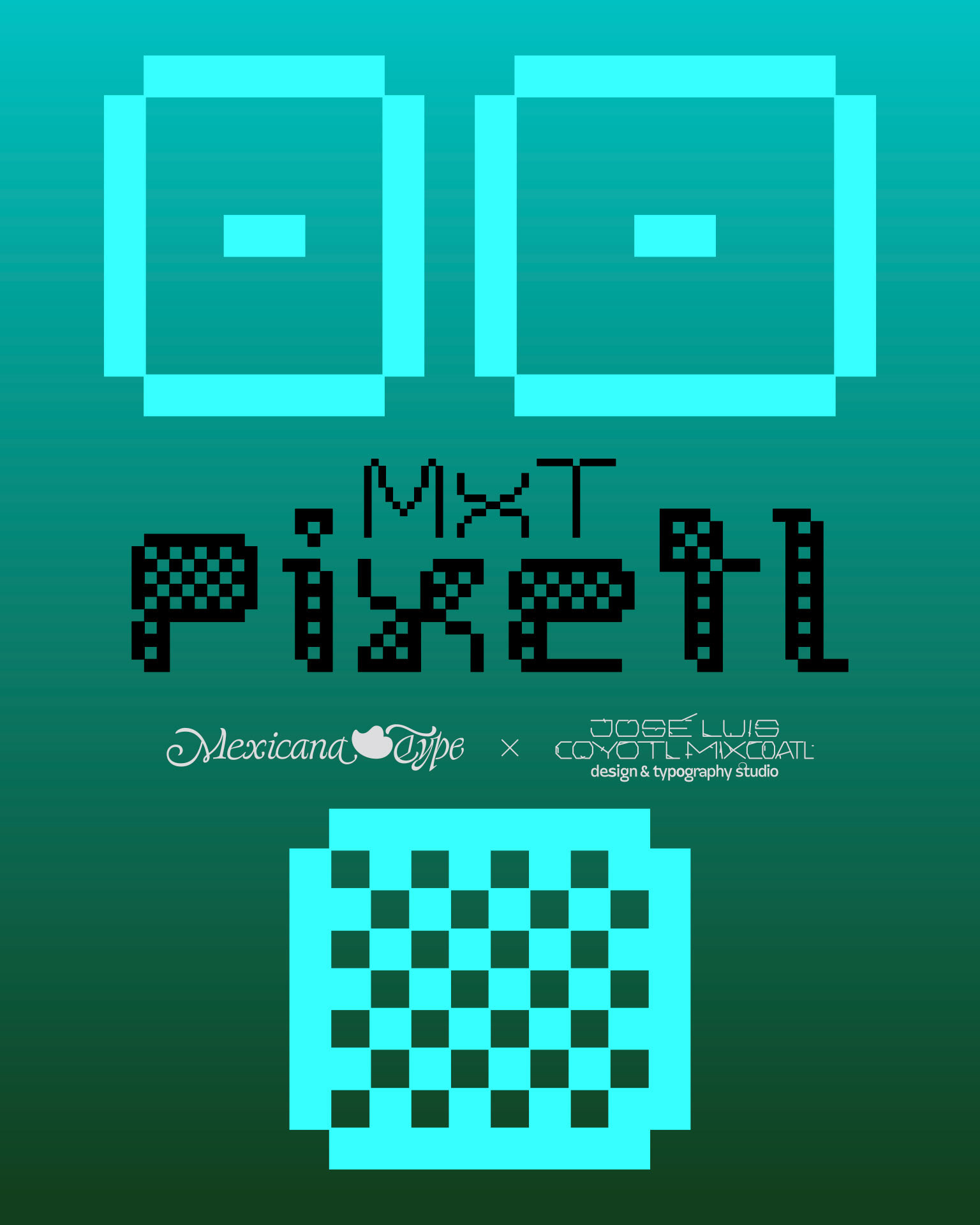
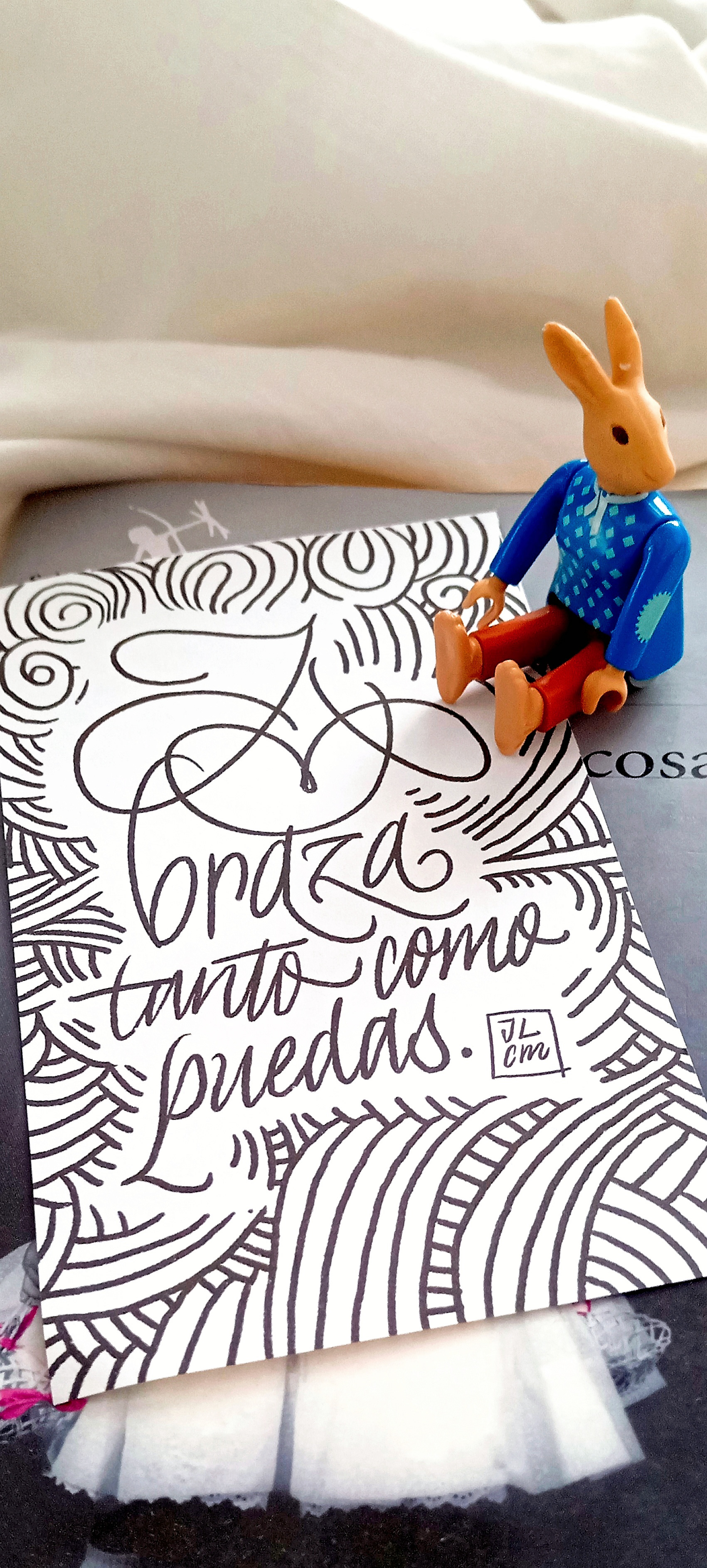
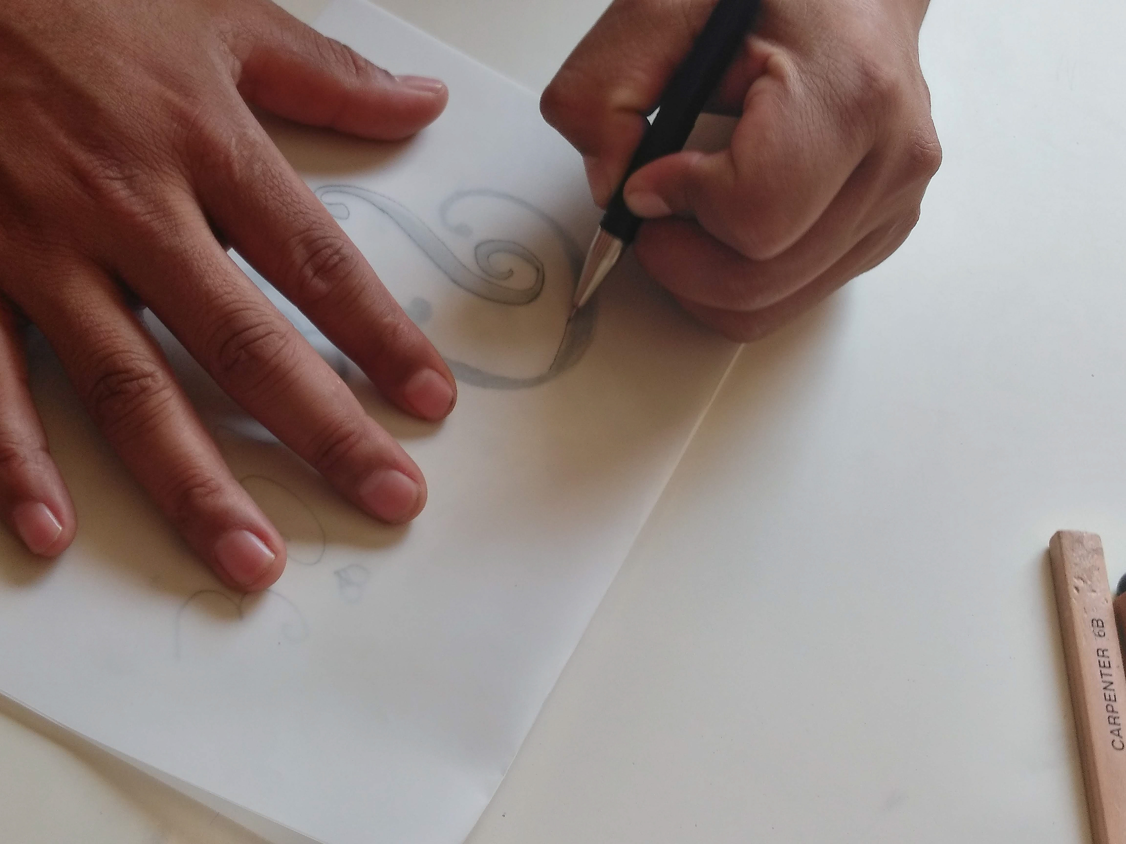
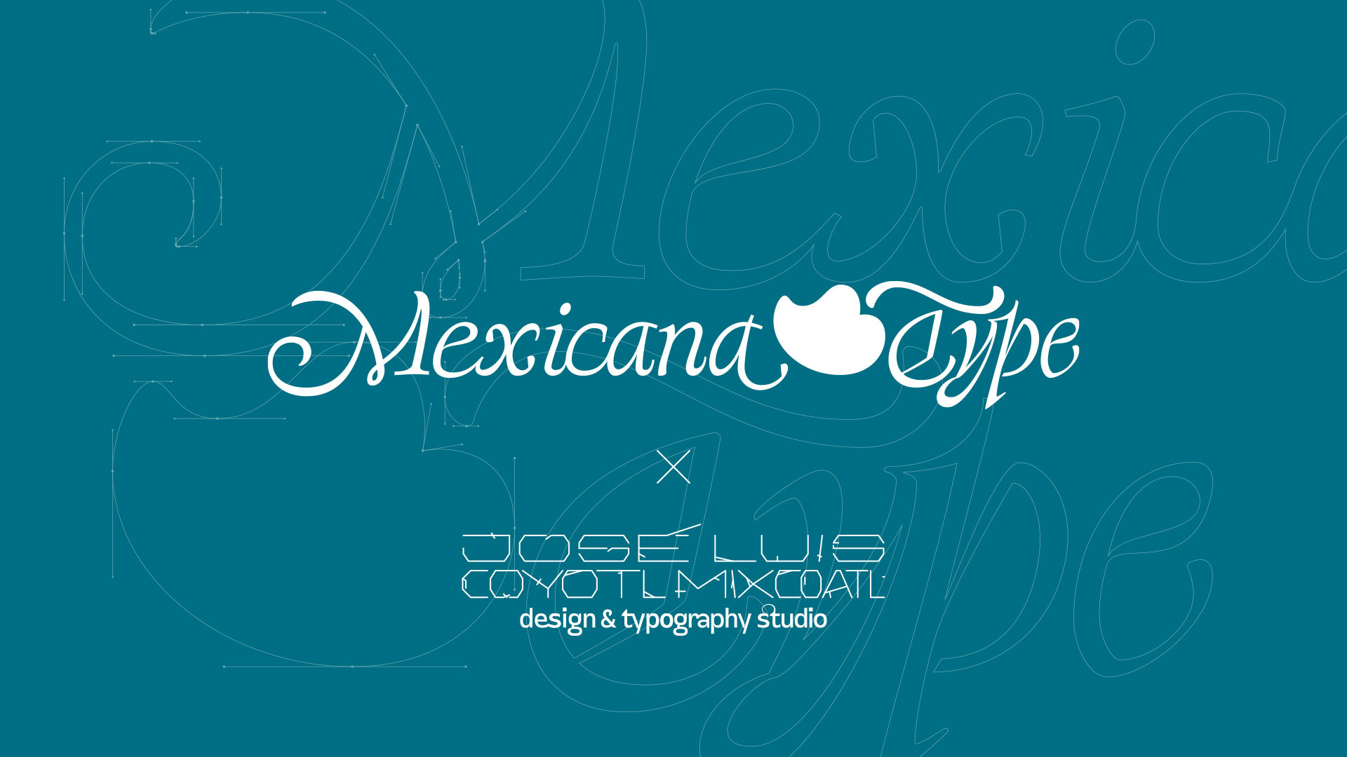
The development of the brand takes baroque typographic styles from novohispanic printed specimens in Mexico for designing the logo, with a custom type research design, enriching the feeling of the diversity of the typefaces catalogue I developed throughout the years as a reference of cultural sources. Also the selection of the brand colors takes blue and white from creole corn that my family sowed, cultivated and harvested in my childhood, also the known 'mexican pink' as secondary color, and even I take the tortilla silhouette as icon. Also the flourish icon is the representation of a chili pepper, a 'chile poblano' that remains the place I come from, but also a heart. The composition is a simply and also a charismatic brand.
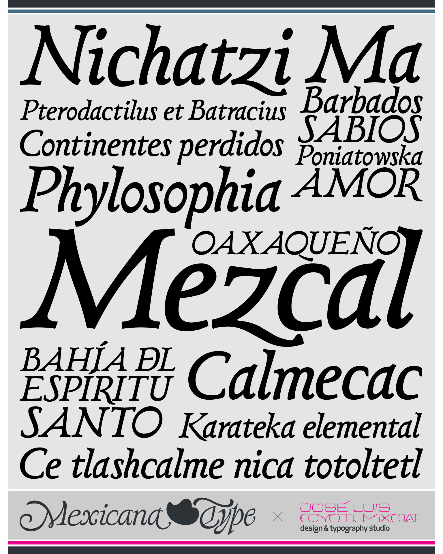
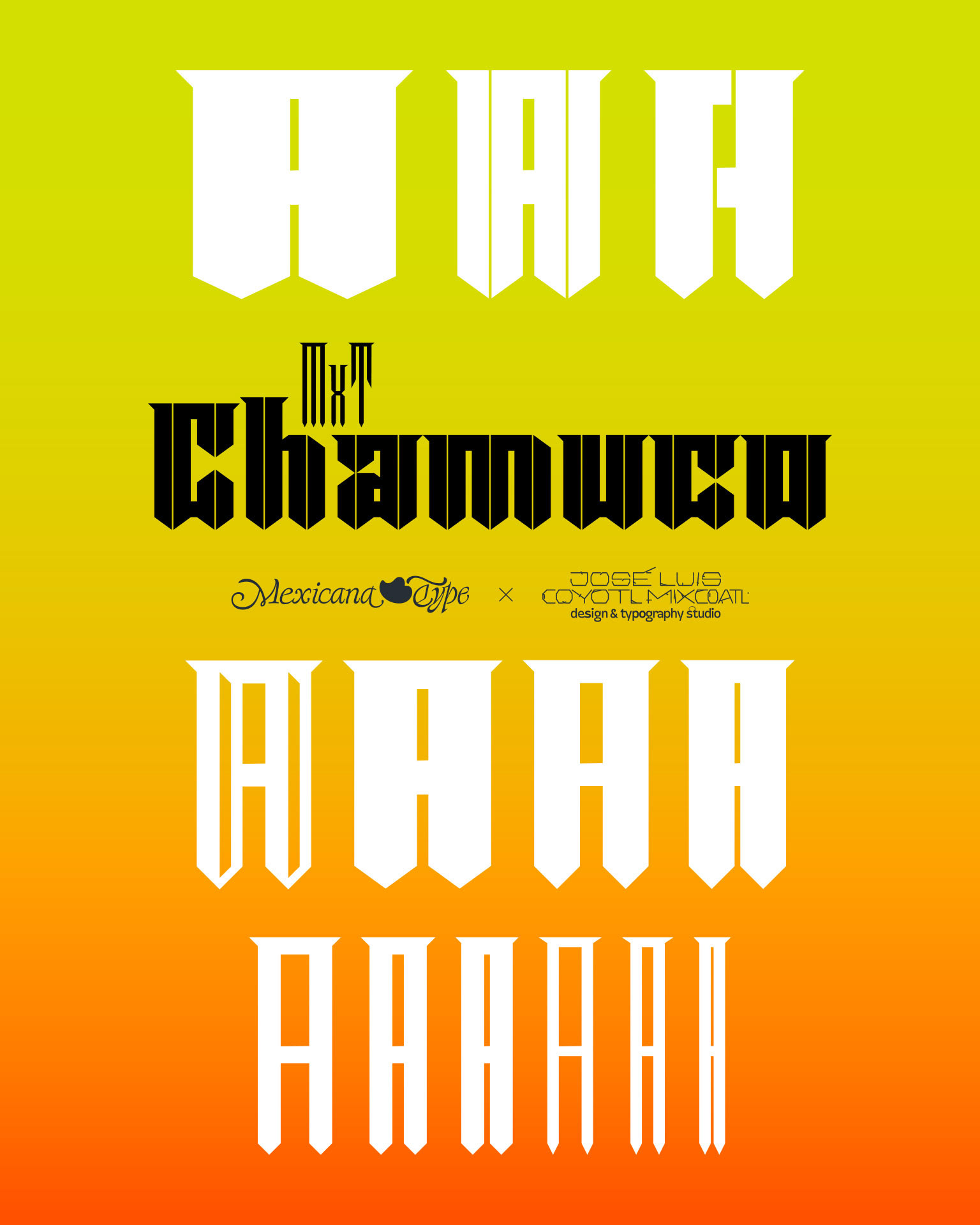
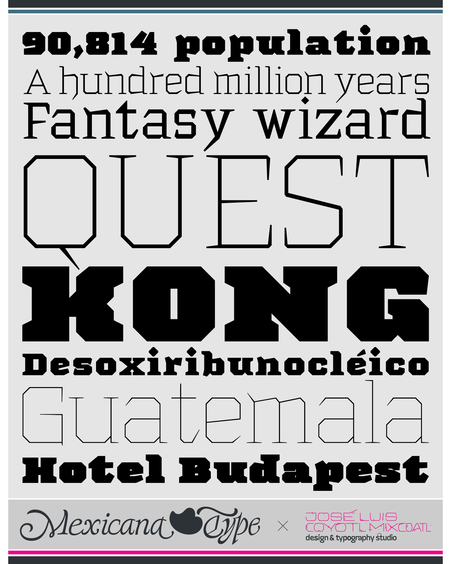
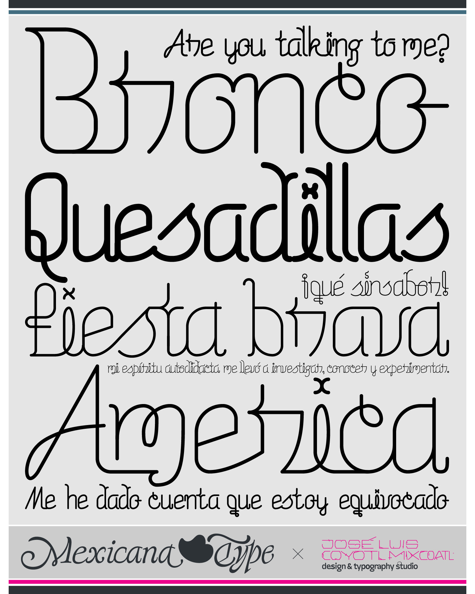
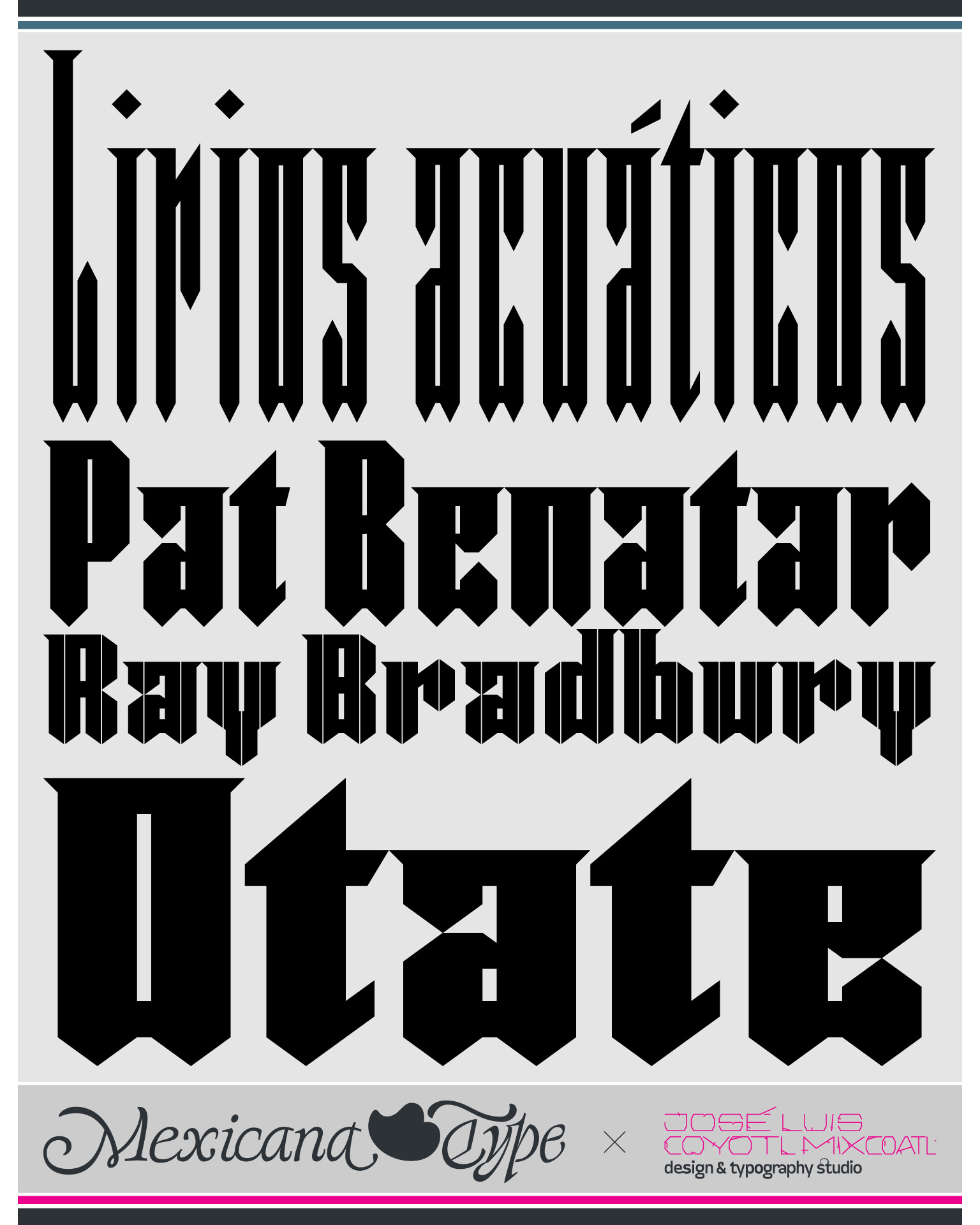
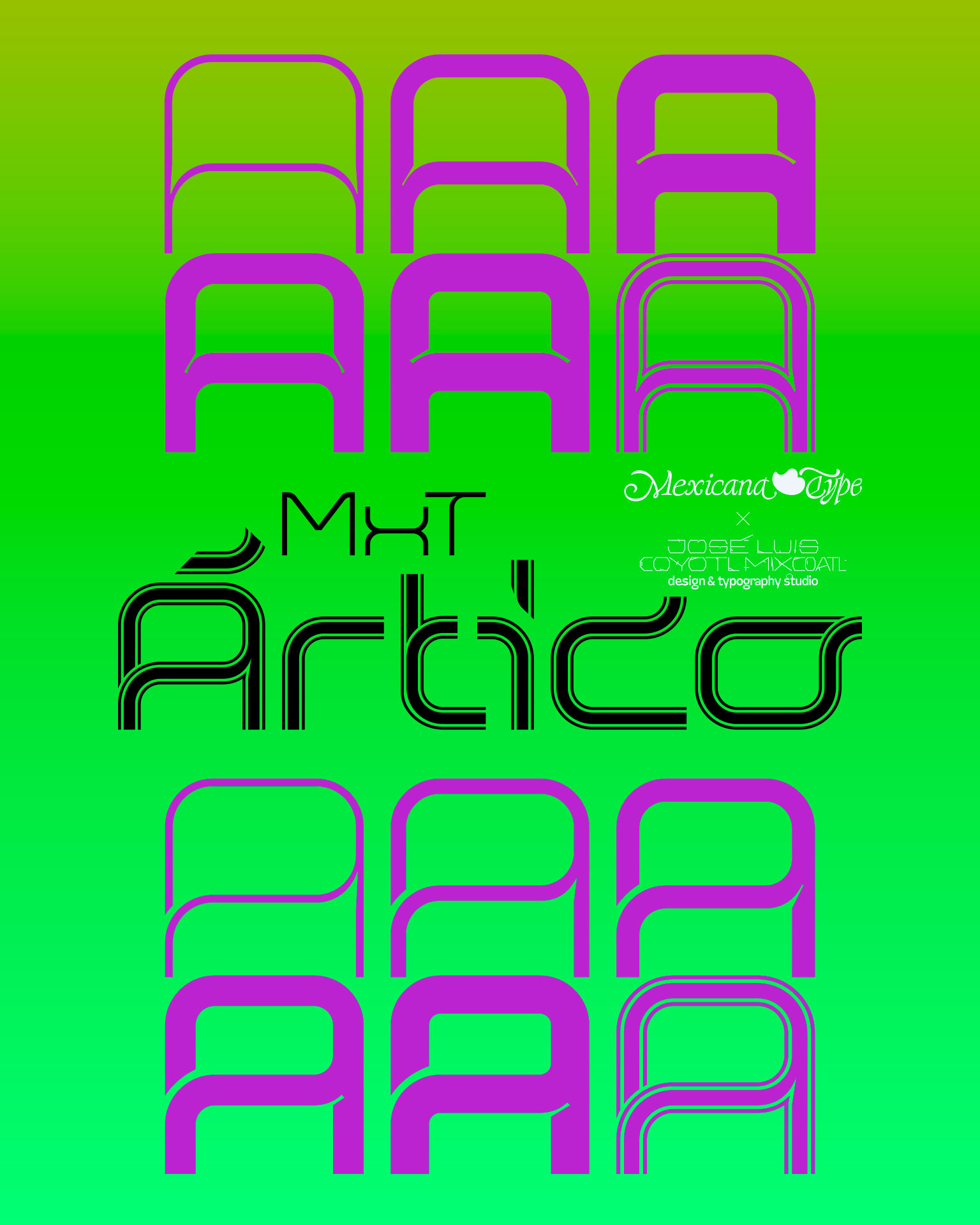
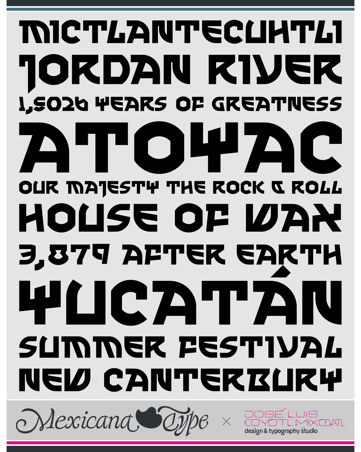
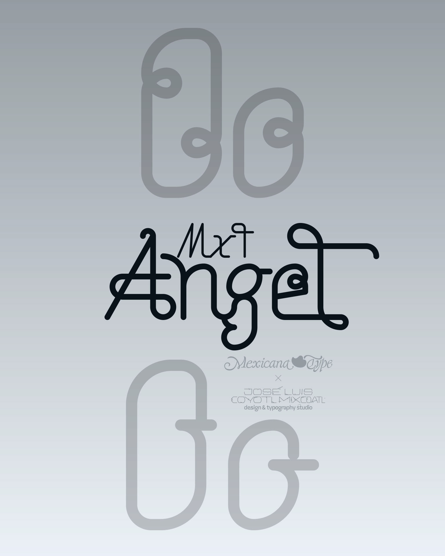
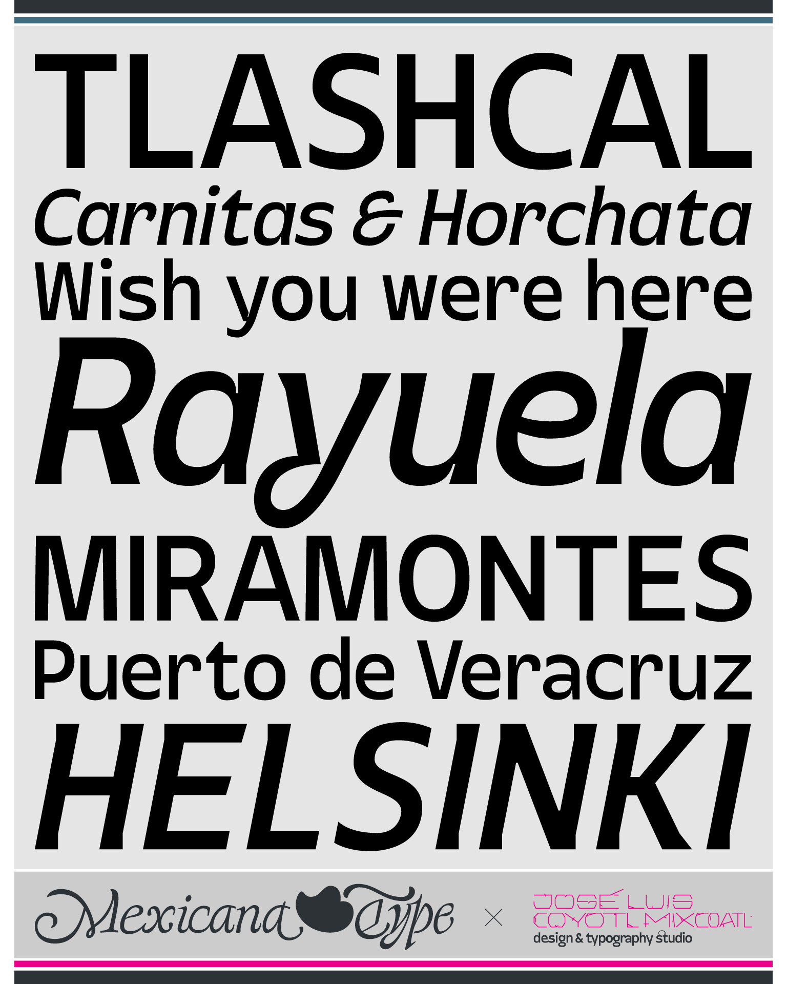
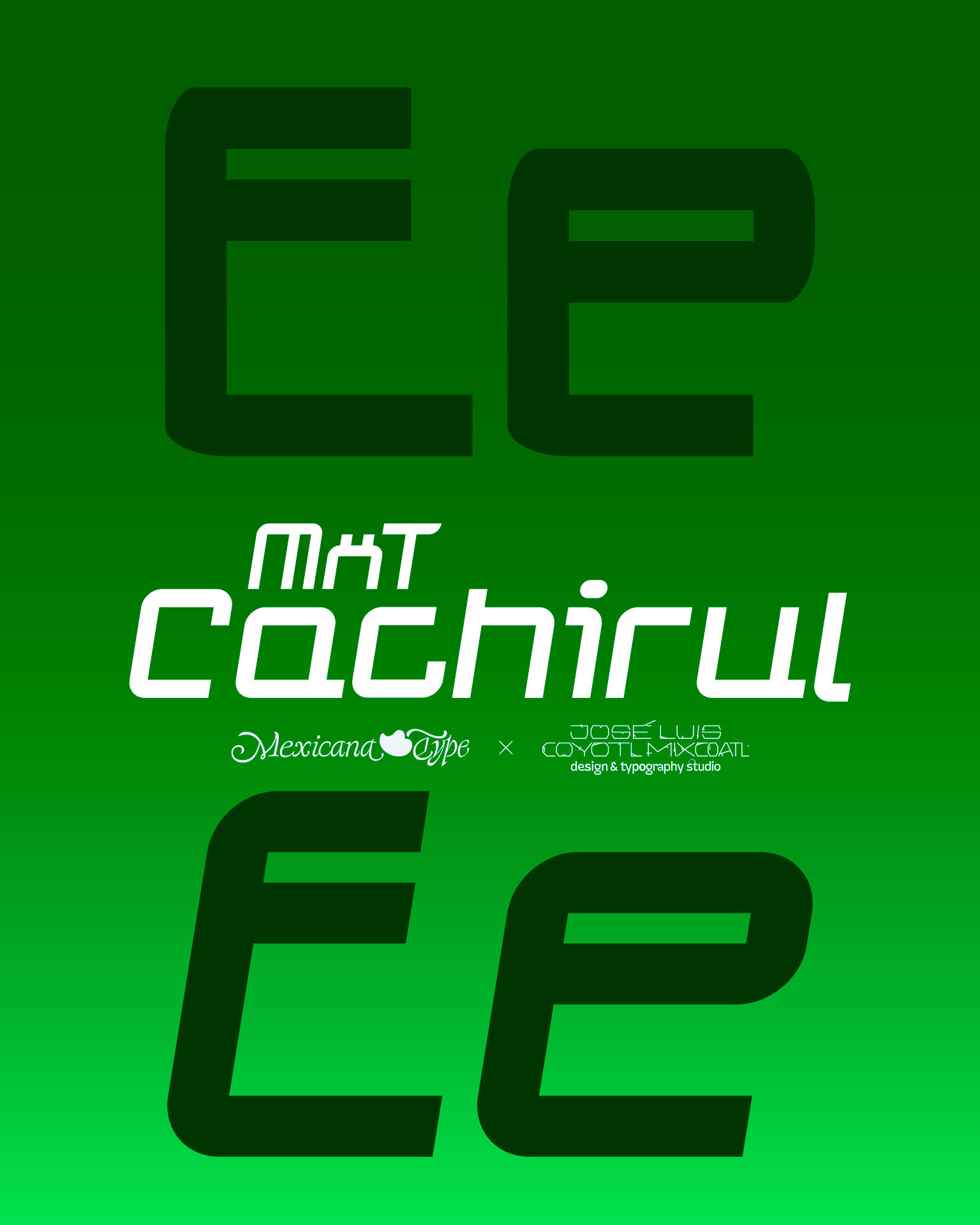
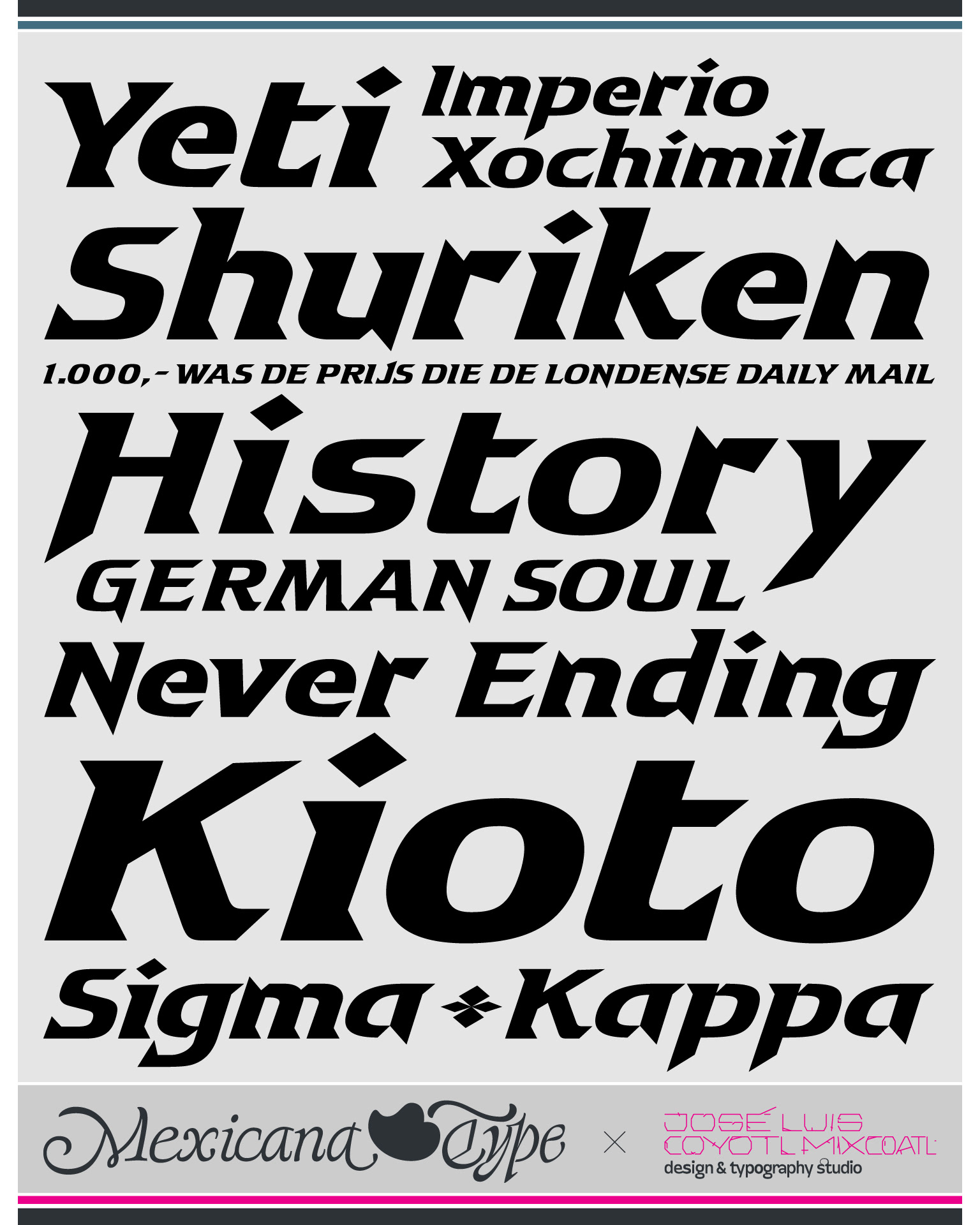
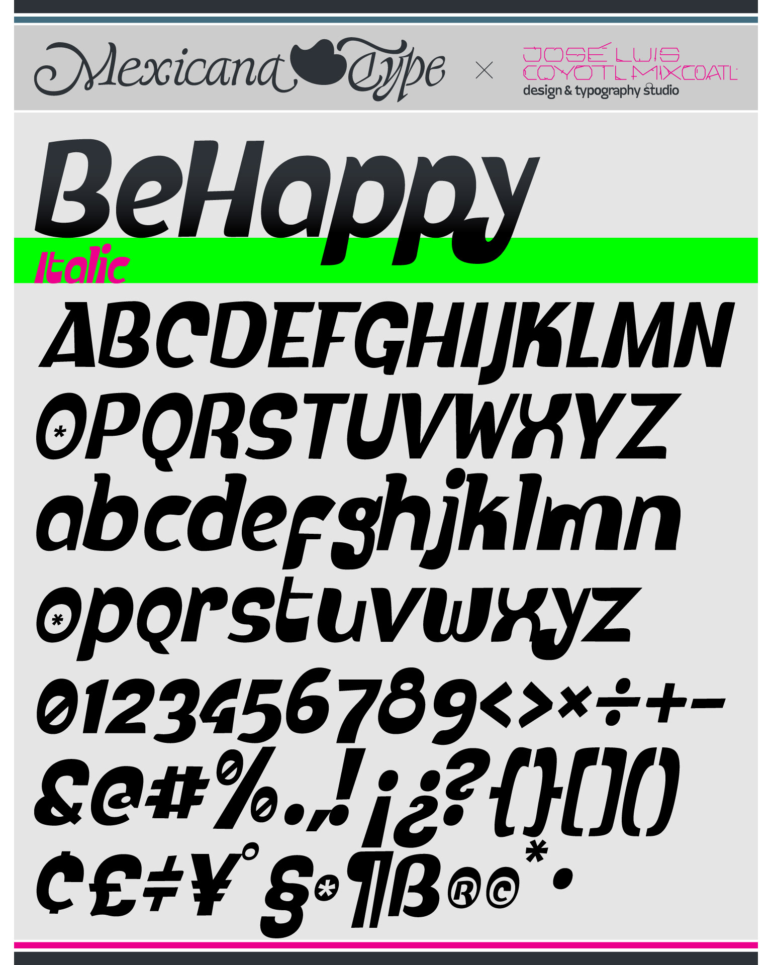
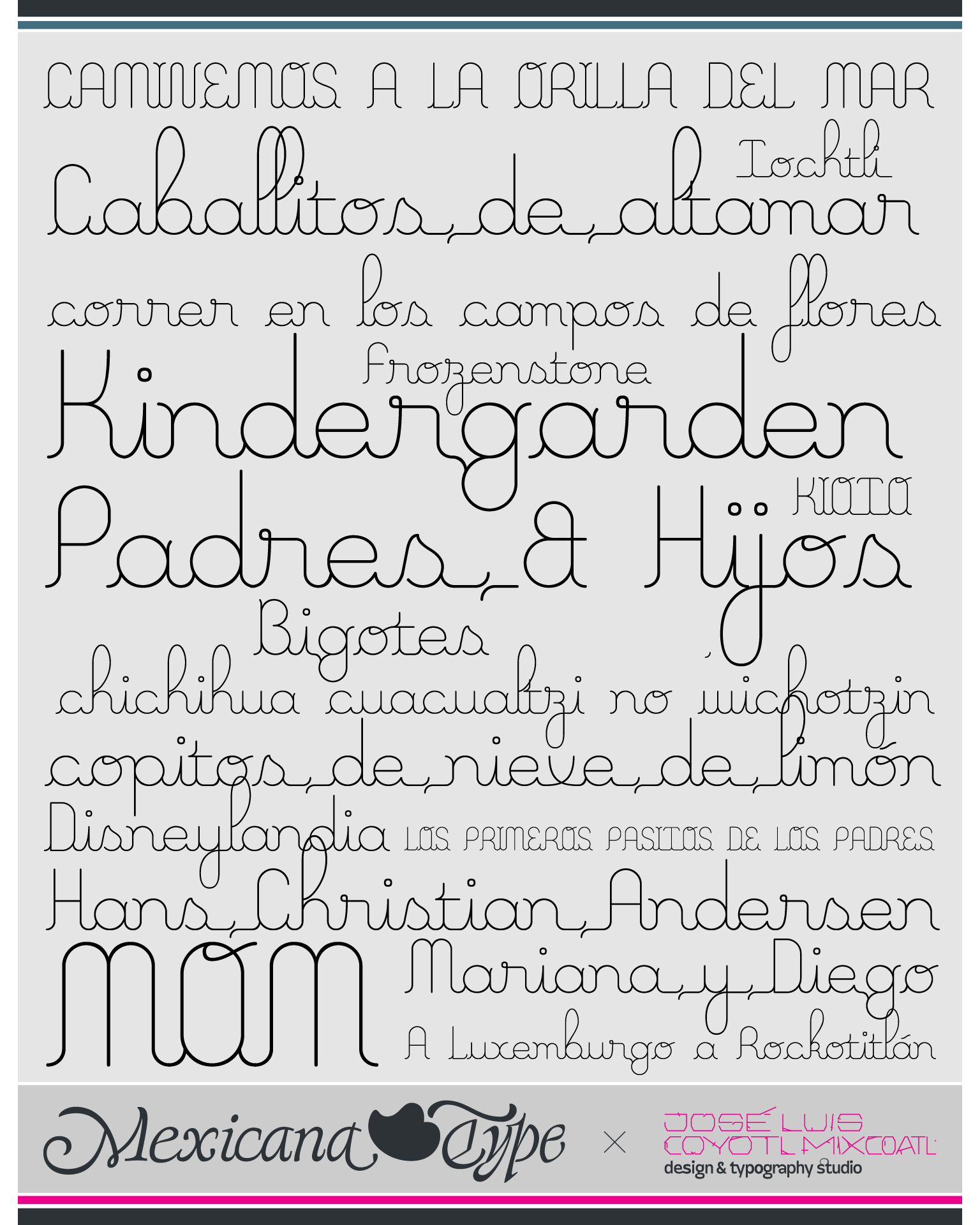
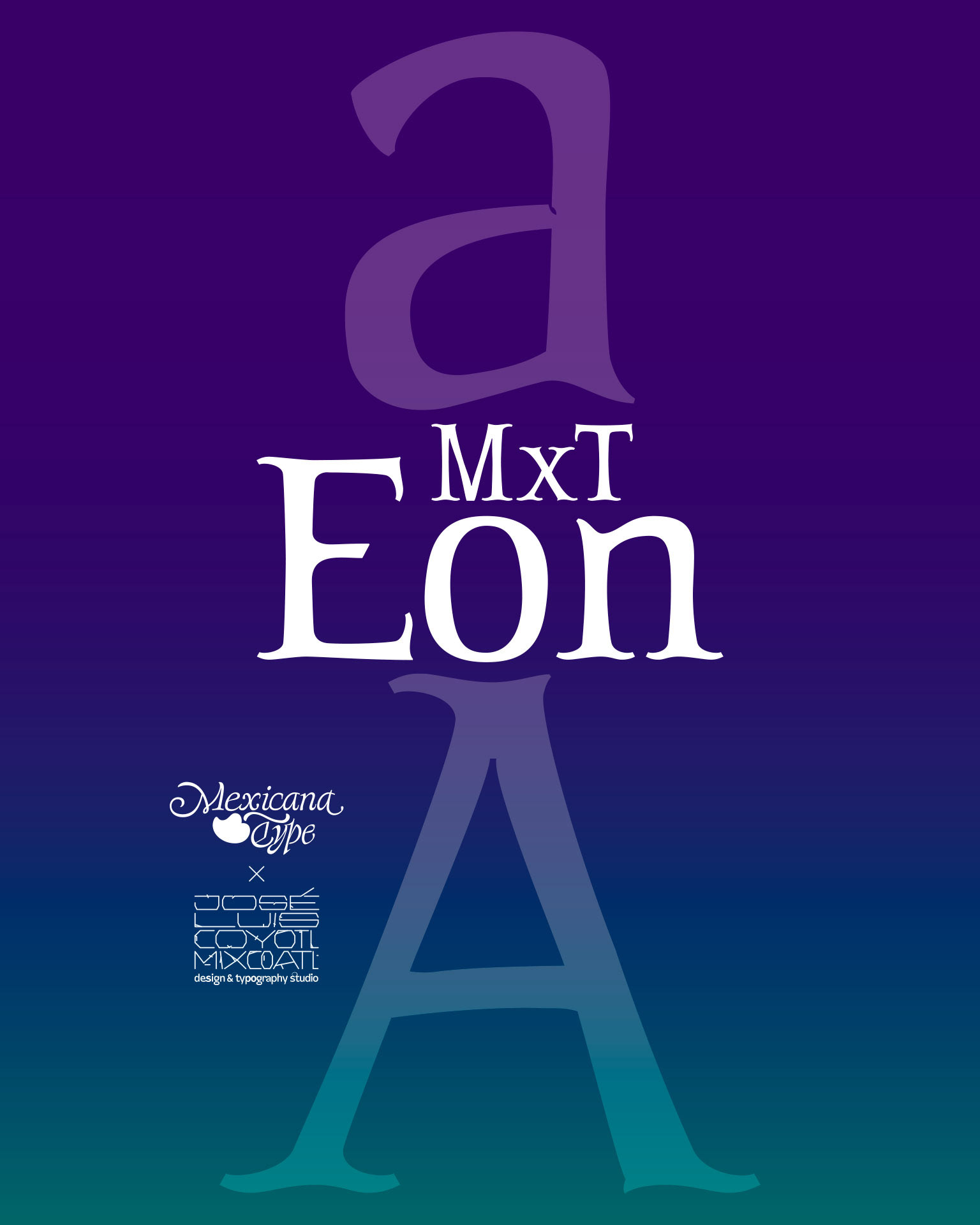
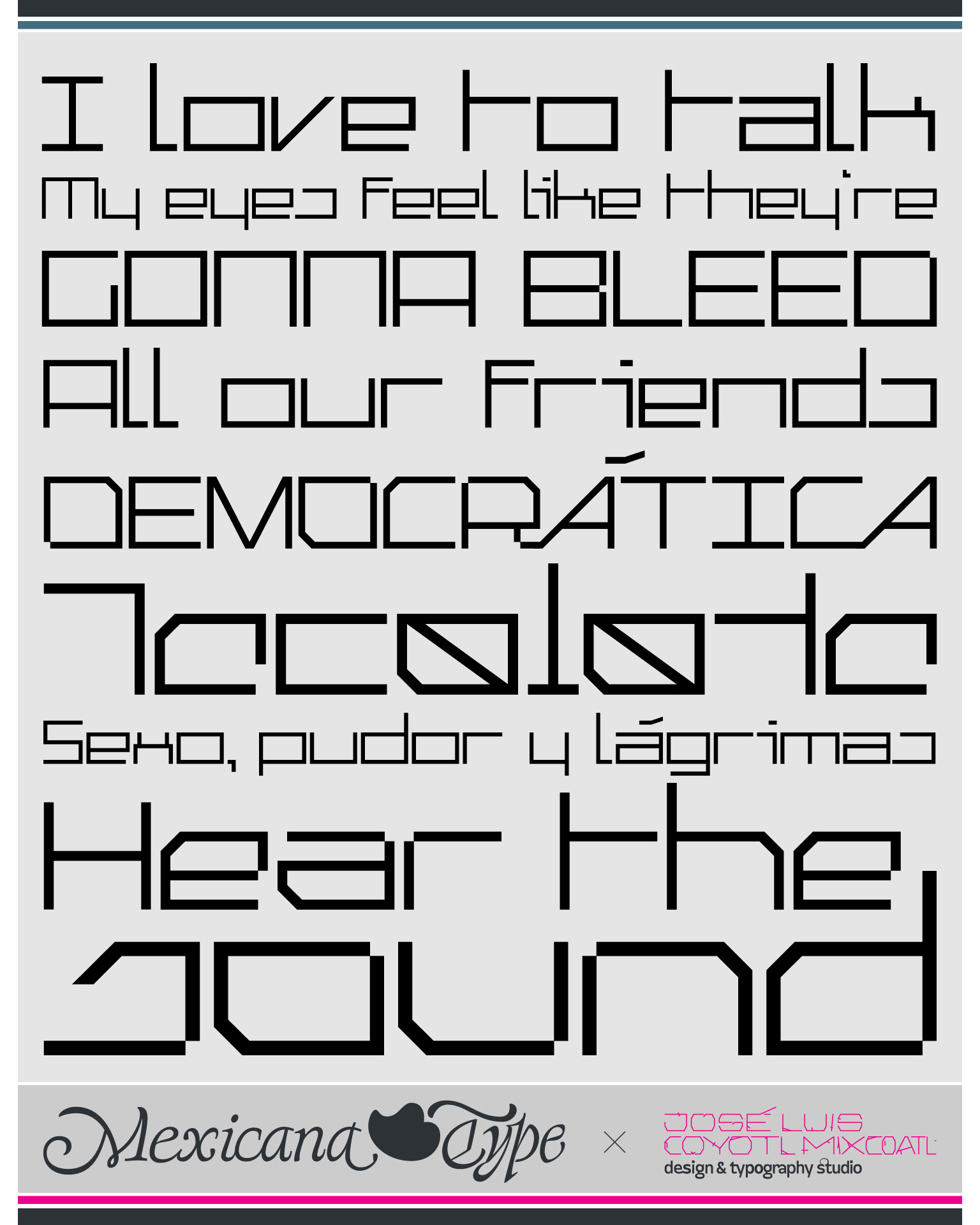
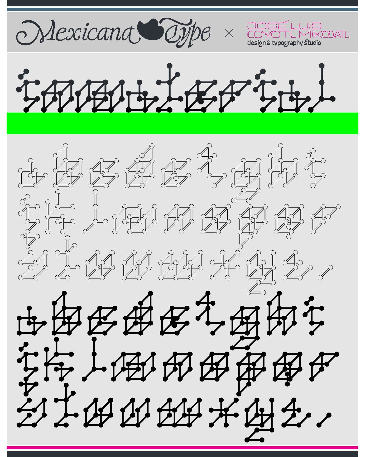
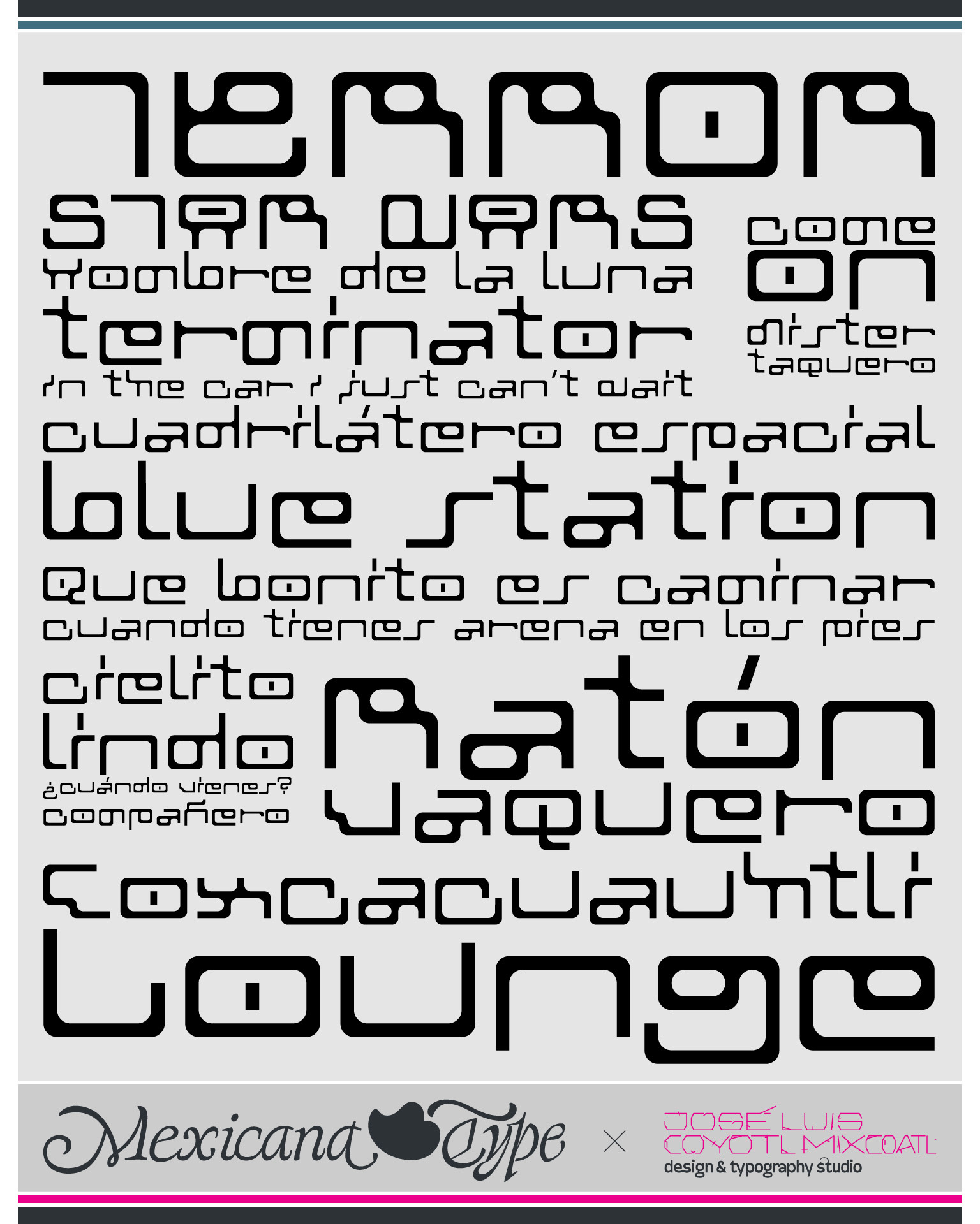
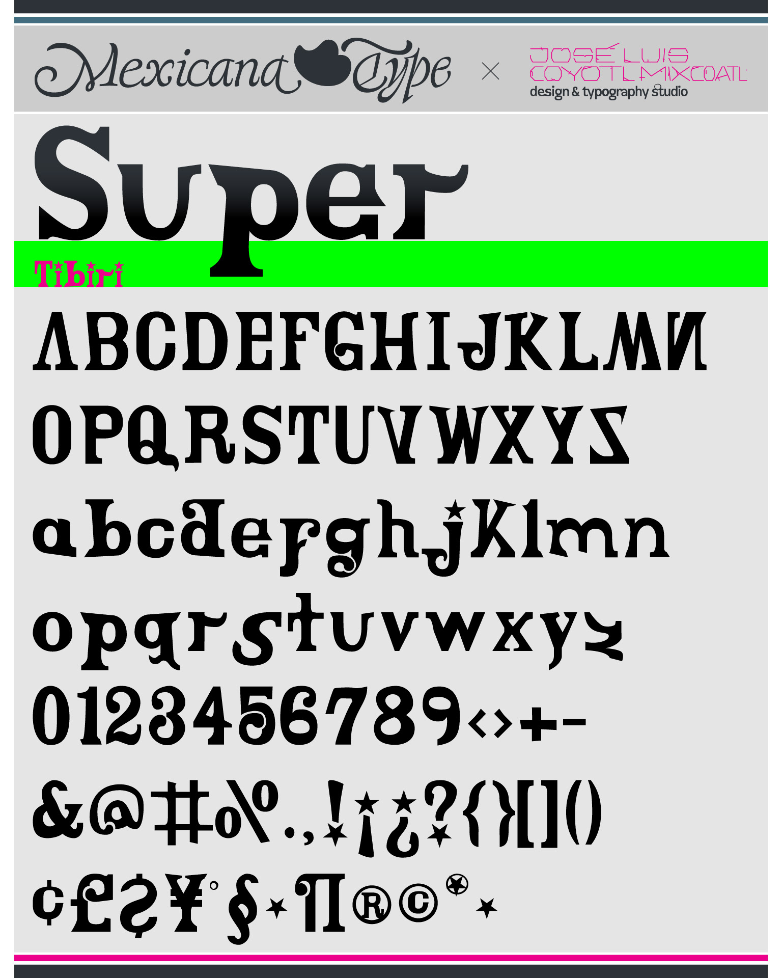
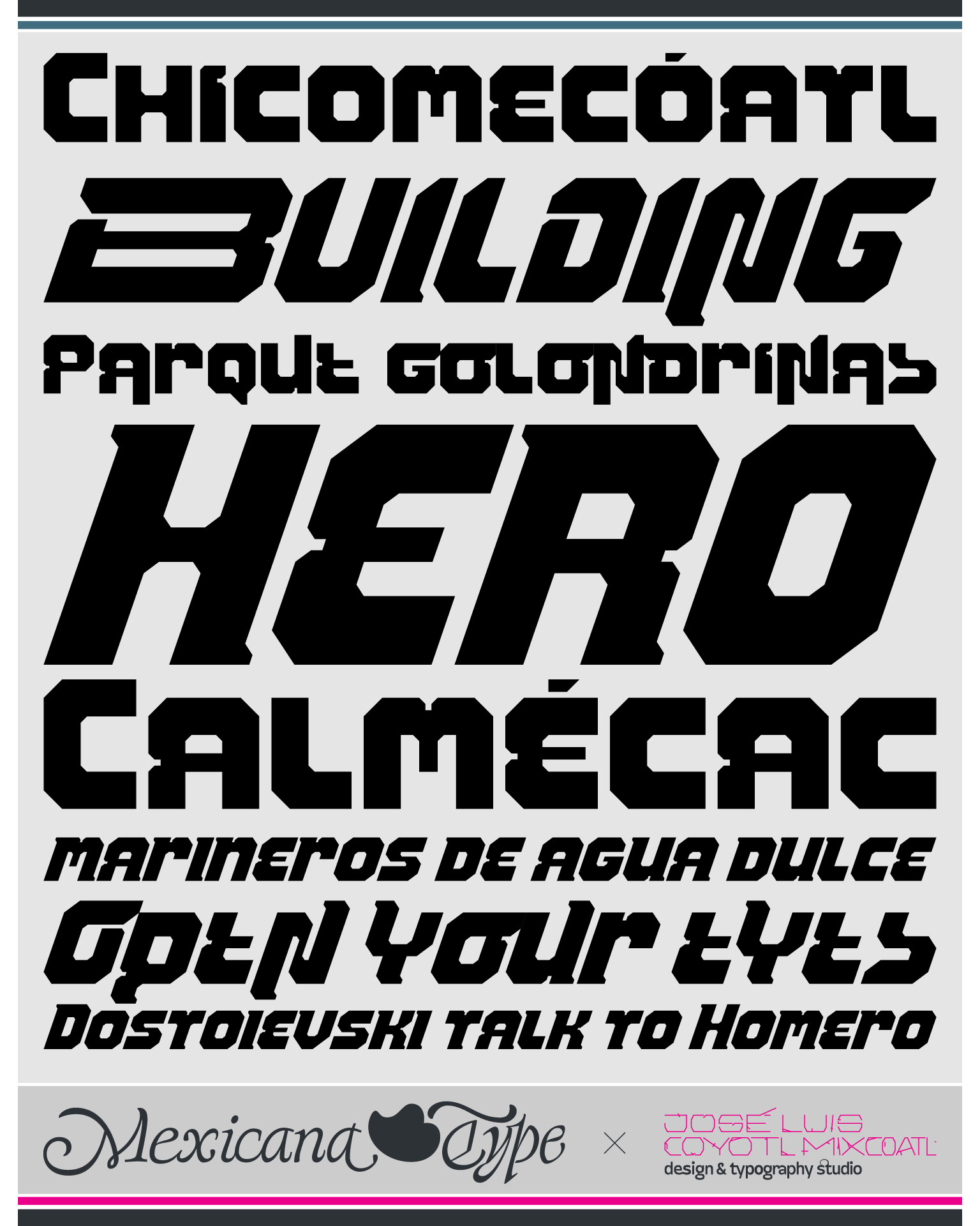
Here above, a showreel with a selection of fonts I designed since 1998 when I started designing fonts as design's student, through 2026, that some of them are already in the process to be re-designed and updated, so I feel excited and confident of great stuff will come on the way.
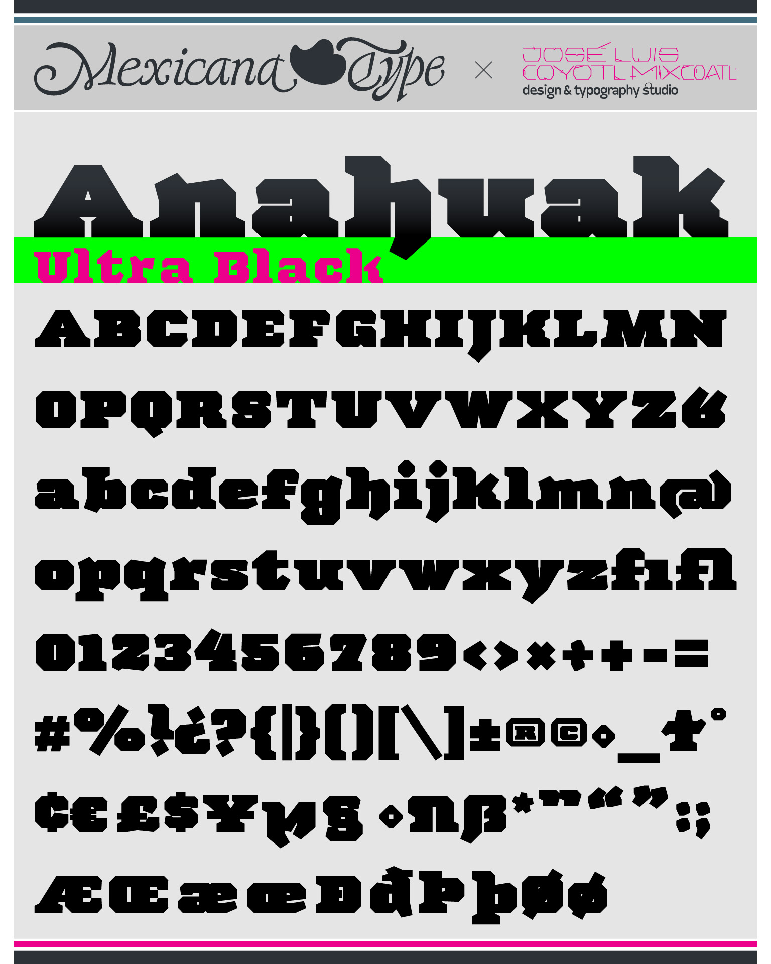
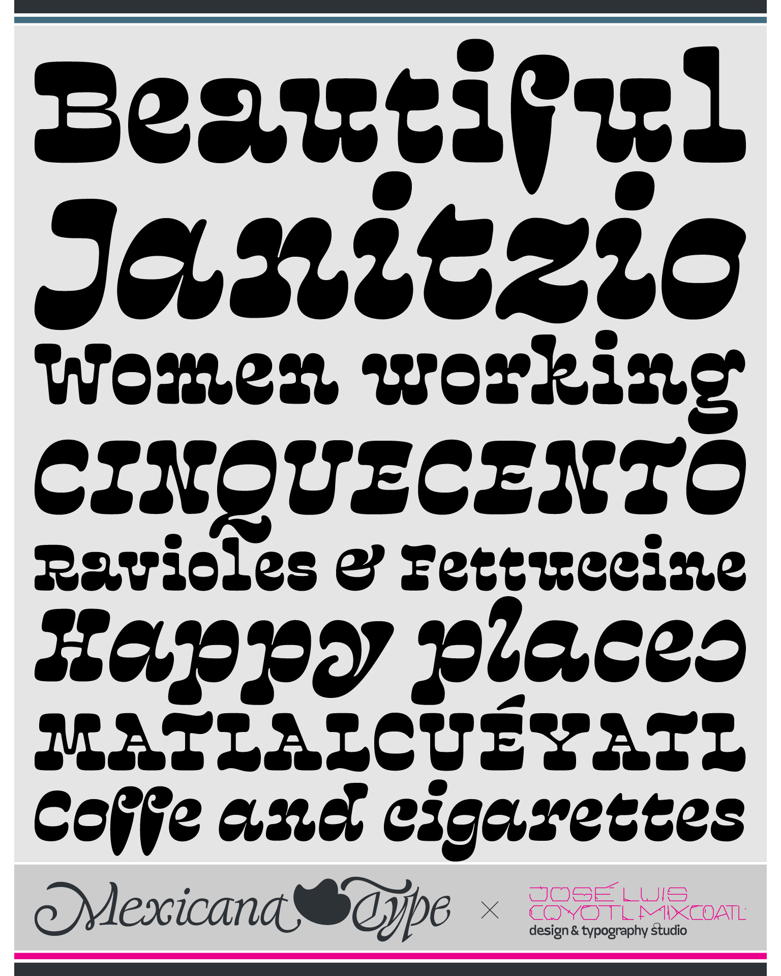
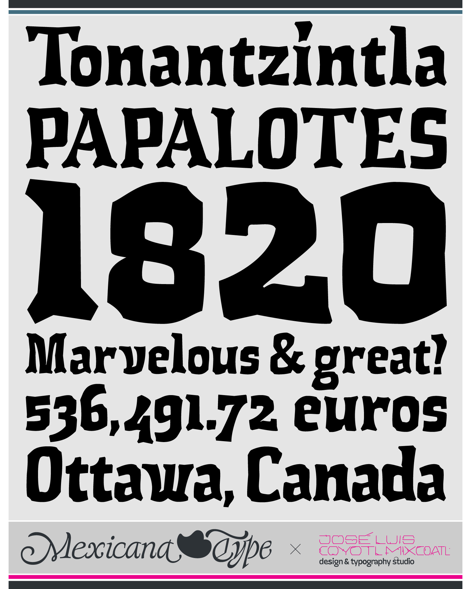
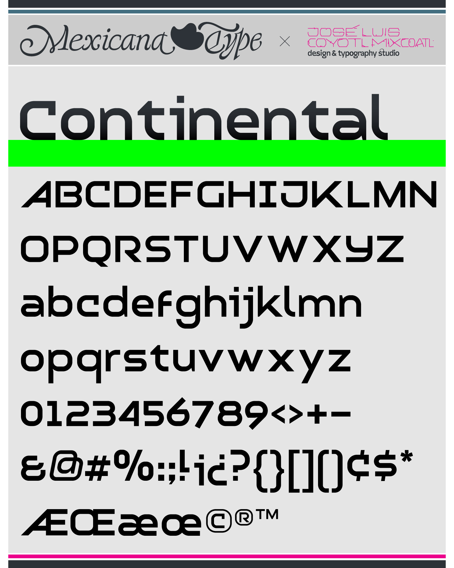
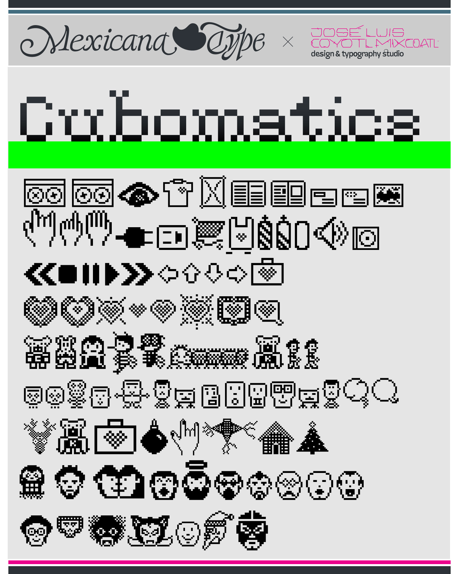
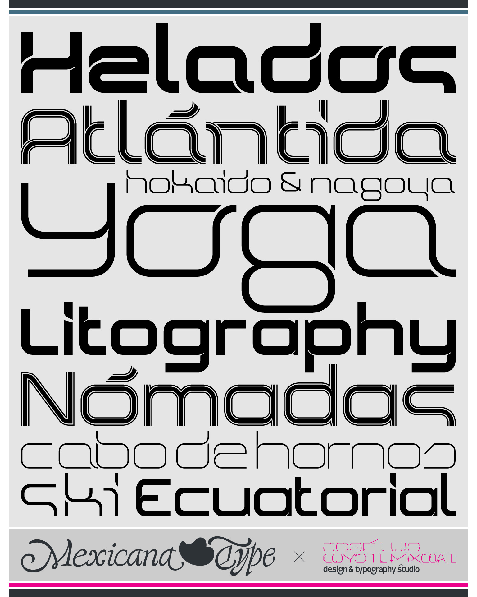
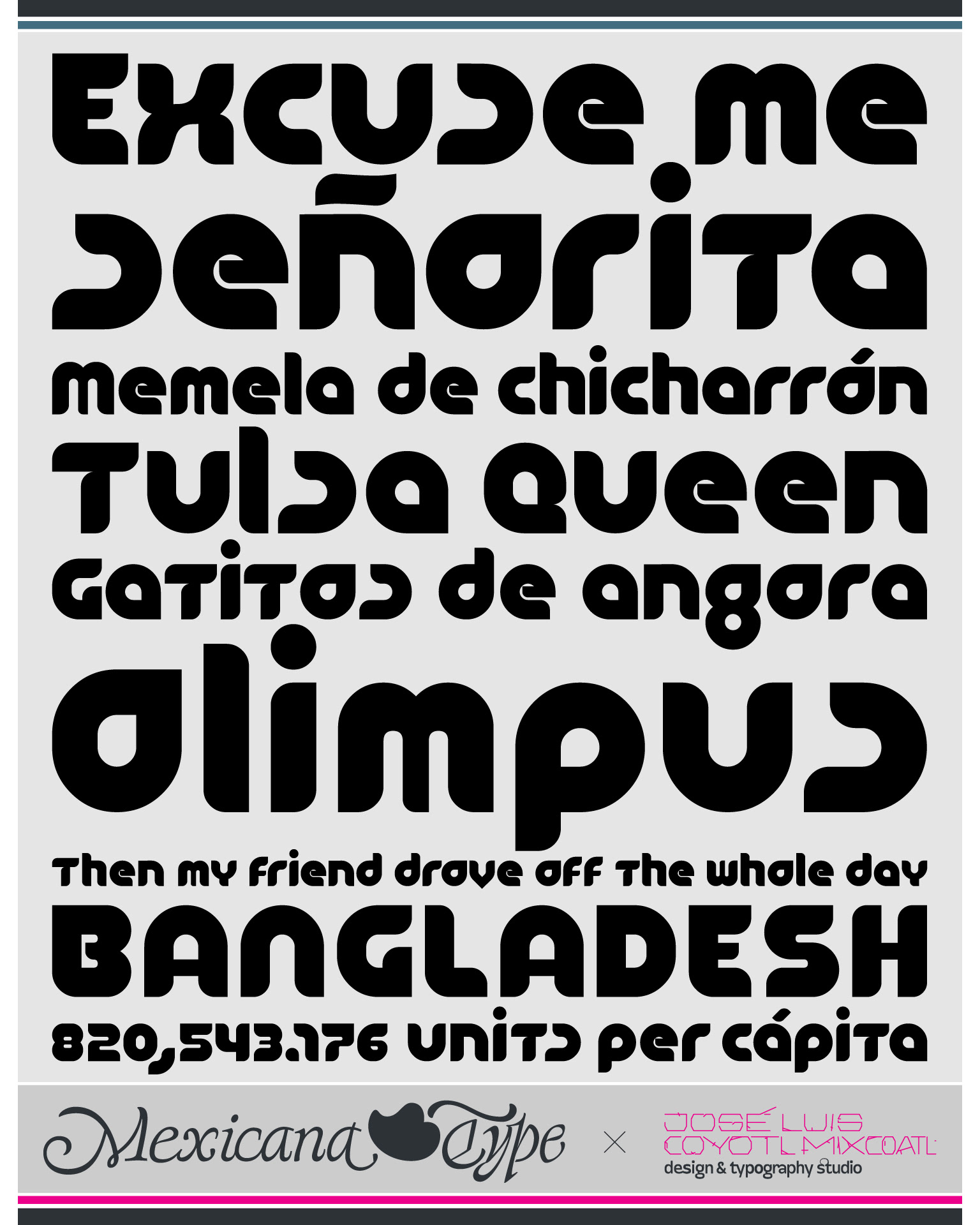
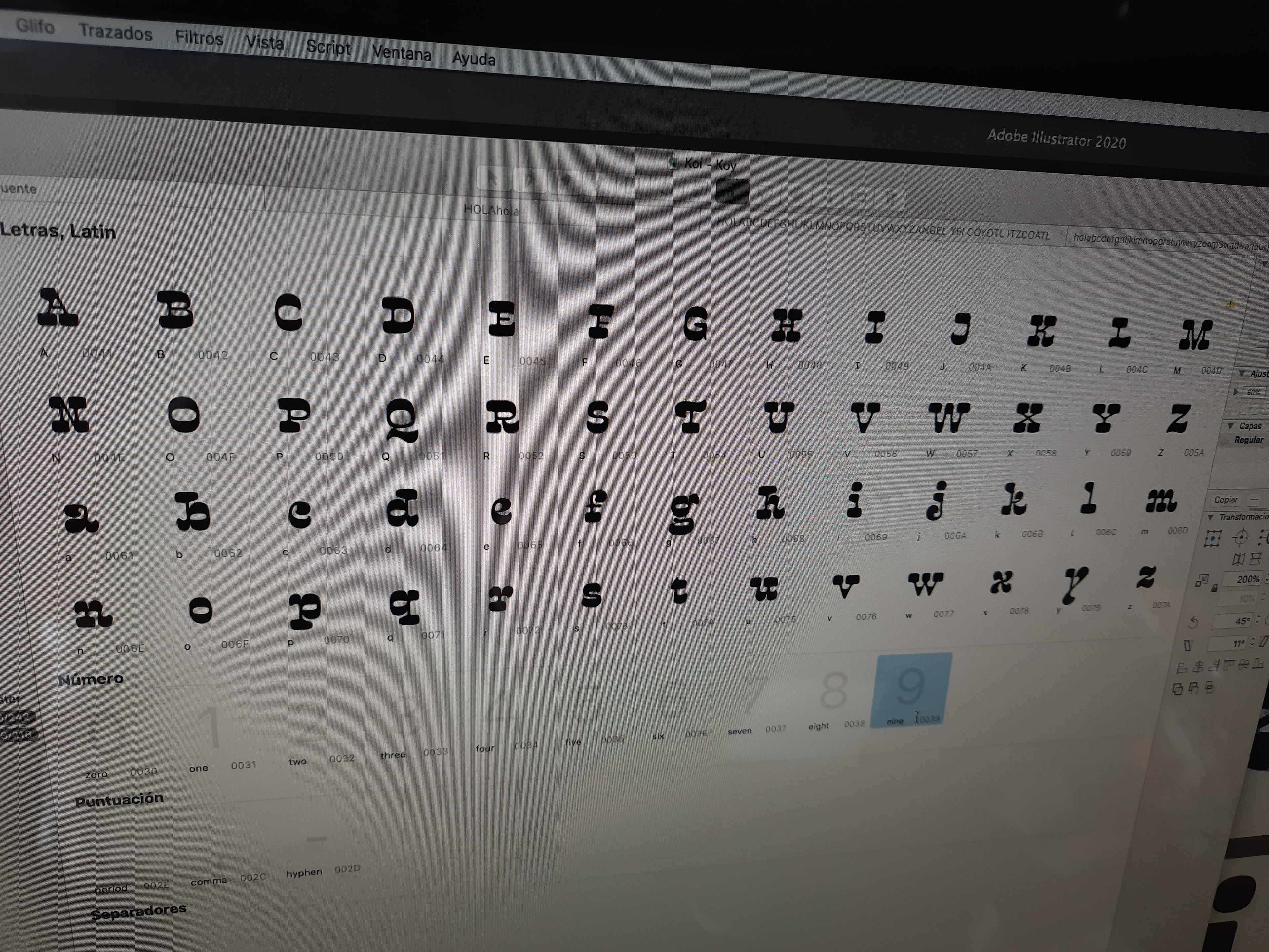
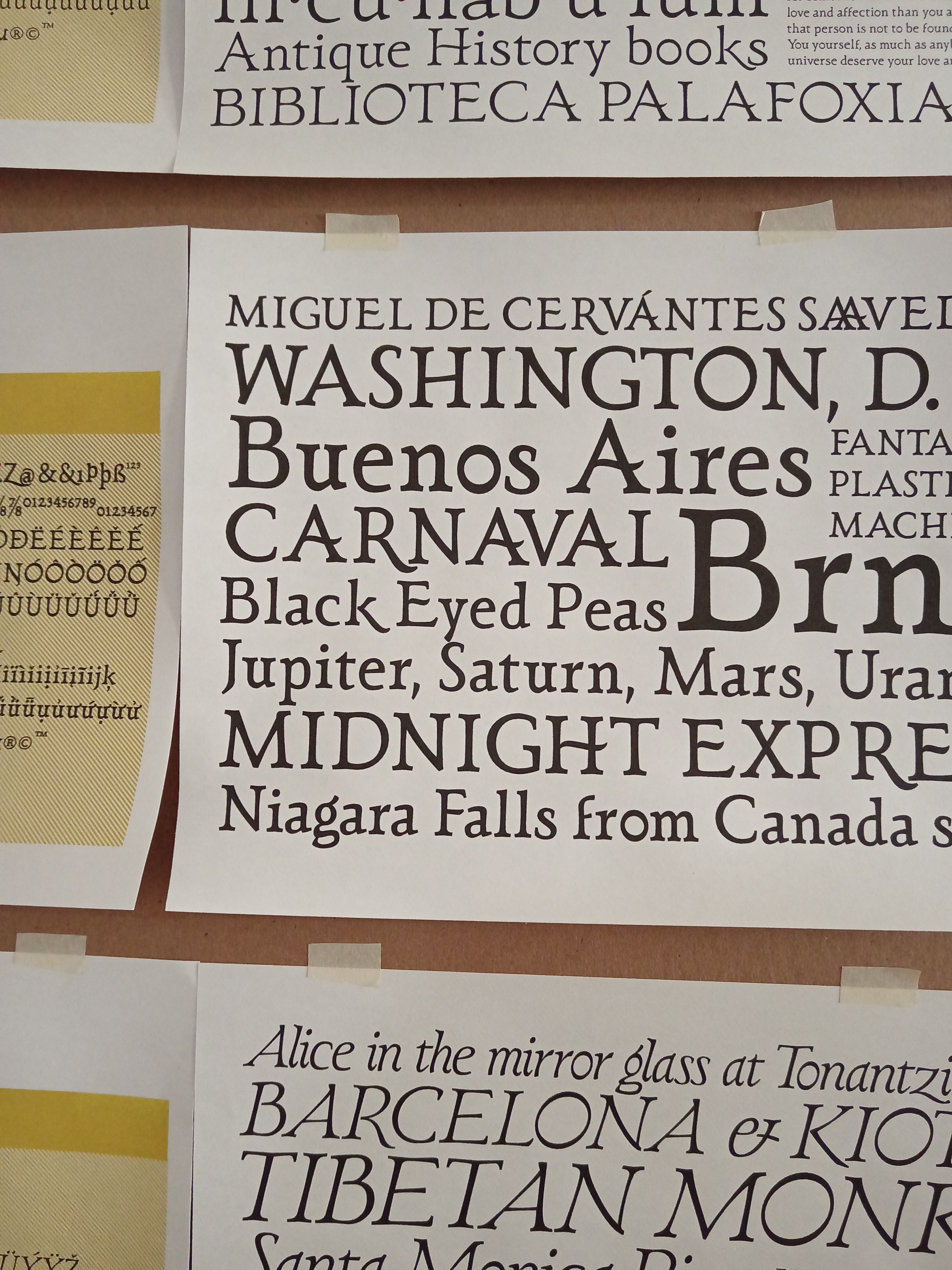
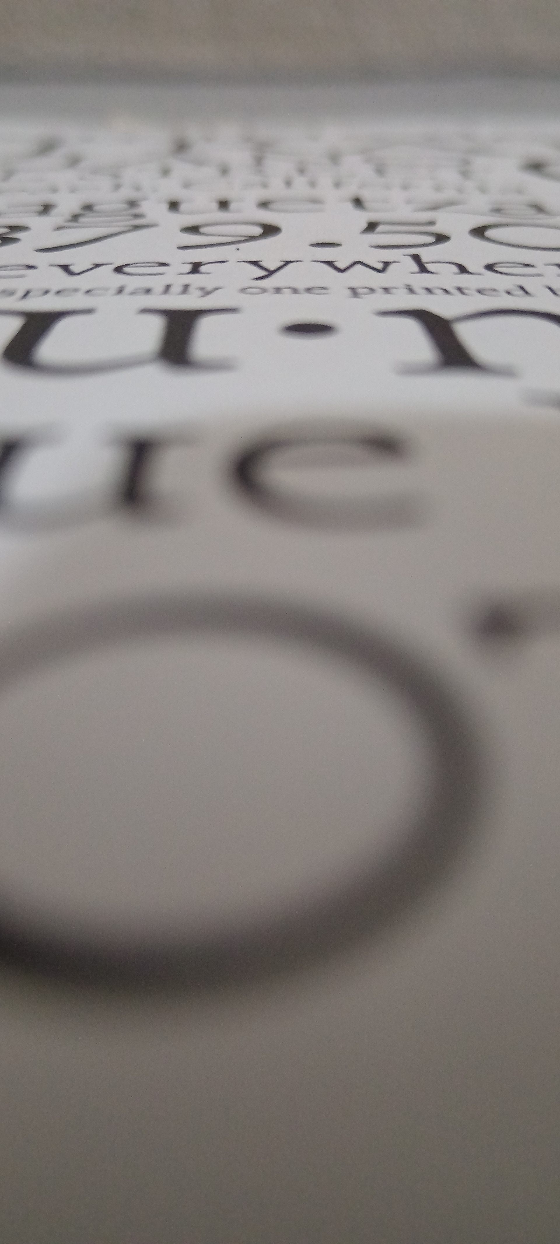
With more than 50 fonts & families, which are +125 individual weights and variations, alphabetical decorative and icons, and more than 230 type specimens, a huge collection fonts maybe so far than the average designers around the world.
You can also find the Mexicana Type website here: mexicanatype.com