Movies usually research their own imagery, including fake corporations, shops or personal marks.
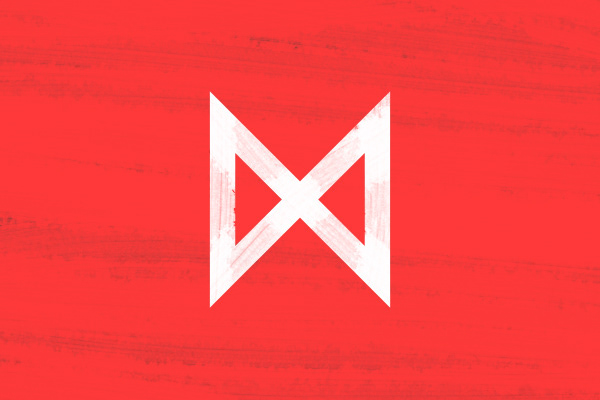
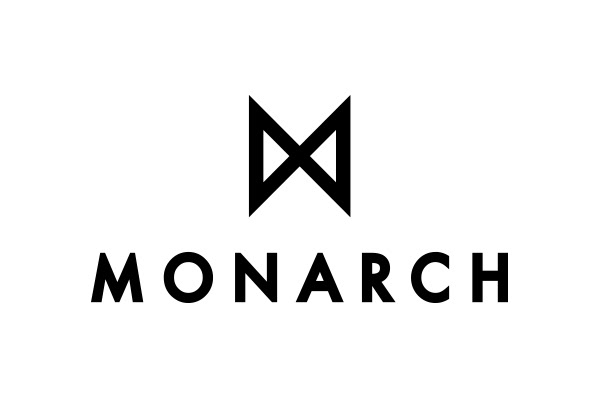
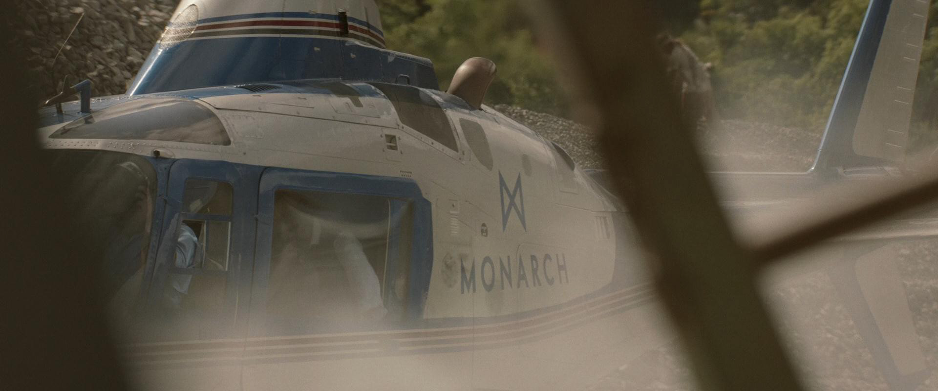
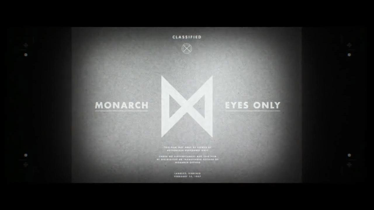
I designed this brand logo for Monarch, the secret project involved into the story of the last Godzilla movie, released in 2014. The main key to follow in the design development was making a hero element as icon. That should be look like simple, geometric and minimal, just like a 50's-60's style brand designs, as the ageless design of Paul Rand's work and others as key references.
I designed this brand logo for Monarch, the secret project involved into the story of the last Godzilla movie, released in 2014. The main key to follow in the design development was making a hero element as icon. That should be look like simple, geometric and minimal, just like a 50's-60's style brand designs, as the ageless design of Paul Rand's work and others as key references.
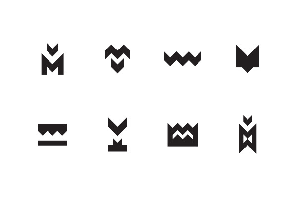
An abstraction of the capital letter 'M' becomes as icon. There are some symbols to see: a two face letter 'M' and a monogram at the same time, the geometric and simplified shape of wings (refering to a monarch butterfly), the target mark of an 'X' and four arrows pointing each other. Simplicity is not so simple as it looks to get it and to do.
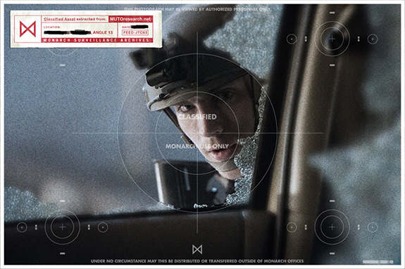
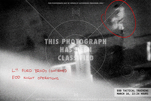
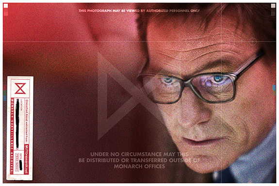
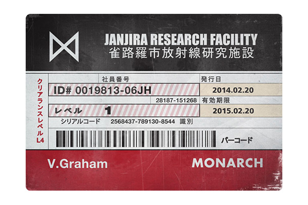
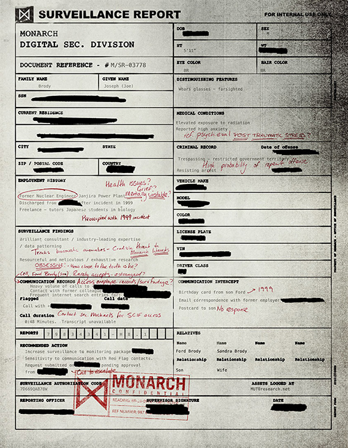
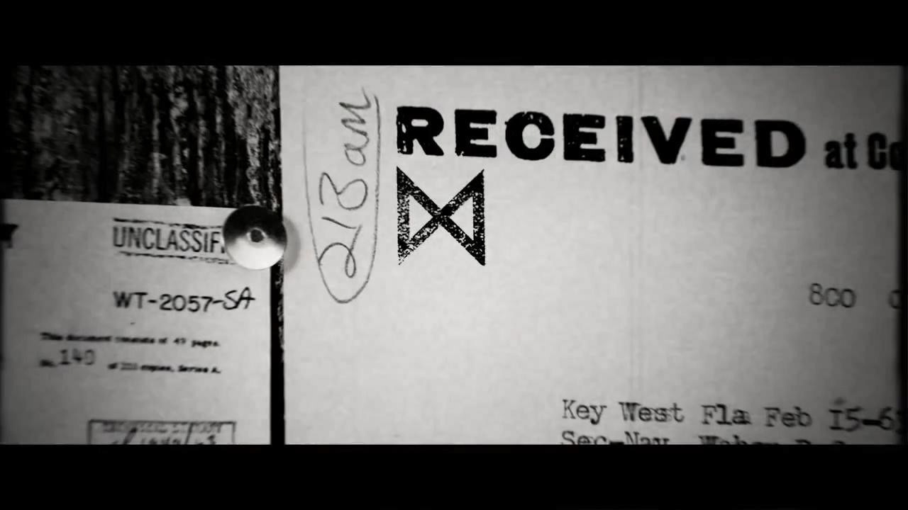
There are a lot of different ways to use the logo. I got some samples (not made by me) from different sources but mainly from the nice viral marketing campaign website page mutoresearch.net developed from the movie for show how the logo works in different ways.
*Designed in Prologue Films.
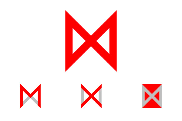
Logo Exploration