
San Andrés Cholula is a municipality based in Puebla, one of the most important states of Mexico, with more than 150,000 people and also one of the most growing cities and economies in Puebla and México.
The challenges involved in a new government also add to the projection of his identity, his perception not only in what assertiveness of its operation and about the public service, but also in the way of how its brand spreads his objetives in elements inside and outside.
A system of graphic elements were proposed and developed for the Municipal Government of San Andres Cholula based on different representative values of the environment and the projection of government policies for a better complementation in the proposal of graphic identity.
First, I may take in mind that San Andrés Cholula is a municipality that empowers a consistent growing through the last decades becoming one of the most important cities in Puebla, even in a national context. But also, San Andrés Cholula is also known as the most ancient alive town in America, also having the biggest pyramid on the basement all over the world. A mixing of deep tradition with a modernity feeling brand was required.
So, the idea was to create a contemporary brand but also with some element that call antiquity. The government wants also represent some other additional concepts, based on its government project for the next coming 3 years in which they will be working on.
I that way, through the research, there were some concepts I want to work with, like the great pyramid of Cholula, originally known as 'Tlachihualtepetl', that represents its pre-hispanic past, that was build on different shapes representing the number of towns and suburbs into the municipality, even five horizontal lines that calls the government actions. Also, besides the pyramid icon are graphics in reference to the industrial activity and the growing development. On the top of it, three person icons arise the stairs of the pyramid, which in the spring equinox there's an important ceremony related with ancient way of receiving vital energy from the universe on this considered sacred place becoming as one of the most highlighted events of the year, and also represents the mixing between people and government.
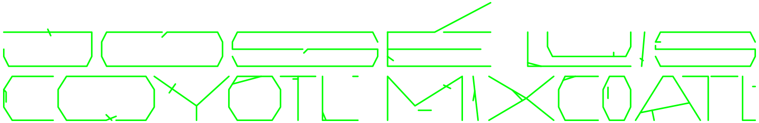
The brandmark was made as a custom type with a typographic solution with unique singularities, also mixing lower and uppercases. Also there are custom type lettering as tagline as a secondary element for the brand, with a more human and cool feeling.
There are also a bar as a complementary element that takes the front facade of the municipal palace that supports additional information of the brand.
Different configurations were made for completing the brand system, cause it gonna be potentially implemented in a lot of different departments of the municipality. Also the color palette have some different options trying to keep a consistent brand program for the huge applications to come.