Tipografilia es the most known and consolidated type design, calligraphy and lettering culture congress throughout Mexico, with conferences, workshops and other activities around making type.
So, by 2018 edition, the number 13th, I was invited to design the graphic identity for the congress. Since there were great collaborations for the ID's in the past from another great designers. The common elements designed along the past editions were a fleuron and a custom title as logo.
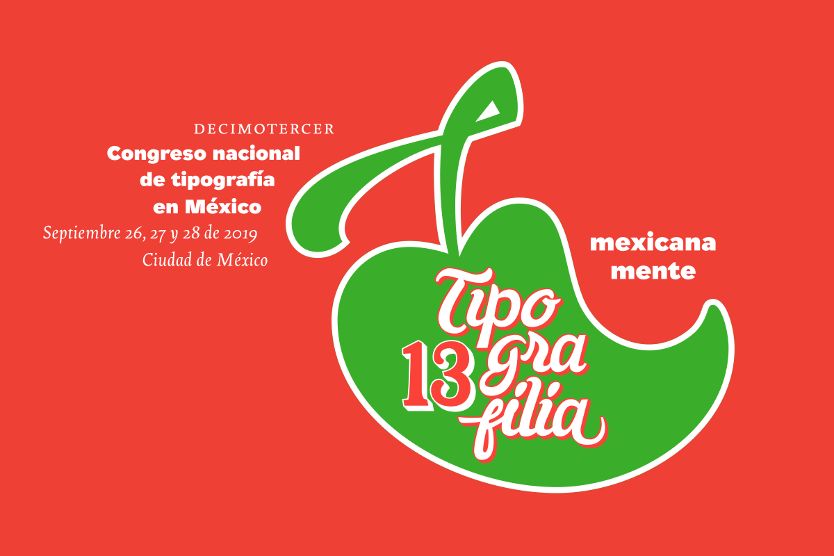
Every time, Tipografilia has a thematic thread that supports the logo as tagline, and also the activities around. By this year, the theme was 'Mexicana Mente', refering for how the type has an influence in the past and present in the mexican cuture and in the proffesional endeavours to the corrent times. So, after an exploration and case study, a concept research and a series of options I develop a fancy but significantly engaged elements with mexican culture.First, as type designer, I wanted to design a custom title, So I just made one based on a font that I design known as 'Central', a script font influenced by the expresive handpainted on the mexican vernacular culture ads on the street. So I designed the name of the event 'Tipografilia' in a distressed feeling, breaking in three parts but beautifully integrated in a typographic composition. Also there were designed the number '13', also custom type designed with the letterpress tradition influence, cause Mexico had the first printing press in the continent of America, so it was also a matter of importance to re-take for the design.

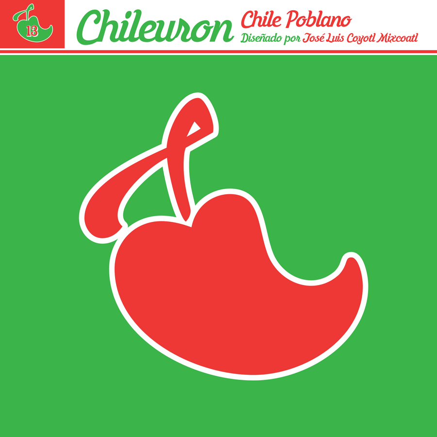
Finally, I developed and design a fleuron, but not like a traditional from the european vignettes (like vines, grapes or other botanical elements), but thinking on something that could represent the mexican culture. So I made a series of chiles (chilies), maybe the most common vegetable on the mexican couisine and even in other matters like language. So I designed 13 different chilies/fleurons, that were named as "Chileurons". The main fleuron for the logo, illustrates the 'Chile poblano' maybe the most popular chili around Mexico, also its name refers from the place that I come from. The other ones were designed based on another varieties of chiles from different places in Mexico, including fresh and dried.
All those elements were integrated in one composition: the number, the 'Tipografilia' word and the fleuron in one piece, also the choice of the colors were taken from the national colors, that conceptually refers passion, nature and purity.