


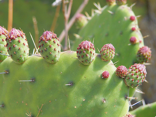
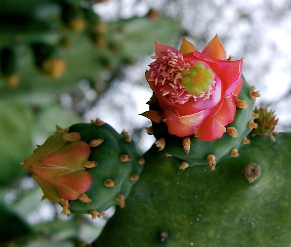
Logo developed for the local government in the town of Tlaxcalancingo, located in San Andrés Cholula in Puebla, México. Researched under the concept of the fruit of the famous mexican cactus: Nopal. Which is widely cultivated in there becoming the second national producer in Mexico. The fruit, called "Tuna" is a sweet and colorful fruit that blossoms a beautiful flower.
So, the logo is developed under this concept, modulating them and making a friendly selection of their colors and designed a custom type for the main name of the town.


OPTION B
(no acepted)

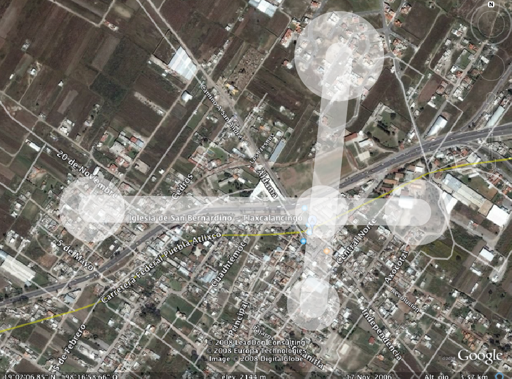
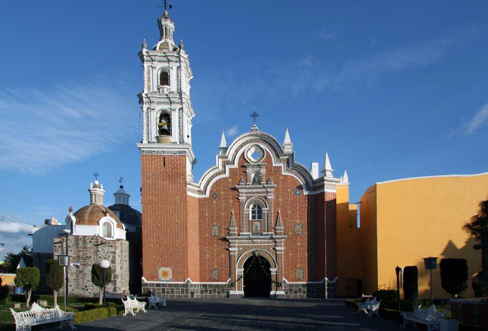
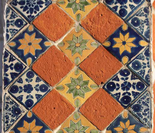
Tlaxcalancingo was founded in 1671 around it's main church, which is in the crosspoint of the 4 important hills making a shape of an imaginary cross of the catholic religion, also representing the four cardinal points and an abstract and simple shape of the T as a "+ (plus)" and each color square represents the eight churches in the town. The shape recovers the baroque-indigenous style made in the mosaic of the front of the church, recovering the orange (clay tiles) and blue (talavera tiles) as predominant colors, also using the custom type developed for this logo.

OPTION C
(no acepted)

An alternate version of the four hills and the crosspoint in which the community was founded, recovering the deep agriculture tradition and pointing out the nature environment on his colors.