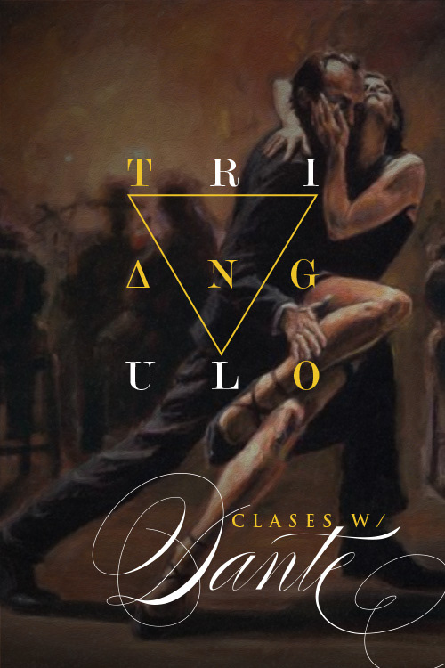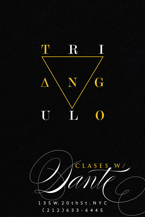
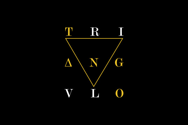
Logo design development for a tango dance hall and instructor in NY. Highlightin the key word TANGO on the logo becomes a big factor, without missing the name of TRIANGULO, so I study the word and taking the number three as the main number, I divide TRIANGULO in three by three modules to laid out the total letters and making a sort of crossword where you can find the word TANGO.
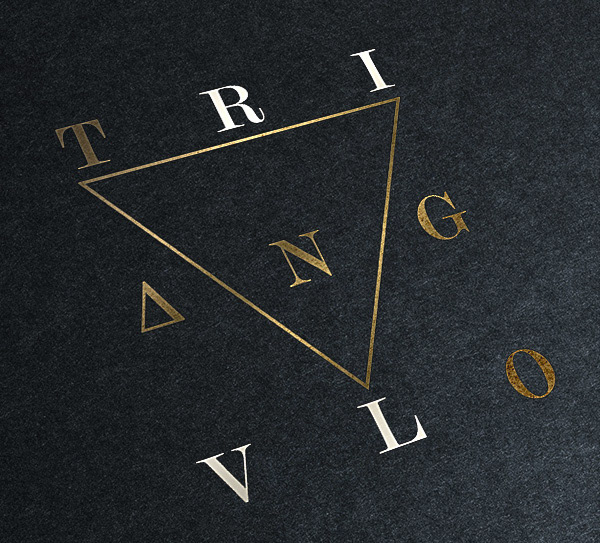
The color black, white and gold gives the elegance and sophistication of tango, with an elegant selection of type and a detail on the A as accent, just for getting more mystic and dramatic feeling. I use the triangle as leit motif for a simple and fancy patern.
LOGO
STATIONERY
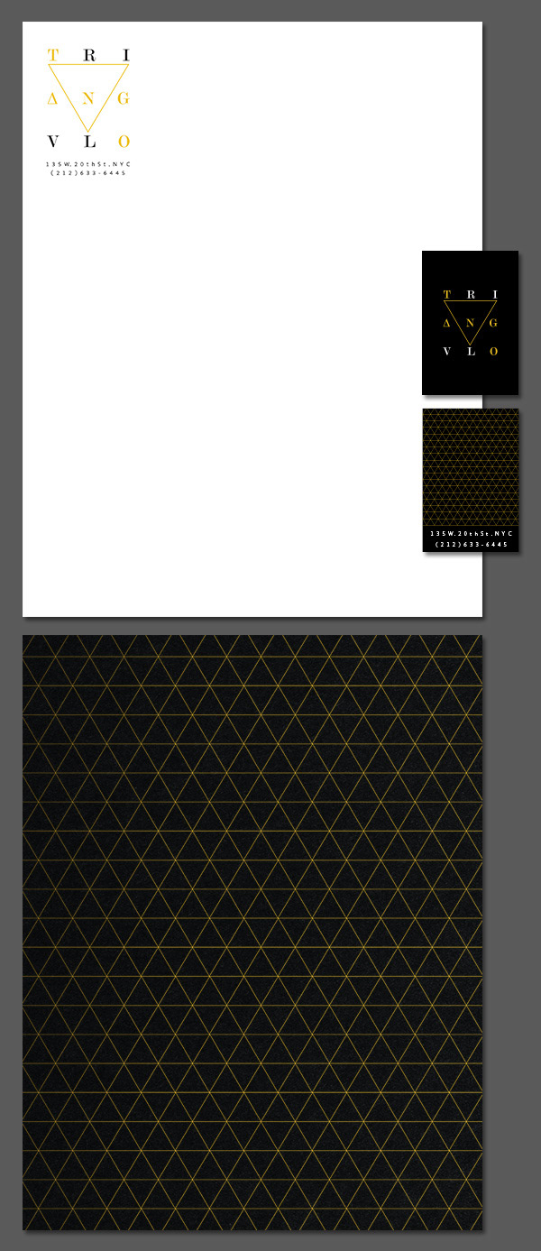
POSTCARDS