CECSAMEX is a 100% mexican company that produces and sell products of galvanized coating throughout Mexico to the different markets just as construction industry, livestock raising and other processing and manufacturing industrial sectors.
Over the years, CECSAMEX has stands its reputation based on the consolidation as a manufacturer of high-quality galvanized wire and a wide range of products from it, as well as its constant growth and challenges every day in a very competitive market.
The history of its growing has led it to go through several stages of restructuring, always seeking a balance between the quality of its products, service to its customers and its ideals as a committed company according to this growing reality.
The diversity of work spaces that CECSAMEX have on its facilities in addition with its constant growth in infrastructure and commercial area, plus to the increasing staff, customers, products and transportation of the company and abroad demanded an optimization in benefit around the environment of the company's brand.
Random overview of old logo and its brand applications
There were a lot of inconsistencies and a void about a criteria that can't manage the brand in a right way, so the company wanted to step forward with the coming times, a new brand mindset that empowers its identity and feel visually strong from inside to the new challenging times.
Into a competitive environment that would measure the new brand design goals, its implementation and expectations to achieve a better positioning in the environment and how it works, focusing their efforts on approaching their target market.
It also had to reflect its growth in a mature and contemporary graphic brand system, with elements created with the language that the company wanted to share according to the current times in the environment of its communications and the image that spread to show abroad with its clients, collaborators, suppliers and business community.
The conceptualization and design process of the renewed brand for CECSAMEX comes from a deep brainstorming and design thinking, a long process research, applying internal surveys, a benchmarking analysis, a study of its current situation and historic grow of its brand since decades back away.
Any perceptions, values and concepts were taken in mind that could contribute and will help for building a brand with a strong character and as a mirror of the evolution process that CECSAMEX is seeking to consolidate, scaling the perception that already has the brandmark in a positive way.
There's neccessary to create a system that becomes an identifiable series of brand resources in its environment, at the same time that allows to differentiate with an unique and enduring identity, with the potential to keep current in the long term, but also allows easily playful and updated in the future.
ICON
A star is the main element for the icon. The star is a symbol of fortune and its iconic sense of excellence, built into the grid of a square, but maybe its the most playful element, becoming larger and collapsable but functional as much as needed keeping its dynamic soul, generating intersections that give it an asymmetrical modulation and with a of great vitality structure.
Into a square, the grid defines the star's shape. the pentagonal center reminds the irregular shape of the zinc mineral stone, the sphalerite, which is the main material of the galvanized covering of the products that the company produce: the Zinc. The 5 peaks reminds the partners of the company, also the spikes of the barbed wire, one of the first and flagship products they produce since 20 years ago. There is also a hidden 'Z' and 'N' into the star shape which are the symbol of Zinc (Zn) from the chemical elements table.
WORDMARK
The wordmark was made and designed with customized proportions to match the star icon. Each letter is made from a simple, geometric and modular, with a thickness and efficient counterforms and designed to be functional in any circumstance, from a minimal scale up to large format. Built into a modular grid and with basic geometric criteria, with optical adjustments to understand its proportions.
The tagline font selection (Trade Gothic Bold Condensed No. 20) was taken thinking on being efficient spaced and to work in small and large scales.
The tagline font selection (Trade Gothic Bold Condensed No. 20) was taken thinking on being efficient spaced and to work in small and large scales.
SLOGAN
"Seguridad en alambre" was also a new brand element, that also got a naming process and after that, the design was also a custom type with an unilinear stroke with a light weight in a structure that was build over some real models with galvanized wire and then stylized with a nice typographical sense.
COLOR PALETTE
The color palette is pretty basic but also fancy with a lot of possibilities. The red an white are the heart of the brand, so it is complemented with a dark grey and other complementary colors into the same range in different combinations, since a monochromatic scheme, and also is open to be combined with other warm, cold and neutral colors. Those ones were selected being the anchor to giving a brand consistency but also that let them be remappped in many ways to being updated again and again across the coming years.
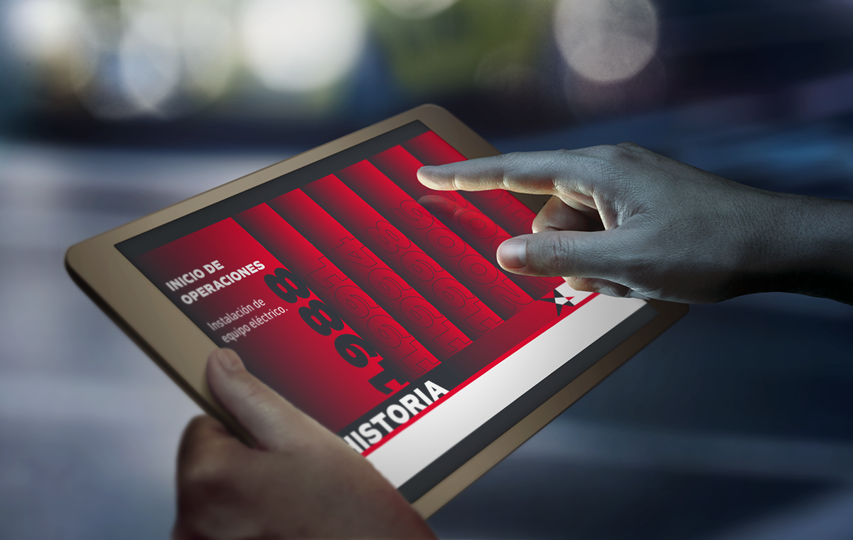
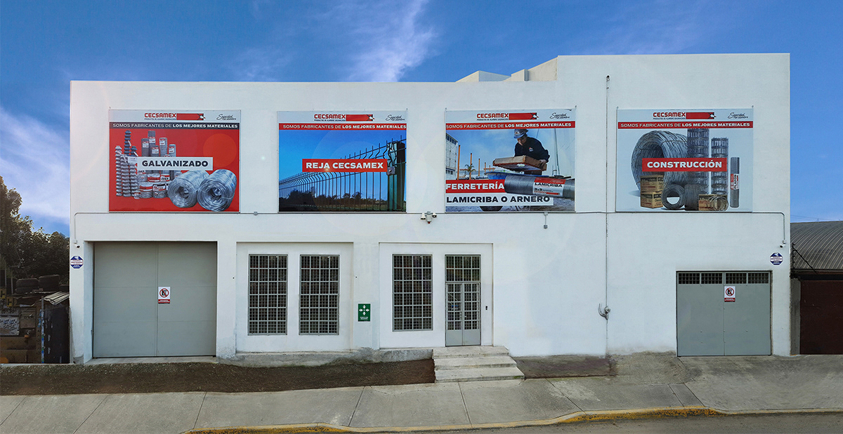
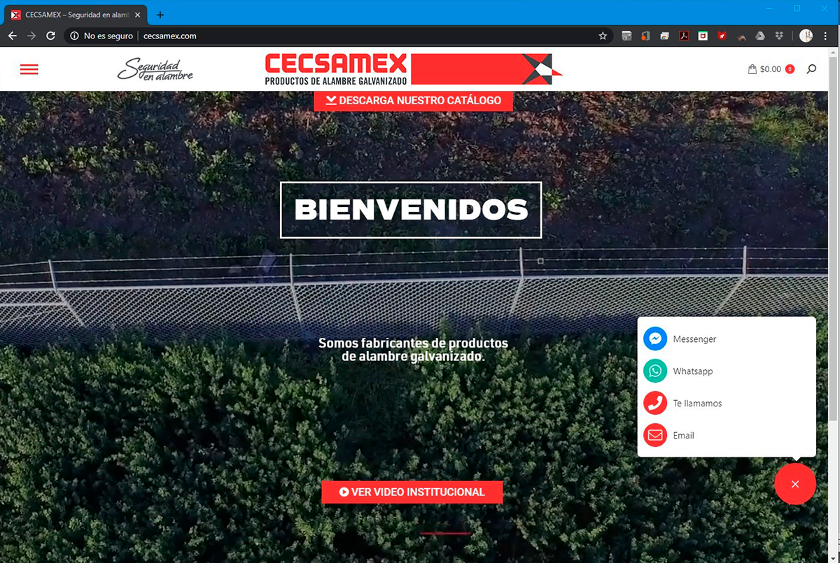
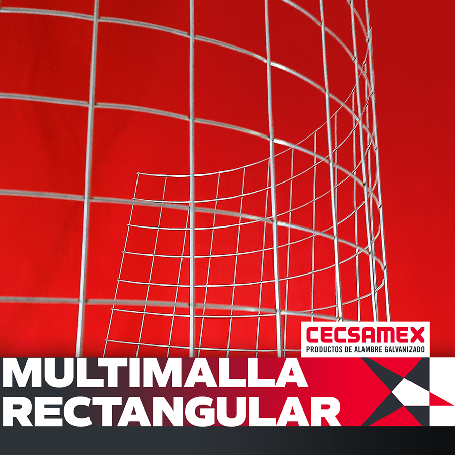
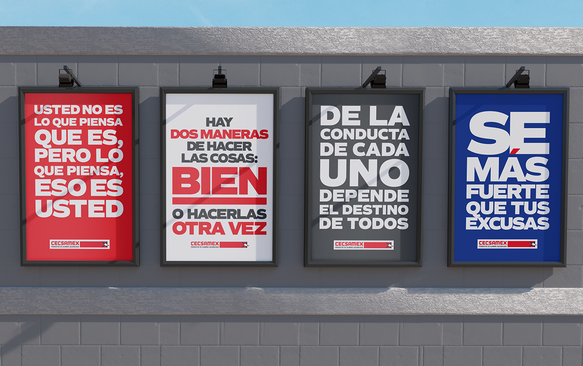
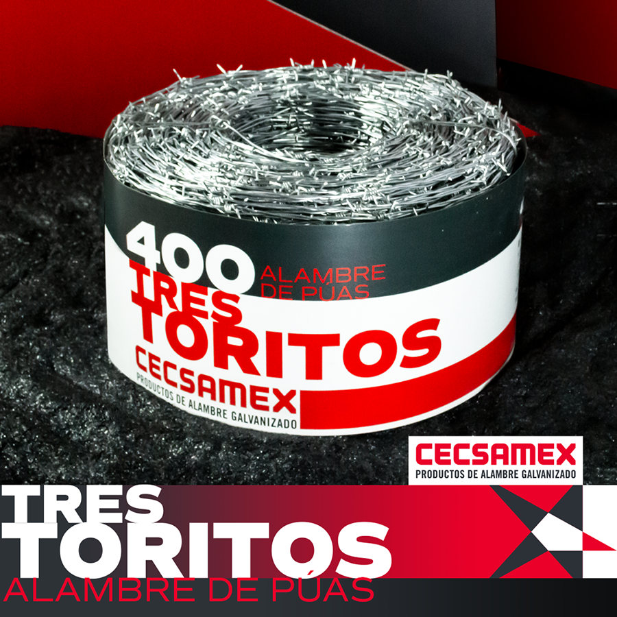
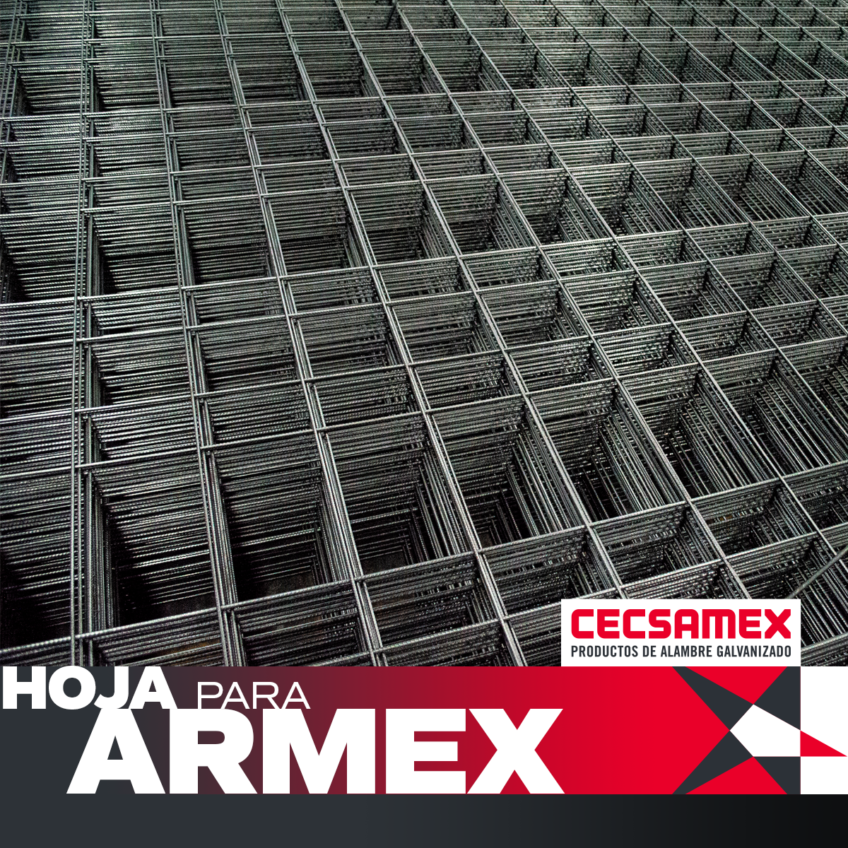
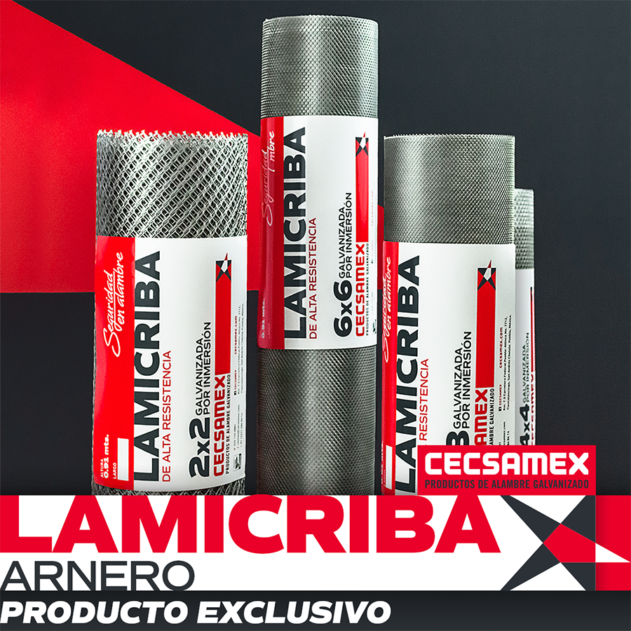
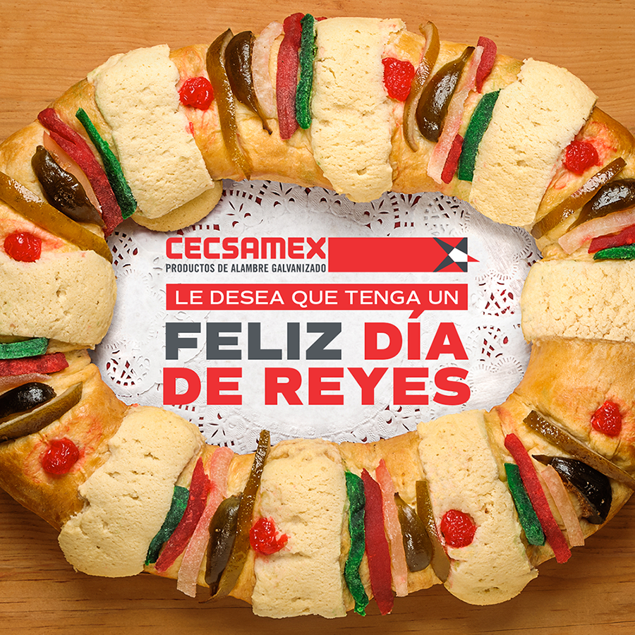
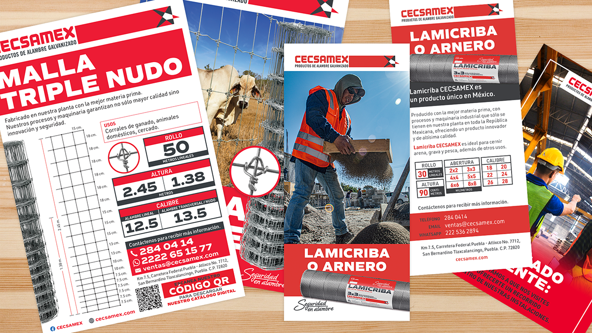
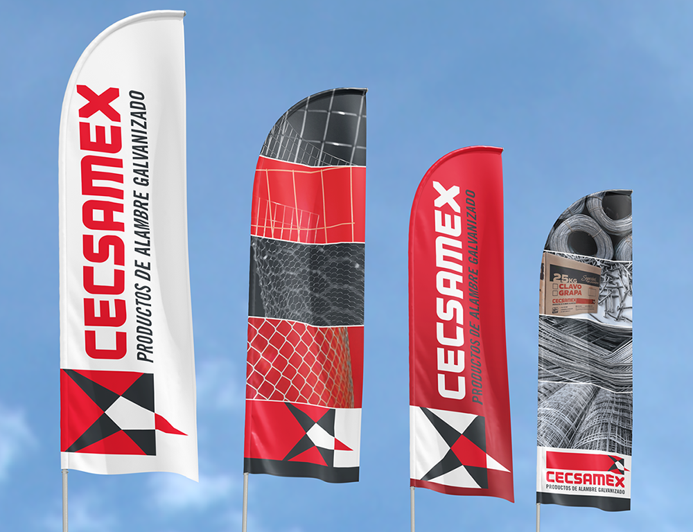
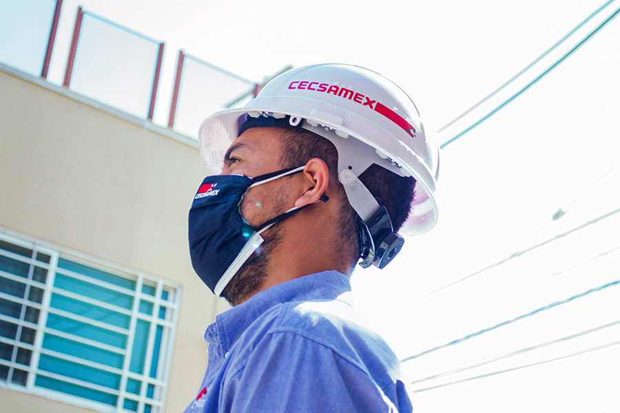
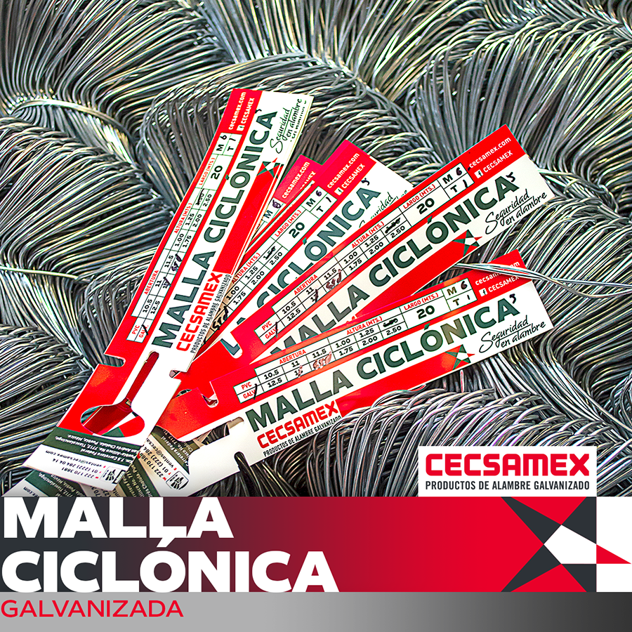
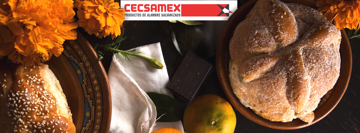
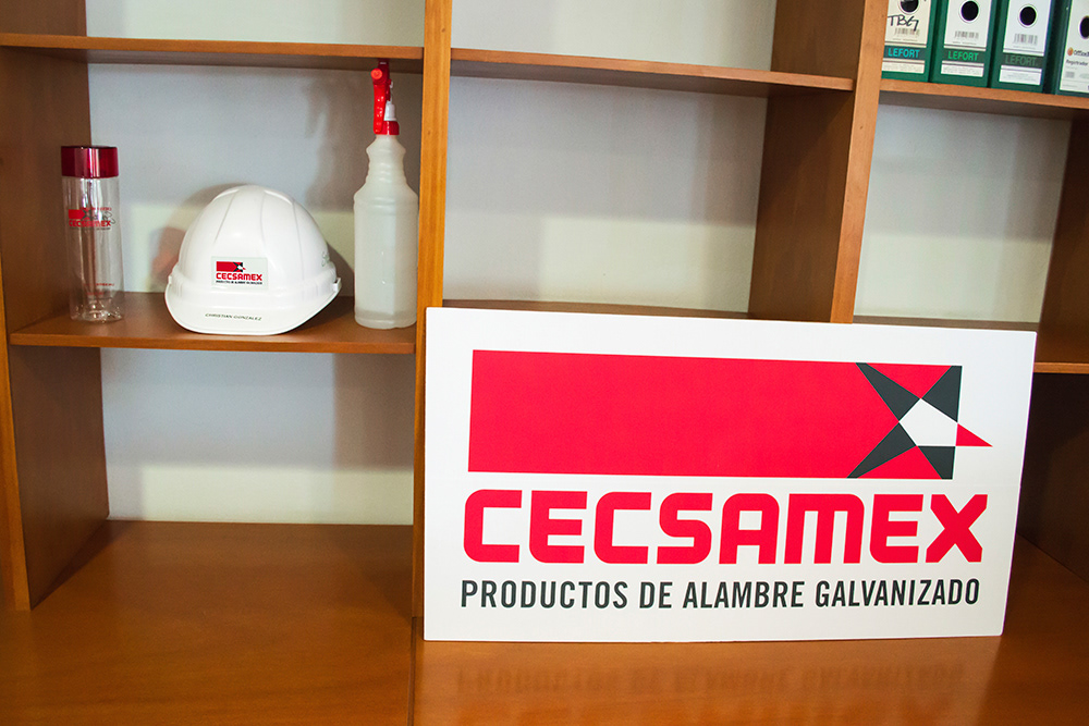
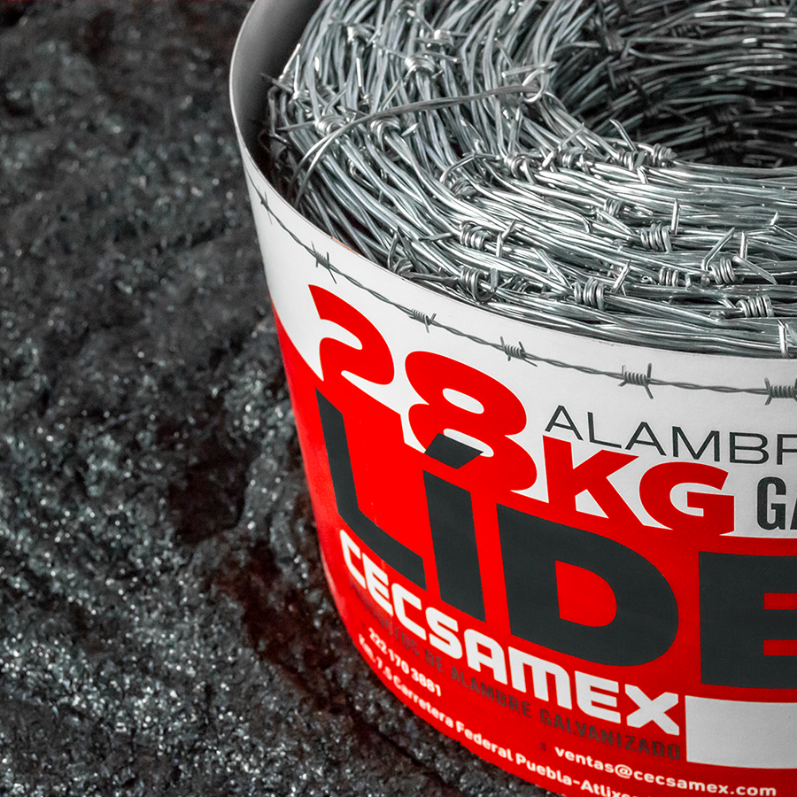
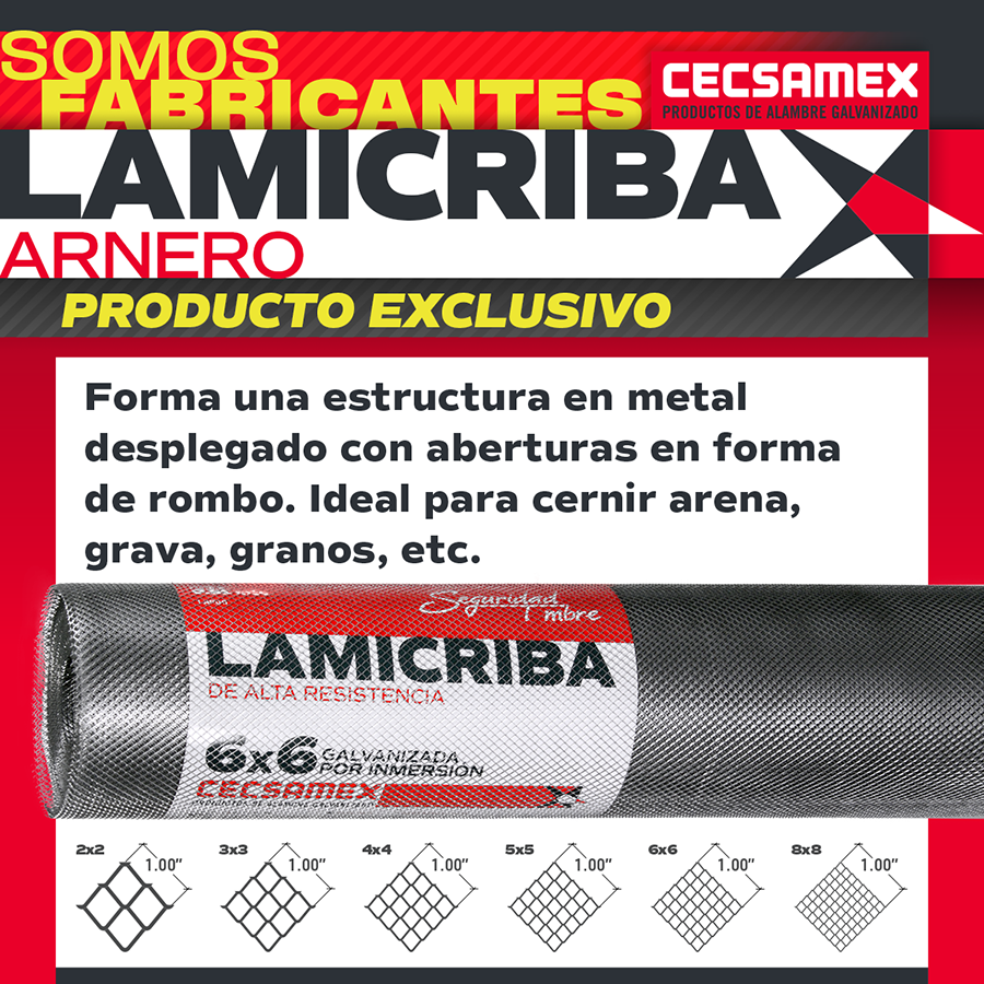
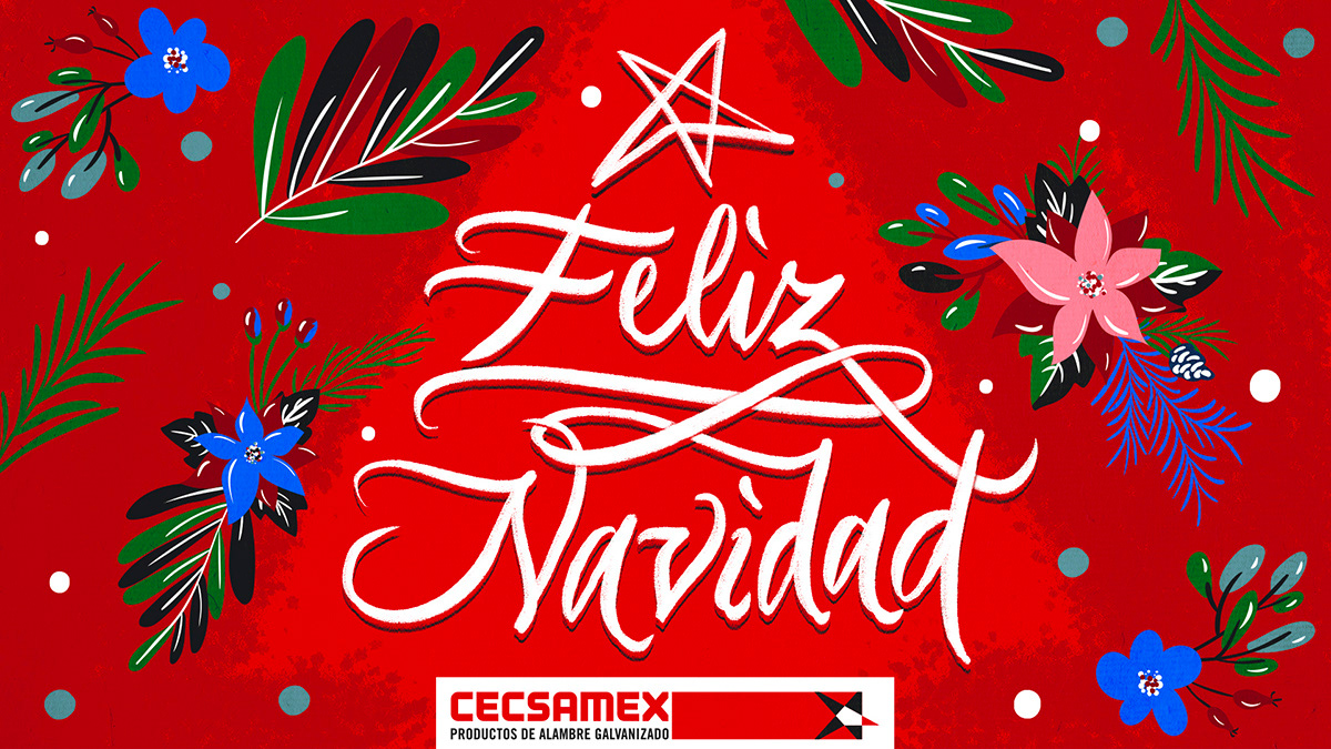
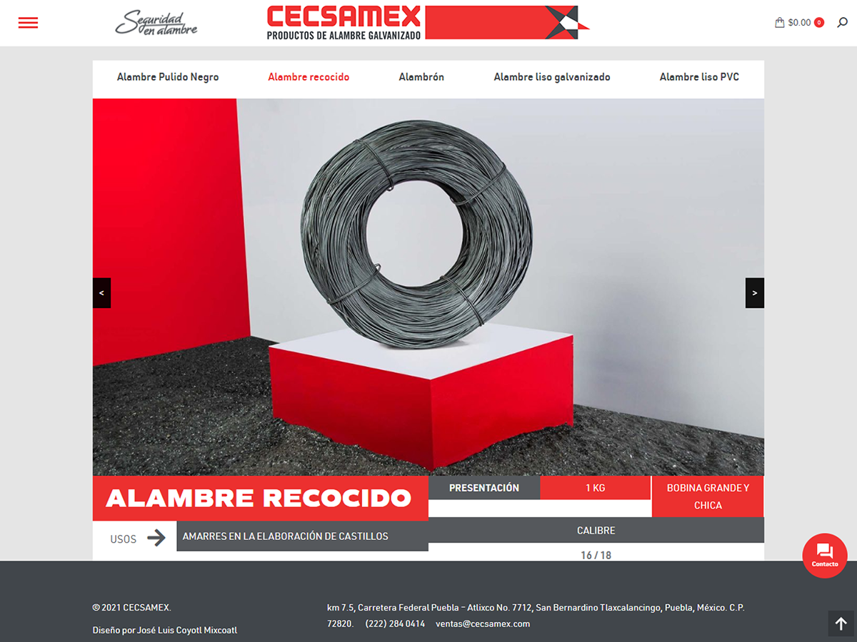
The brand design process takes two phases to be completed. The first one was all about to design and develop a new soul for the internal uses and seeding the possibilities of the uses on the outer media, even in digital and social media. It was pretty hard to develop, because we must start almost from zero, but the client was so open to everything I did, so that was a great incentive and let me explore and show the possibilities of a brand with a lot of expectations. During around 9 months I develop a wide range of design stuff, with the purpose of building a system that supports the new brand that remains for long time. A +150 pages styleguide were made with all the criteria for the new brand.
The second phase comes after a year I finished the brand mainly for social media, digital and new printed applications that consolidates and step forward a new level on the matureness of CECSAMEX throughout its first year with the new brand.
Along the time I work for CESAMEX identity, we also made our own library of resources, vectors, photography and other stuff, complementes with some few stock images sometimes.
There were a lot of items (±1000) and topics that needed to be designed around three years I work on this project for they can consolidate the new management of its brand in almost any area, here below are mentioned in a very general way, such as:
—Main brand & secondary versions
—Sub-brands for products
—Slogan/Tagline
—Color palette
—Typographic palette
—Photographic style
—Stationary
—Printed seller forms
—Commercial promotional items
—ID tags / wallets
—Product labels and packaging system
—Promotional items
—Printed material
—Dress/clothing
—Exhibitor pavillion graphics
—Social media
—Newsletters campaigns
—Digital signatures for corporative email
—Digital media
—Institutional videos
—UI/UX interface and website design (cecsamex.com)
—Signage/wayfinding system
—Custom type & Icon designs
—Outdoor graphics
—Infographics
—Brand product and lifestyle photography
—Copywritting
You can find some of the work I did for CECSAMEX in another pages into my website:
+Institutional corporate video 2019. link here
+Institutional short videos. link here
+Chronology spot videos. link here
+Videos and animations for social media. link here
+UI, UX and website redesign. link here
+Social media/Graphic contents. link here
+Product brand photography. link here
All that work can't be possible without a great and charm client that always was confident on the work I displayed on design, art/creative direction, consultancy, but also the support of other designers, photographers, editors, web designers, cinematographers and assistants that in one way or another make this project better.
Thanks to all of them.
----------------------
*Even there were a ton of stuff I did, I can't show some material for having sensitive information cause confidential terms, but I just made a showreel that illustrates significantly of what I and my team made.

